priority level:
MY ROLE
UX Designer (User interviews, Workshop facilitation, Graphics, Wireframing, Prototyping)
Revamp of the onboarding experience
Collaborated with Product owner, Josef Jaud, UES (User Experience) Team

Nice to have
Important
very critical

Company project:
solution preview

About Me


50%
Introverted


50%
Introverted


THE PREMISE
In order to improve Ryte's non-touch funnel, (a model where quality leads are nurtured into purchasing a package), I led the design for a personalized onboarding experience where these potential customers can better understand the value of Ryte based off of what their goals are.
Overview

How might we show immediate value to the users who sign up for the tool, right from the get go?
As a company, we learned that our lead generation (10k~ new signups per month), was not converting well to long-term "Basic" or "Business" package users. Although our marketing efforts were working, it's clear that the users who land on our tool are unable to grasp the immediate value of signing up with Ryte. To them it's unclear what we can offer and how they can start using it as there is hardly any clear introduction in the tool.
Just like a new customer entering a brick-and-mortar store, first impressions and customer service matter a lot. It might even be the competitive edge that makes all the difference. As the designer, my goal is to replicate this inviting experience for our first time users.
Problem statement

The new onboarding experience aims to not only take users into the tool after signing up. It also aims to communicate the value that Ryte can offer and tailor it to what our users actually need right from the very beginning: from the questionnaire survey that personalizes a users' experience to an intro tour to give the user the feeling and reassurance that this is the tool they are looking for.
The Solution

- Evaluating user pain points in current user flow
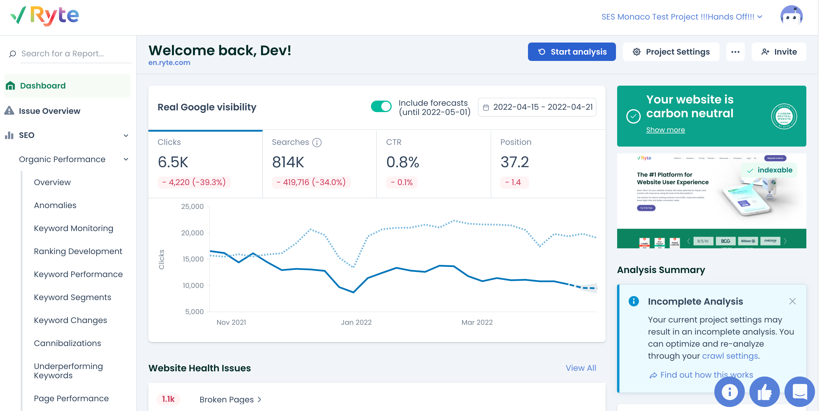
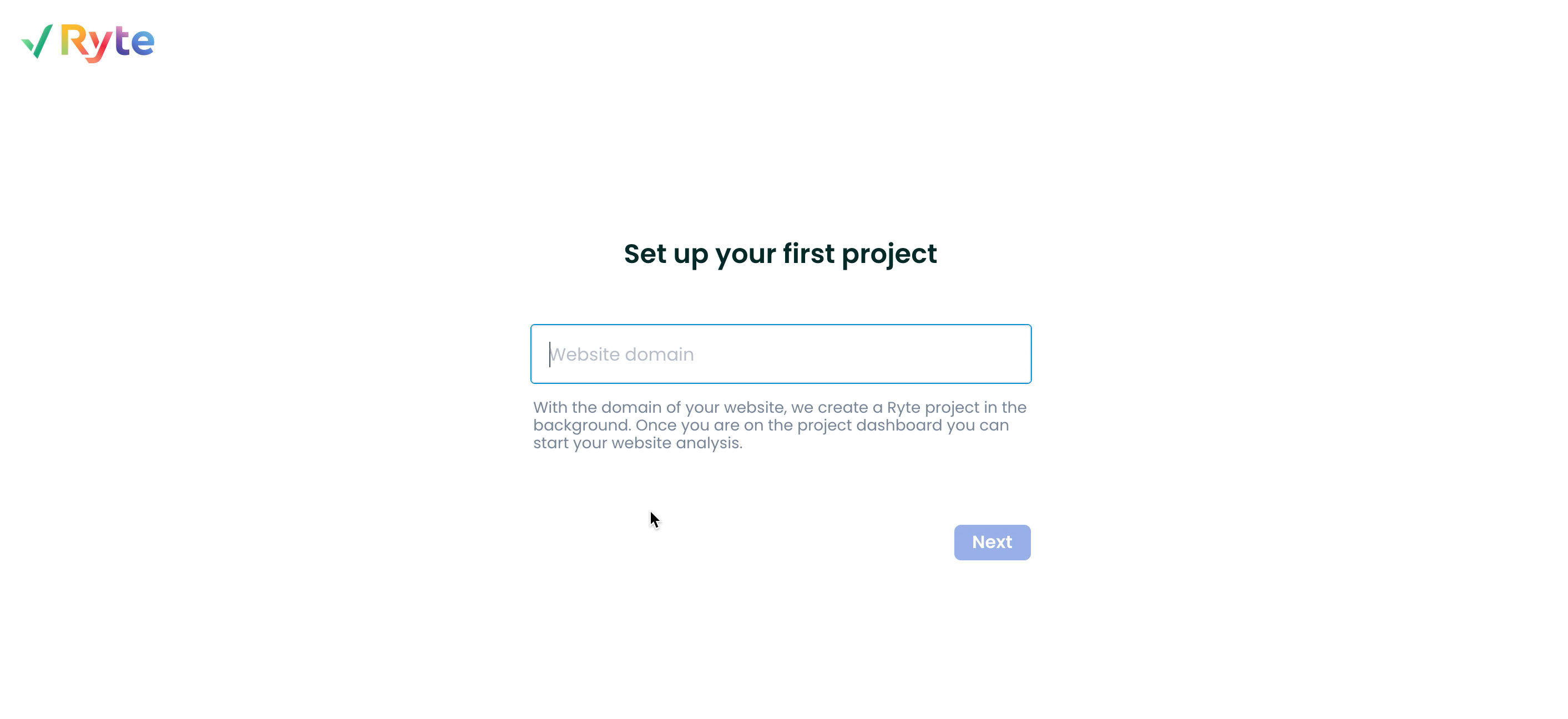
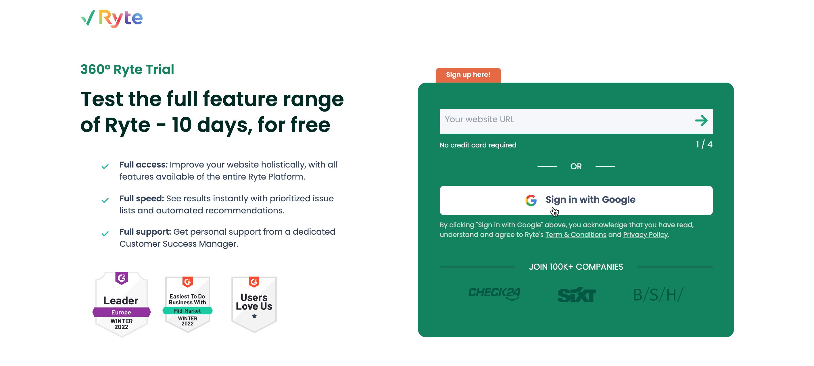
- The current onboarding process: Before the most prominent page - the dashboard - is seen by users upon their first sign up, the onboarding process is actually what takes them there. Along with the PO, I reviewed and analyzed the current onboarding experience and listed out the problematic parts of the user flow.
The process

The problem with the current onboarding process:
- After registration and set up users are immediately taken to the dashboard with no prior context or understanding of what is happening
- The current process was very overwhelming and confusing for users: The Ryte tool had over 1000 features with different use cases, lack of a personalized introductory and directional experience on how to get value quickly made for bad user experience.
2. Understanding the User's Perspective
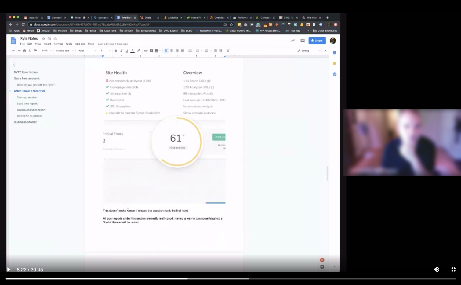
How is the onboarding experience perceived by actual users? I went to conduct a remote interview with a user who has previously signed up for Ryte but did not continue using the tool in order to understand what pain points they have and what aspects of the experience need clarification and improvement.
User registration
project set up
Dashboard


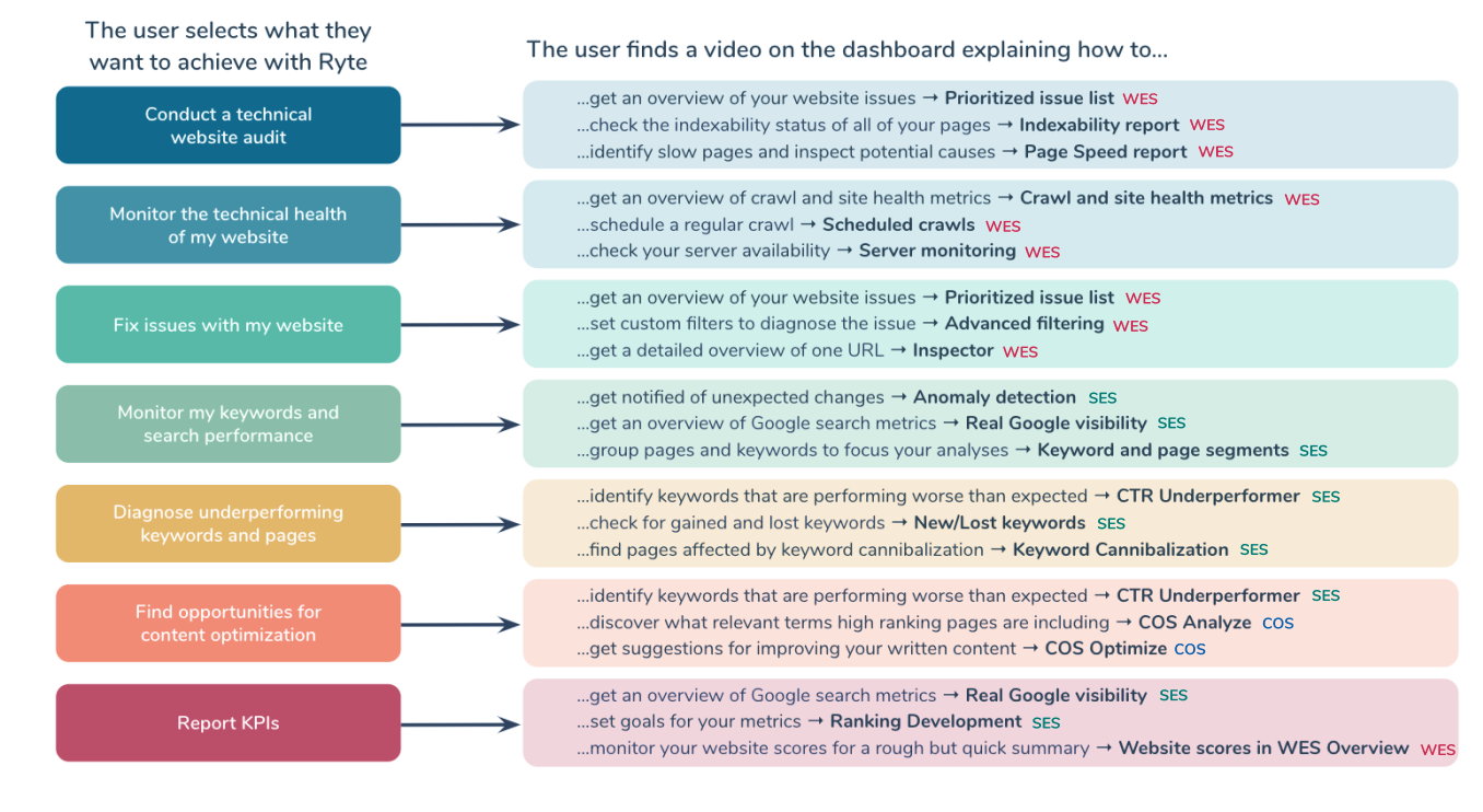
To address the problem of users not seeing the value that Ryte can provide on the get-go, I along with our UX Researcher, mapped the macro goals and micro use cases that a user might face, and evaluated what content and feature they need to be directed to:
3. Mapping out the user’s goals
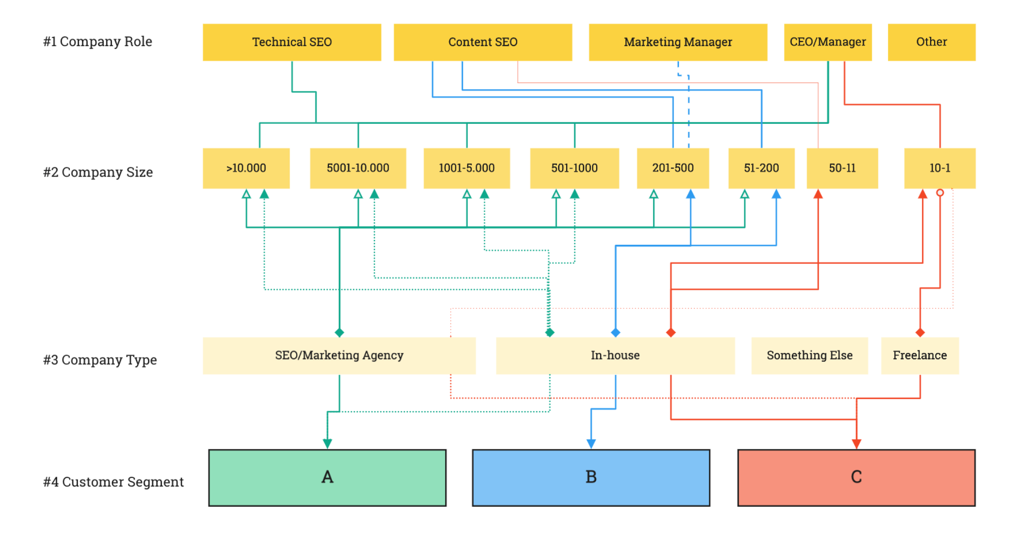
Since the goal is to improve the non-touch funnel and gain more quality leads and reduce churn, I needed to understand how our Business Development team sees what a "quality lead" looks like in order to identify them quicker and nurture their journey with enriched content that suits their needs.
4. Considering business needs
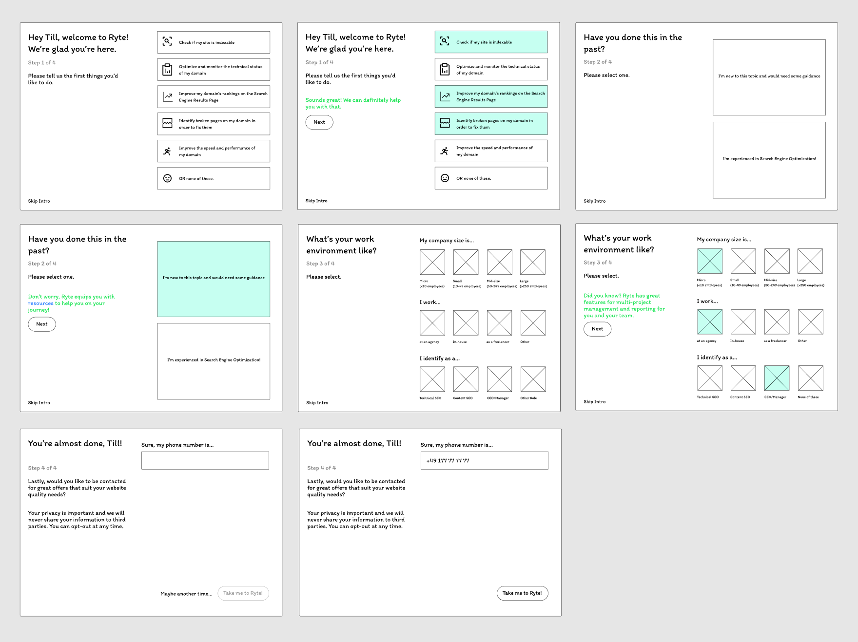
The onboarding would feature first a survey questionnaire that gathers information from the user in order to curate a personalized experience, and afterwards an intro tour based on user’s responses. This would not only allow us to understand what our users need, it also helps us identify quality leads within the funnel.
5. Wireframing
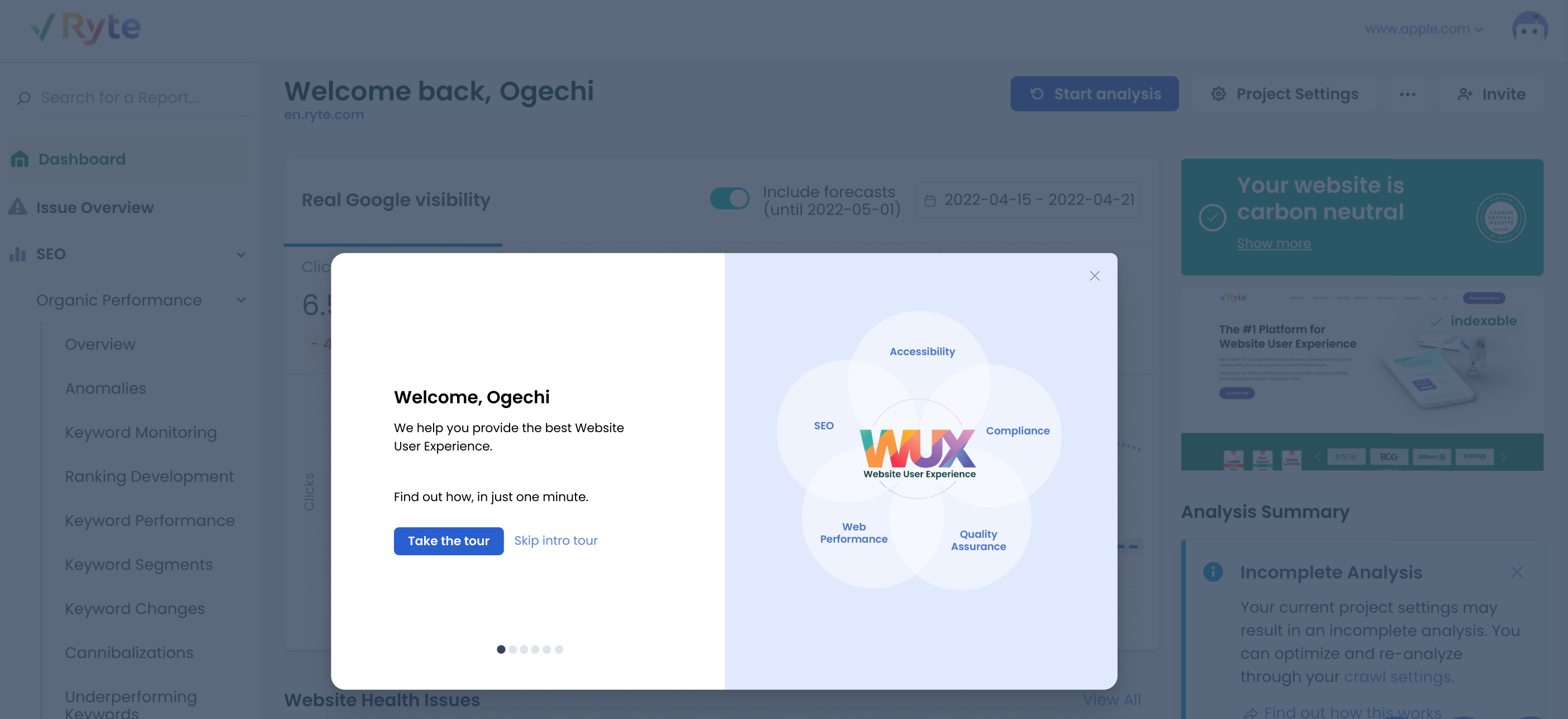
In a (cross functional) kickoff workshop, we defined the 5 most important Jobs to be done(JTBD) by our users:
“What is it that users want to get achieved with Ryte?”
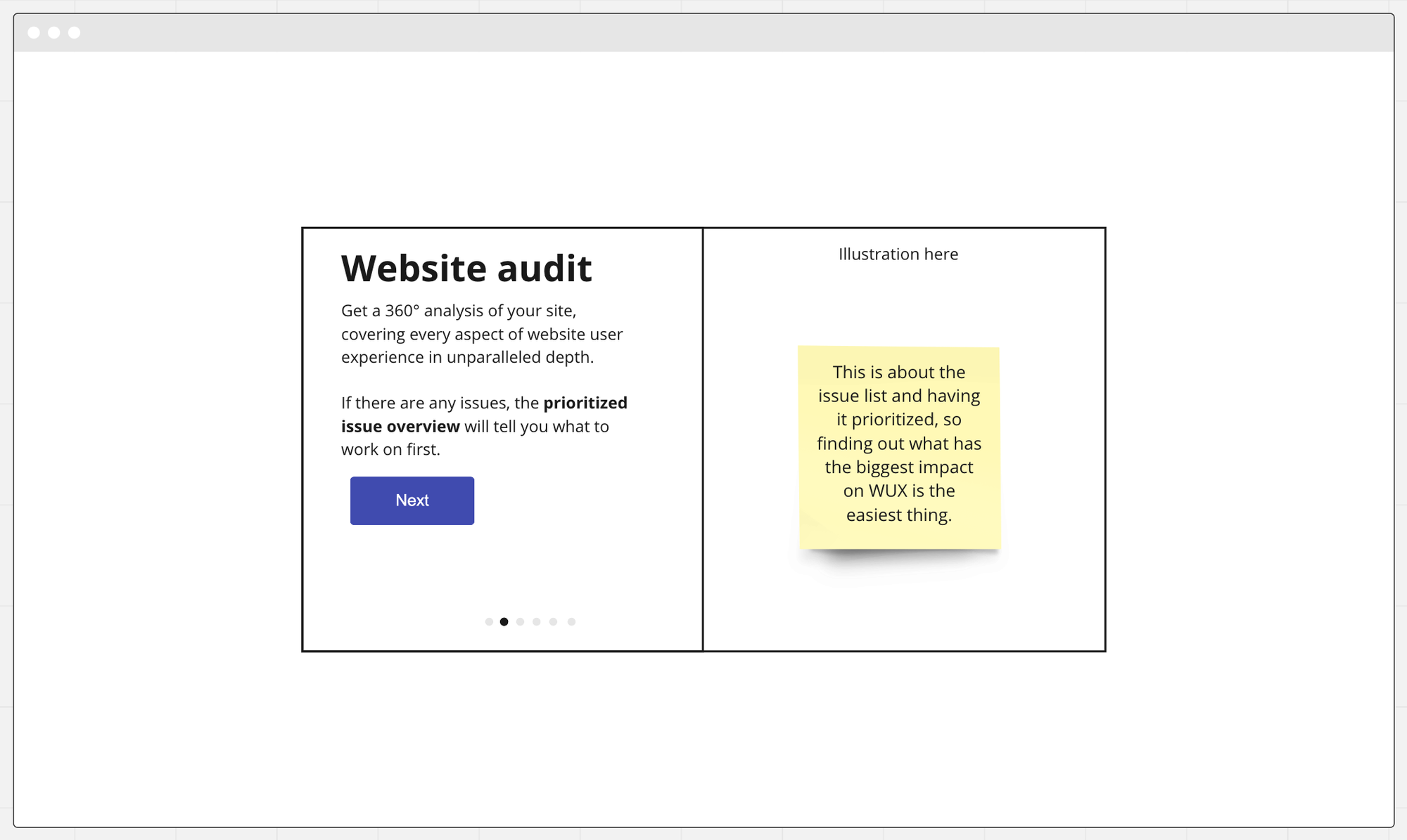
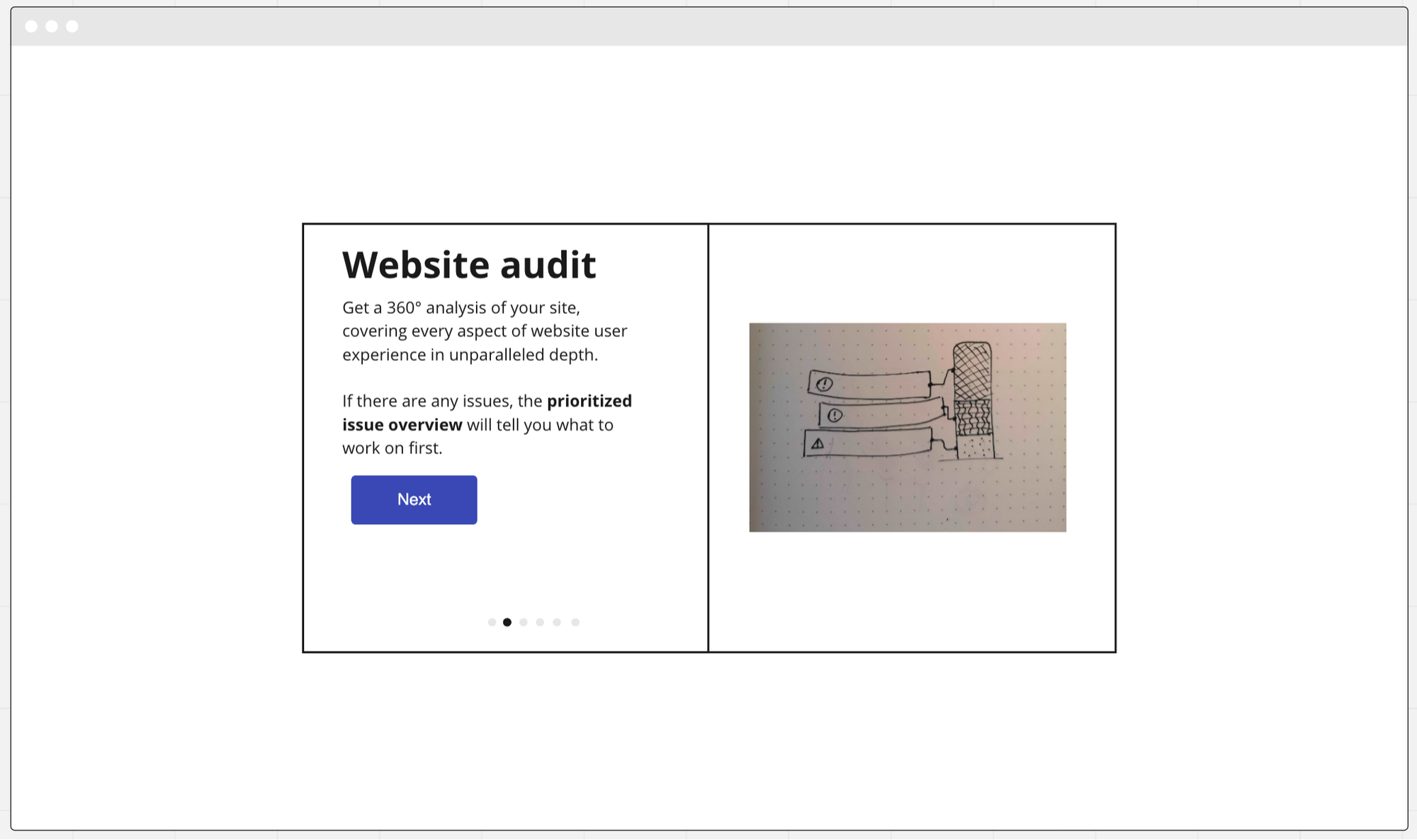
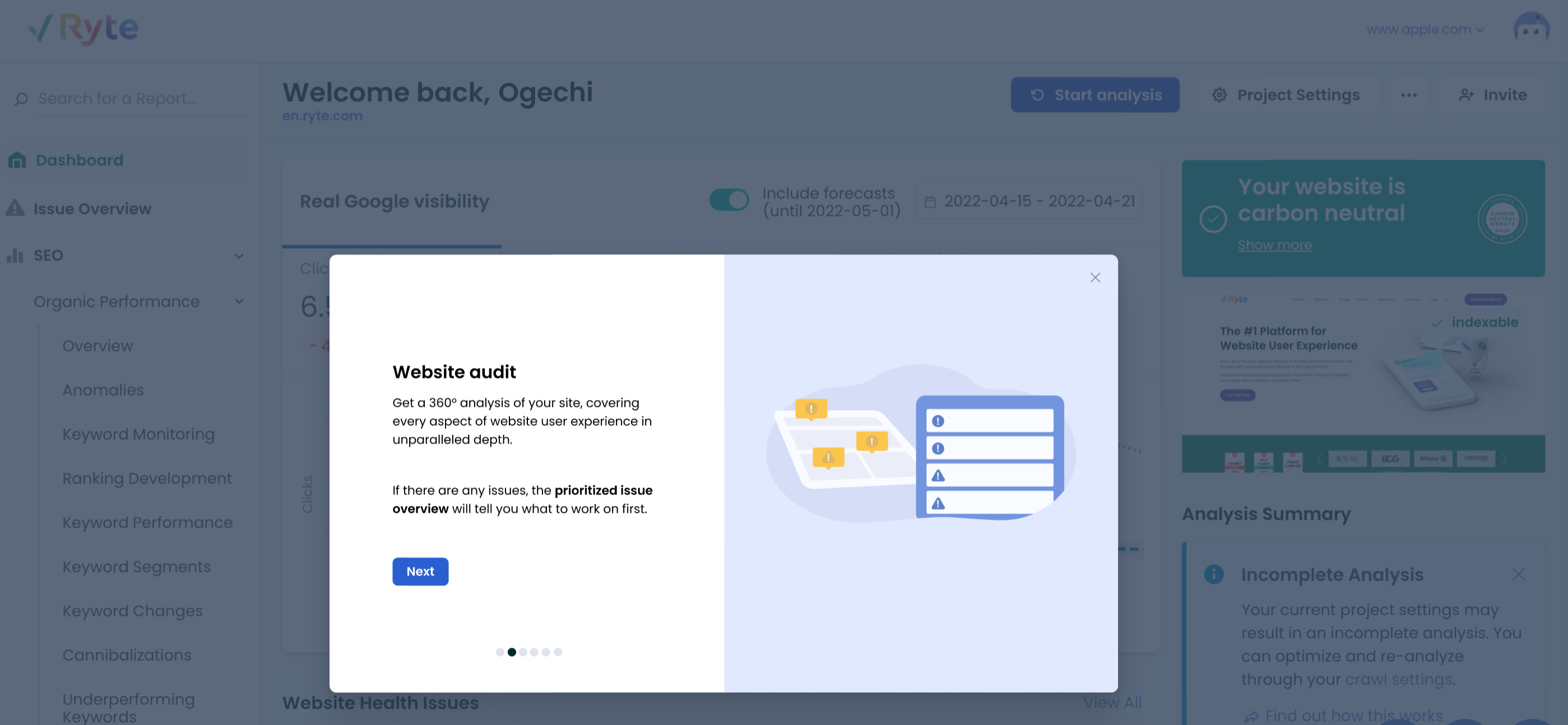
1. Website Audit: Get a 360 degree analysis of your website
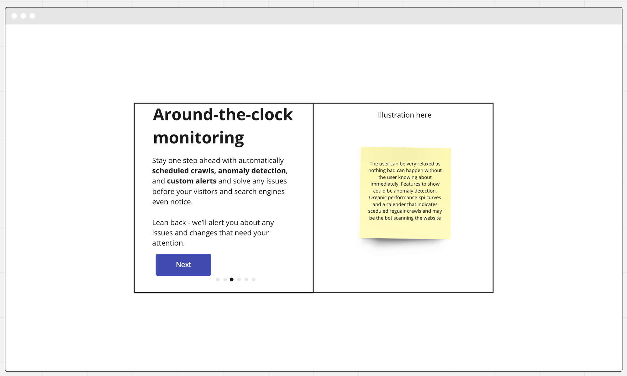
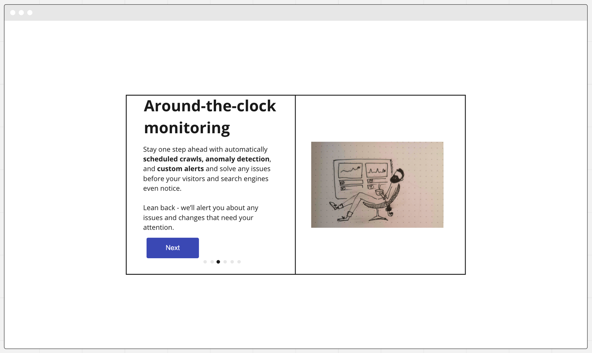
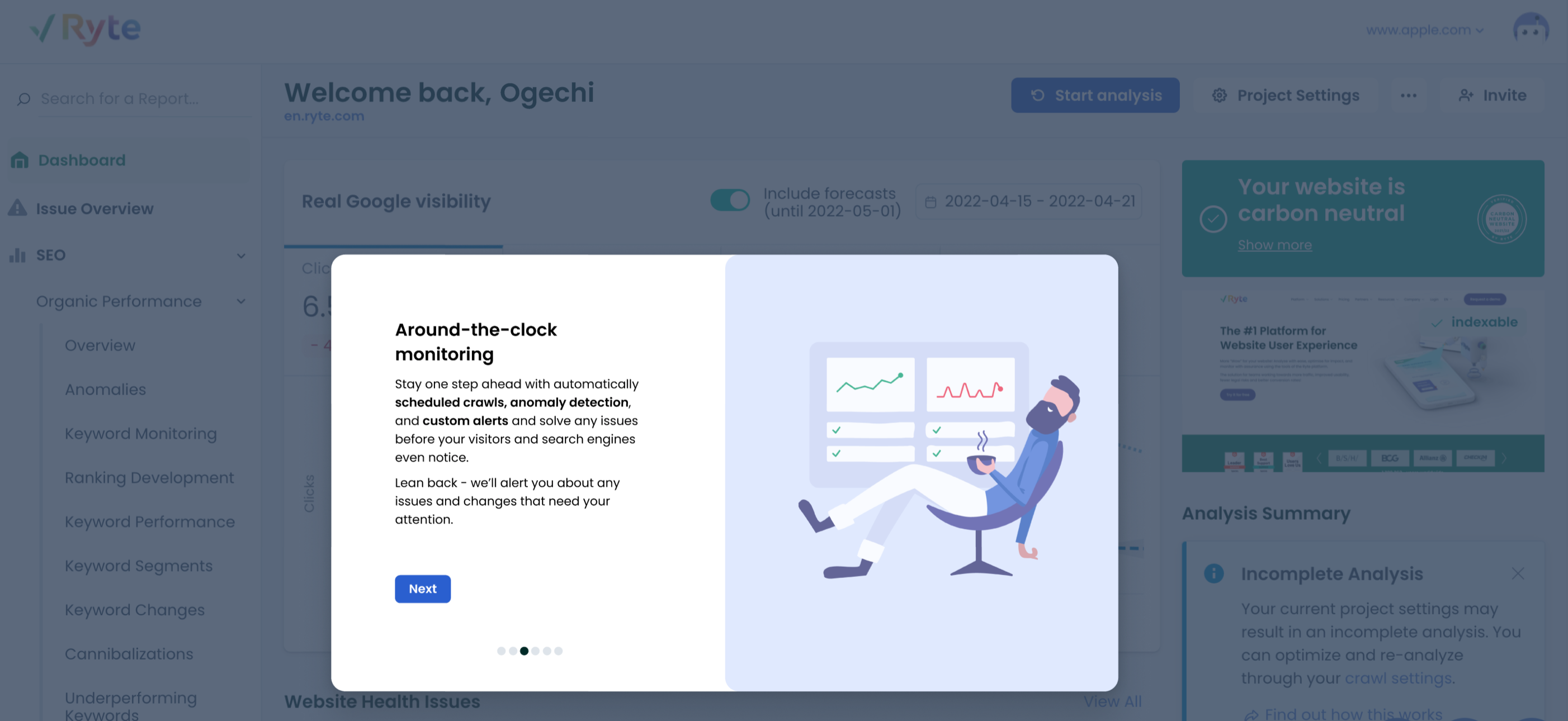
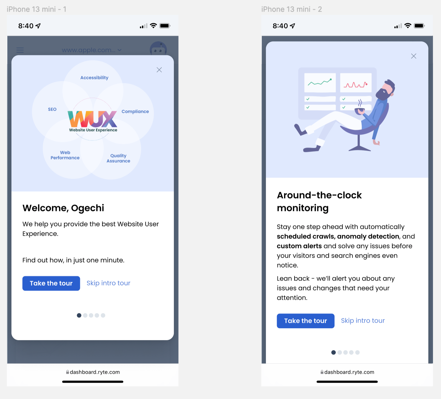
2. Around the clock monitoring: Stay one step ahead with automatically scheduled crawls, anomaly detection, and custom alerts and solve any issues before your visitors and search engines even notice.
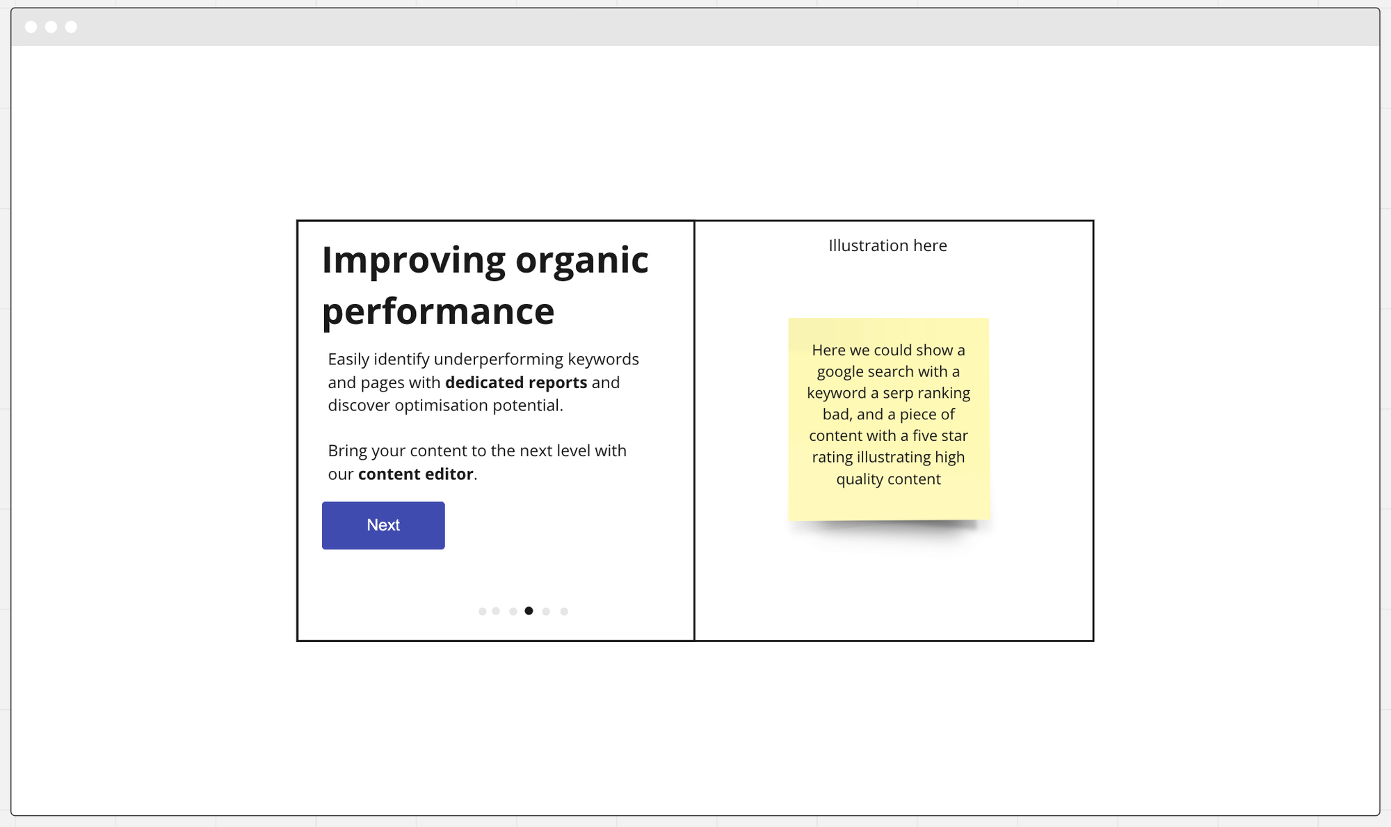
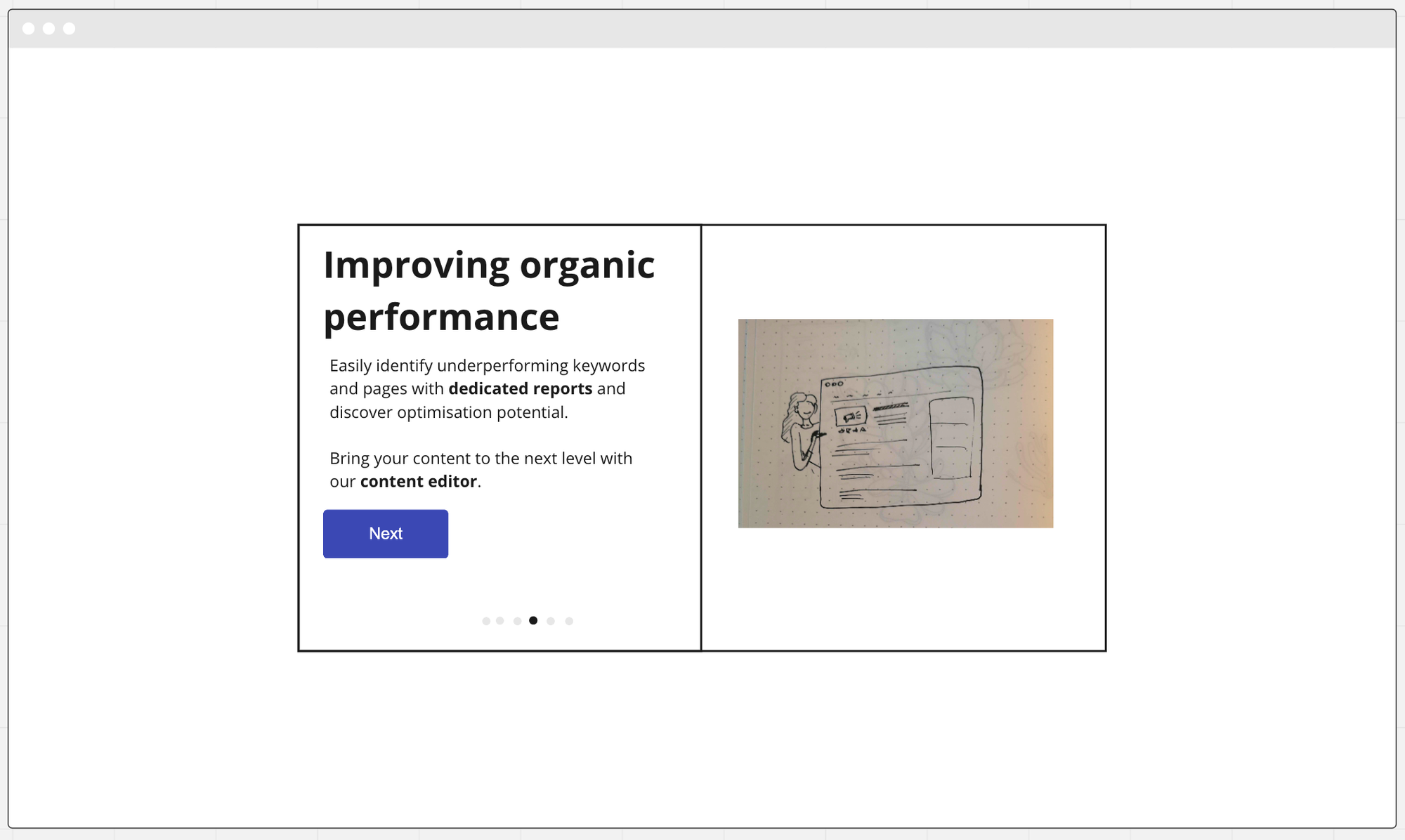
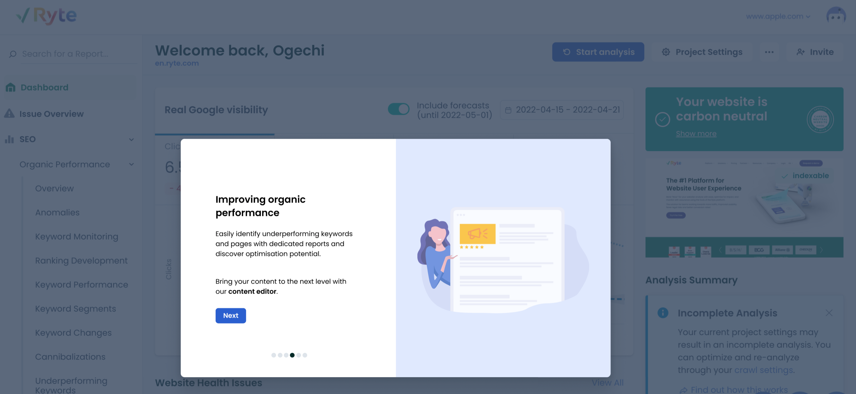
3. Keyword search: Easily identify underperforming keywords and pages with dedicated reports and discover optimisation potential.
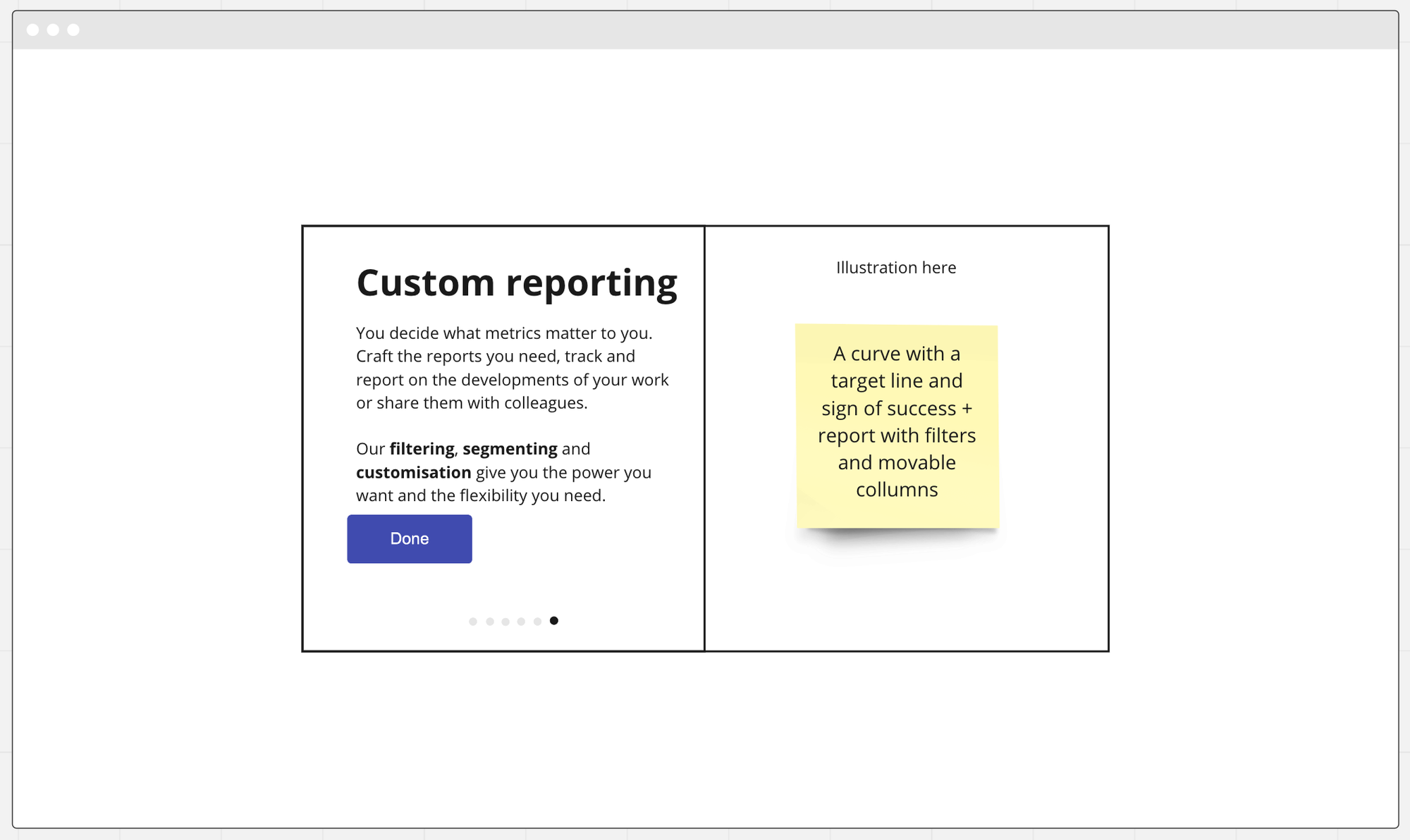
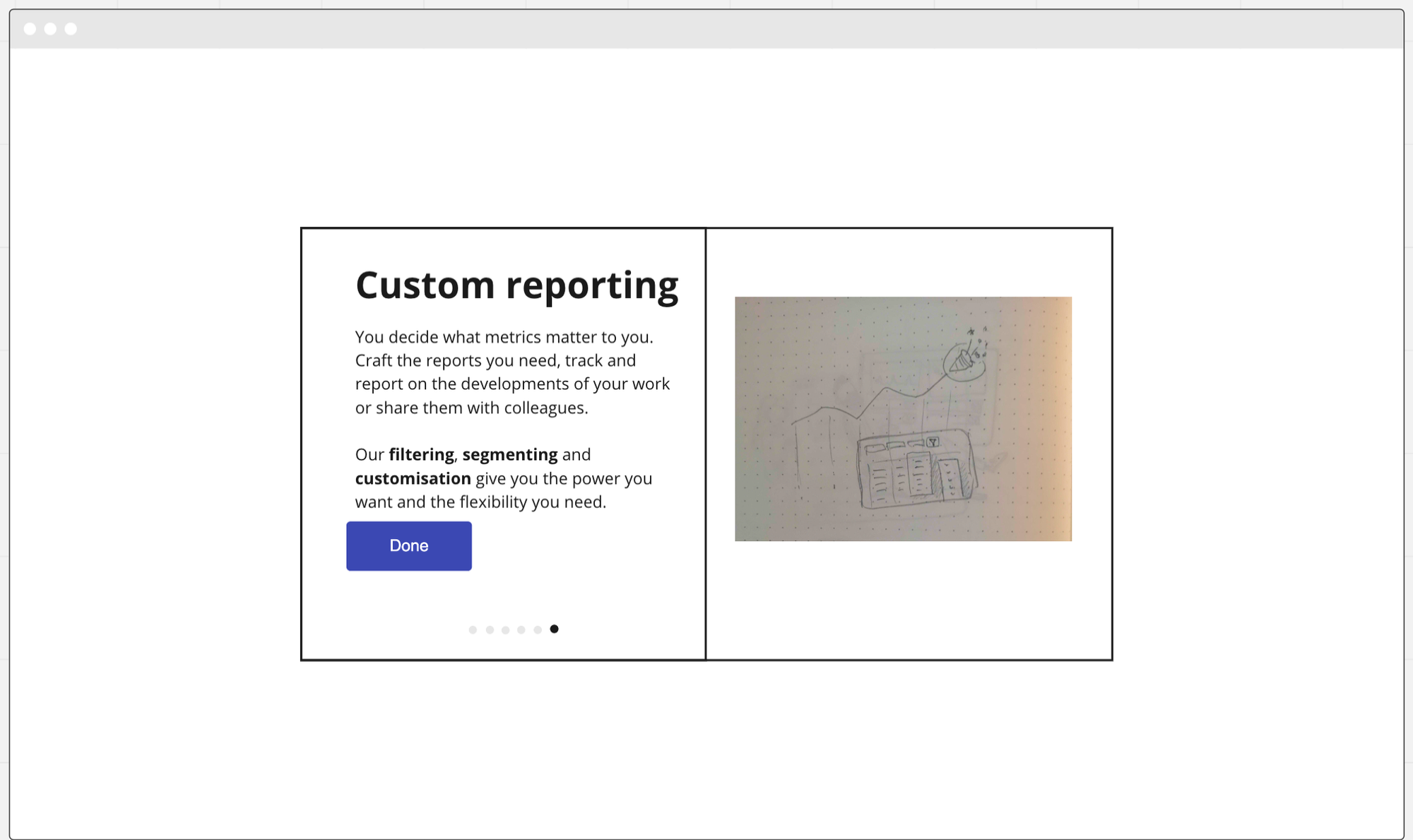
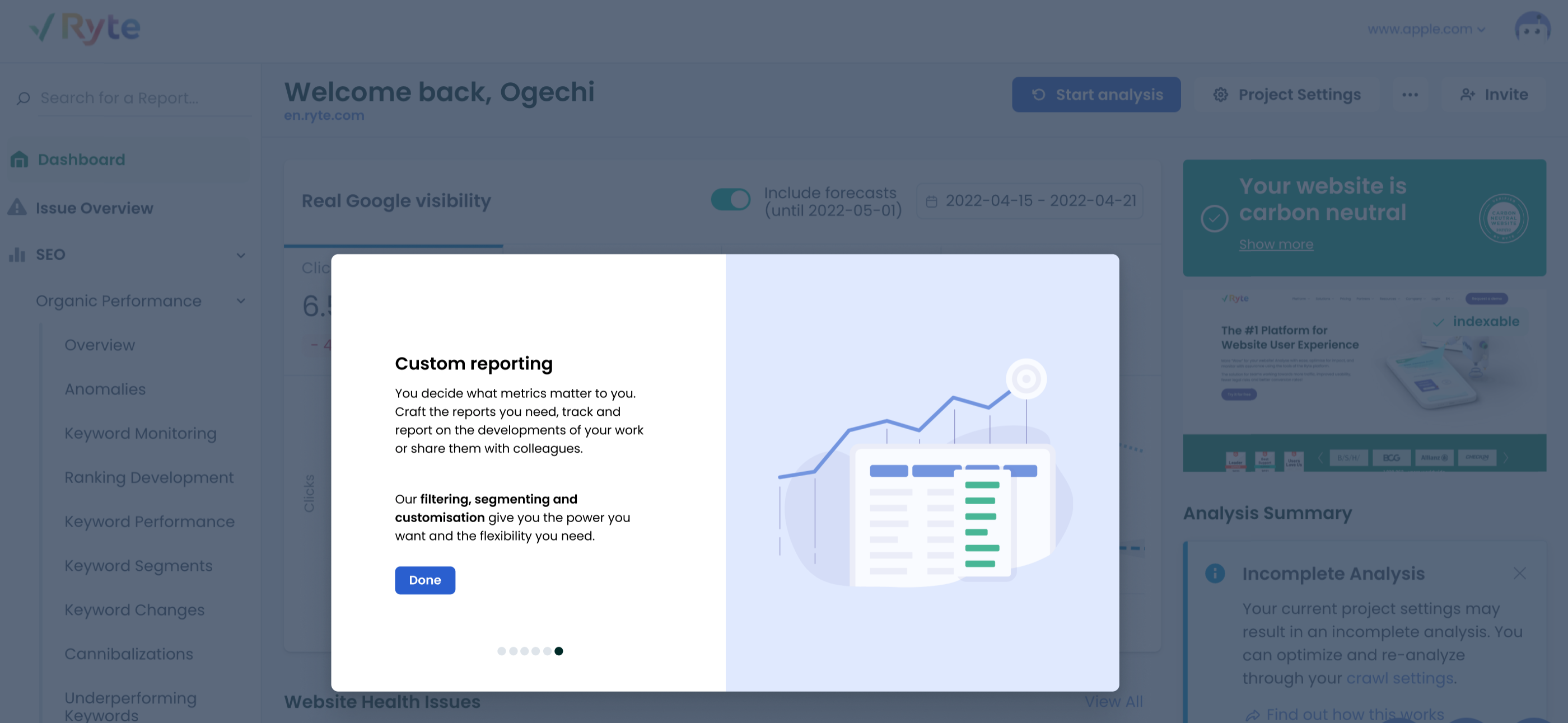
4. Custom reporting: Craft the reports you need, track and report on the developments of your work or share them with colleagues.
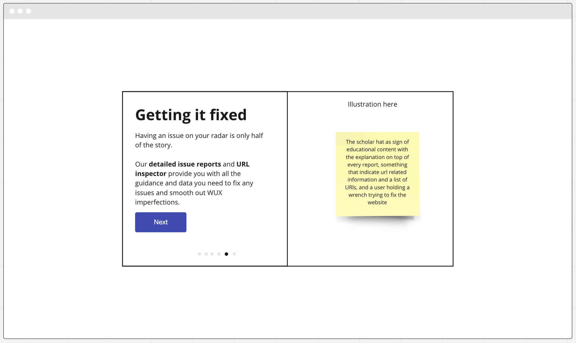
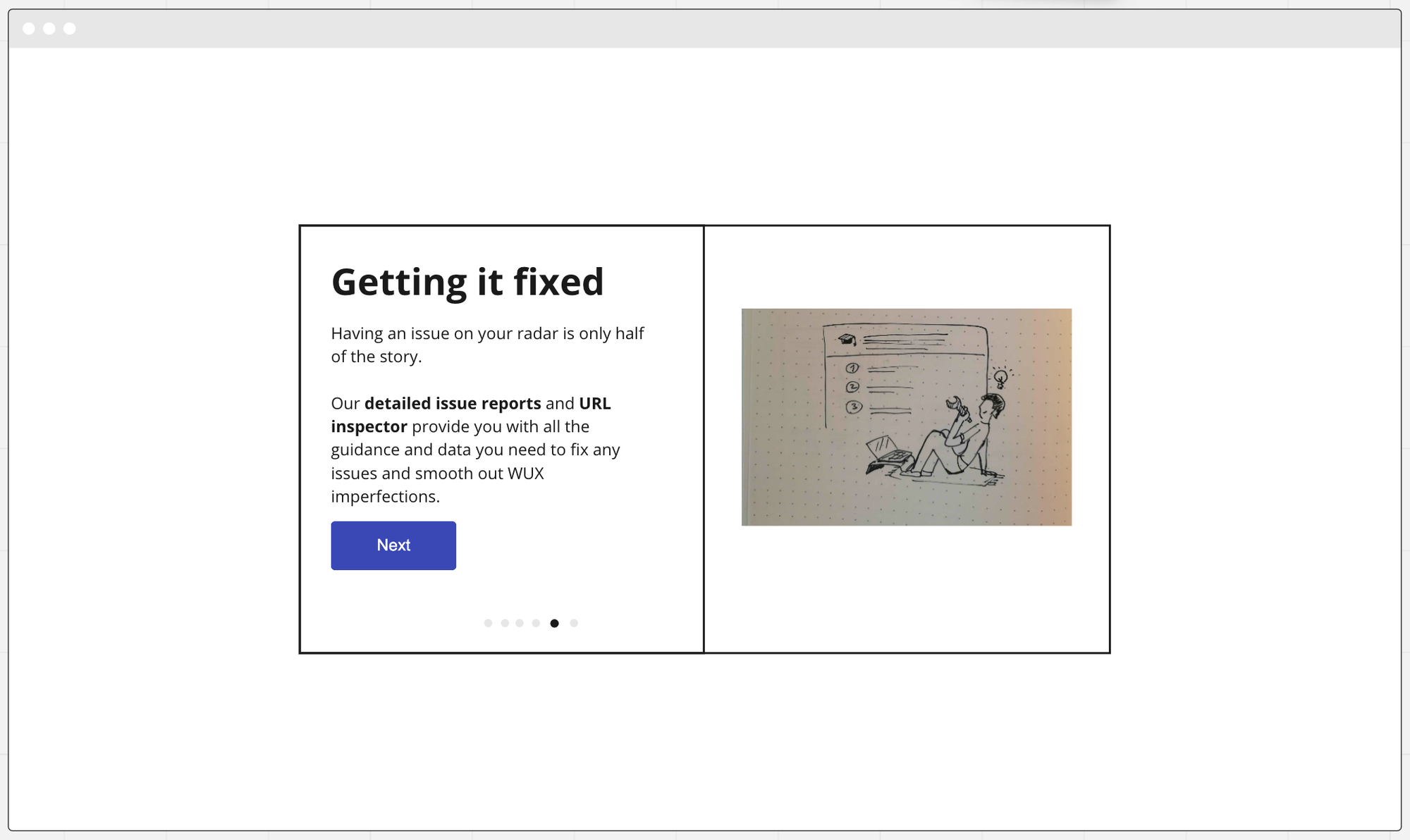
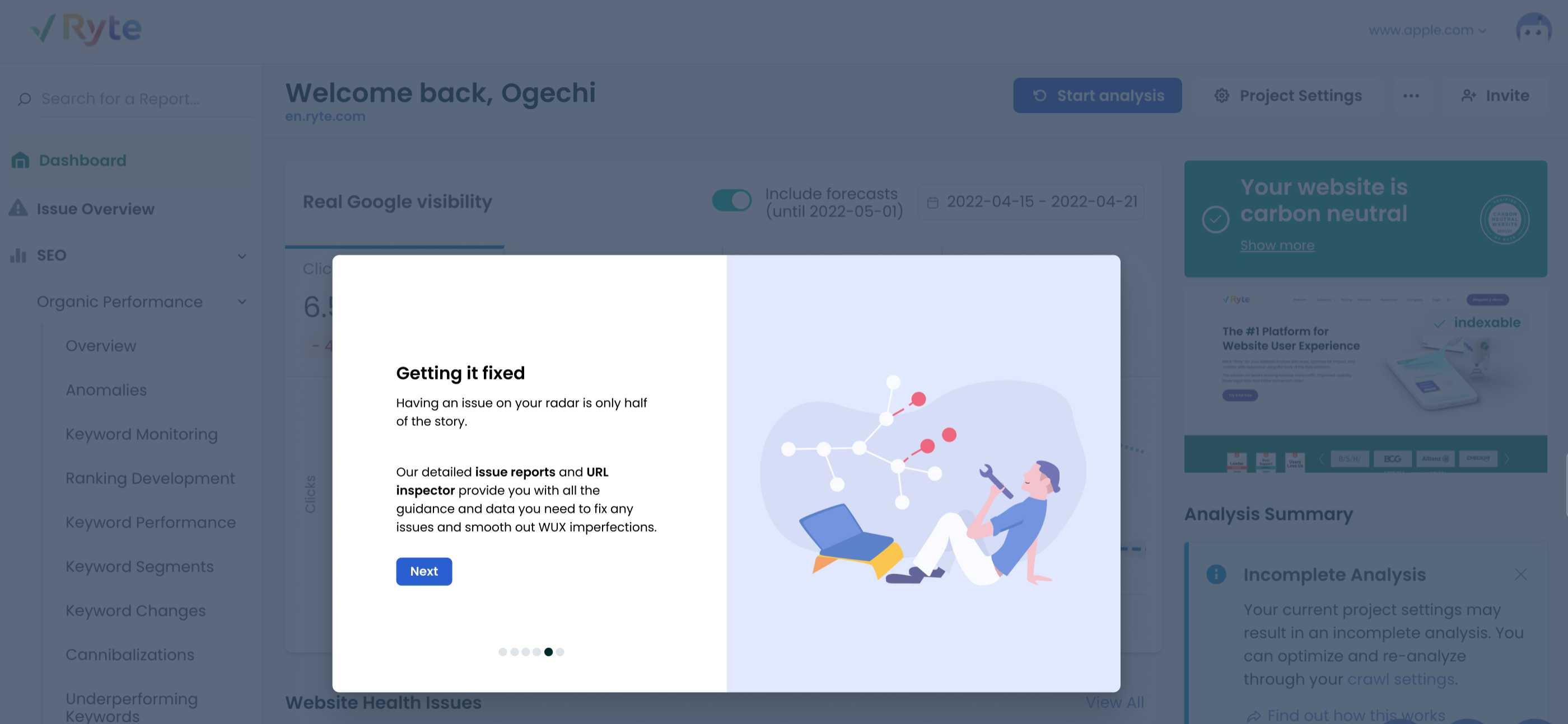
5. detailed issue reports and URL inspector: provide you with all the guidance and data you need to fix any issues and smooth out WUX imperfections.
Kickoff workshop for Intro tour feature:

Workshop conclusions for Intro tour feature

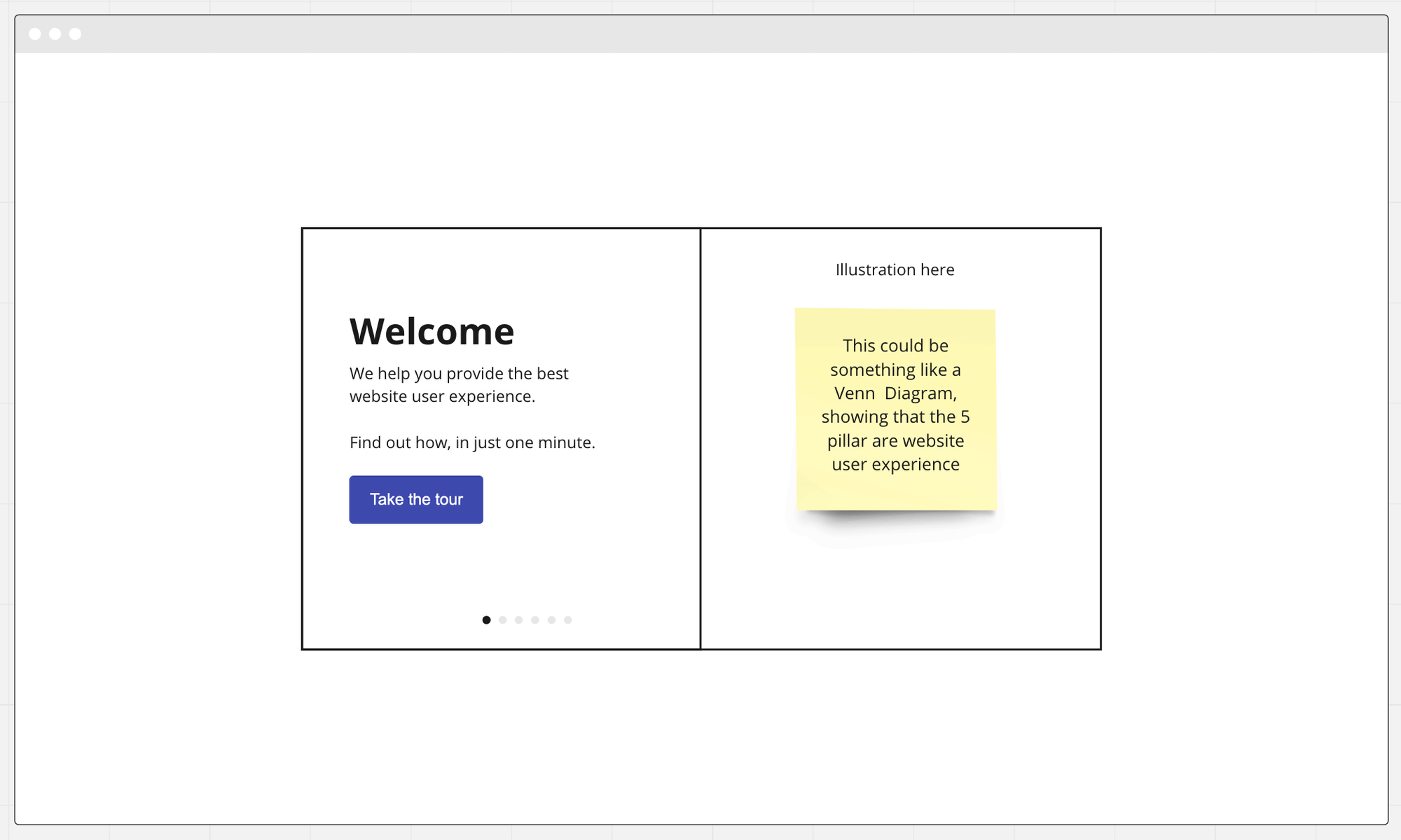
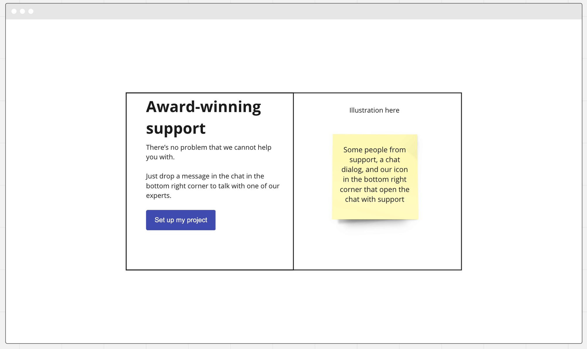
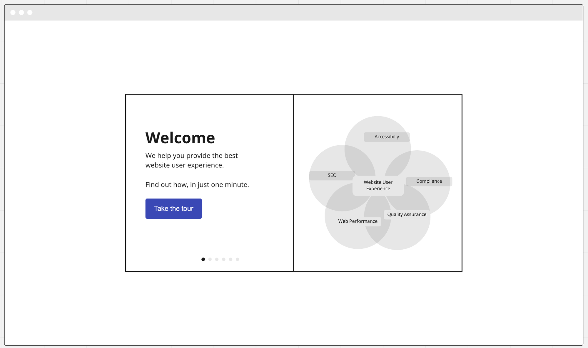
I started out with wireframes on Miro to reflect all conclusions reached in the crossfunctional kickoff workshop we had:
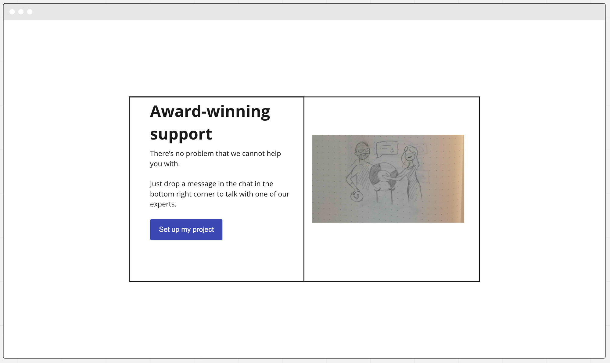
I made skeletal Illustration sketches representing illustration ideas we agreed on during the workshops:
wireframing

Illustrations 1:
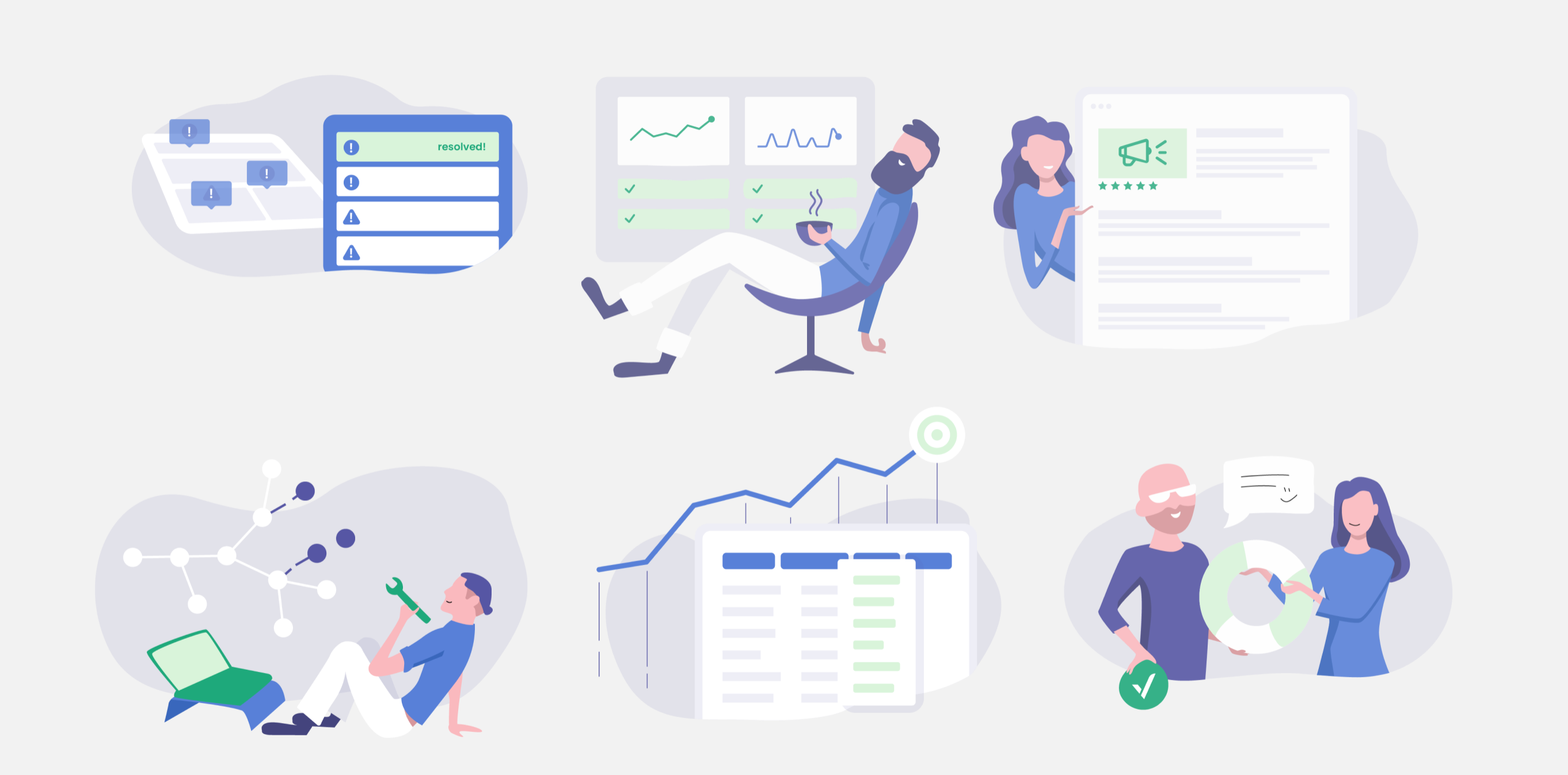
Final illustrations

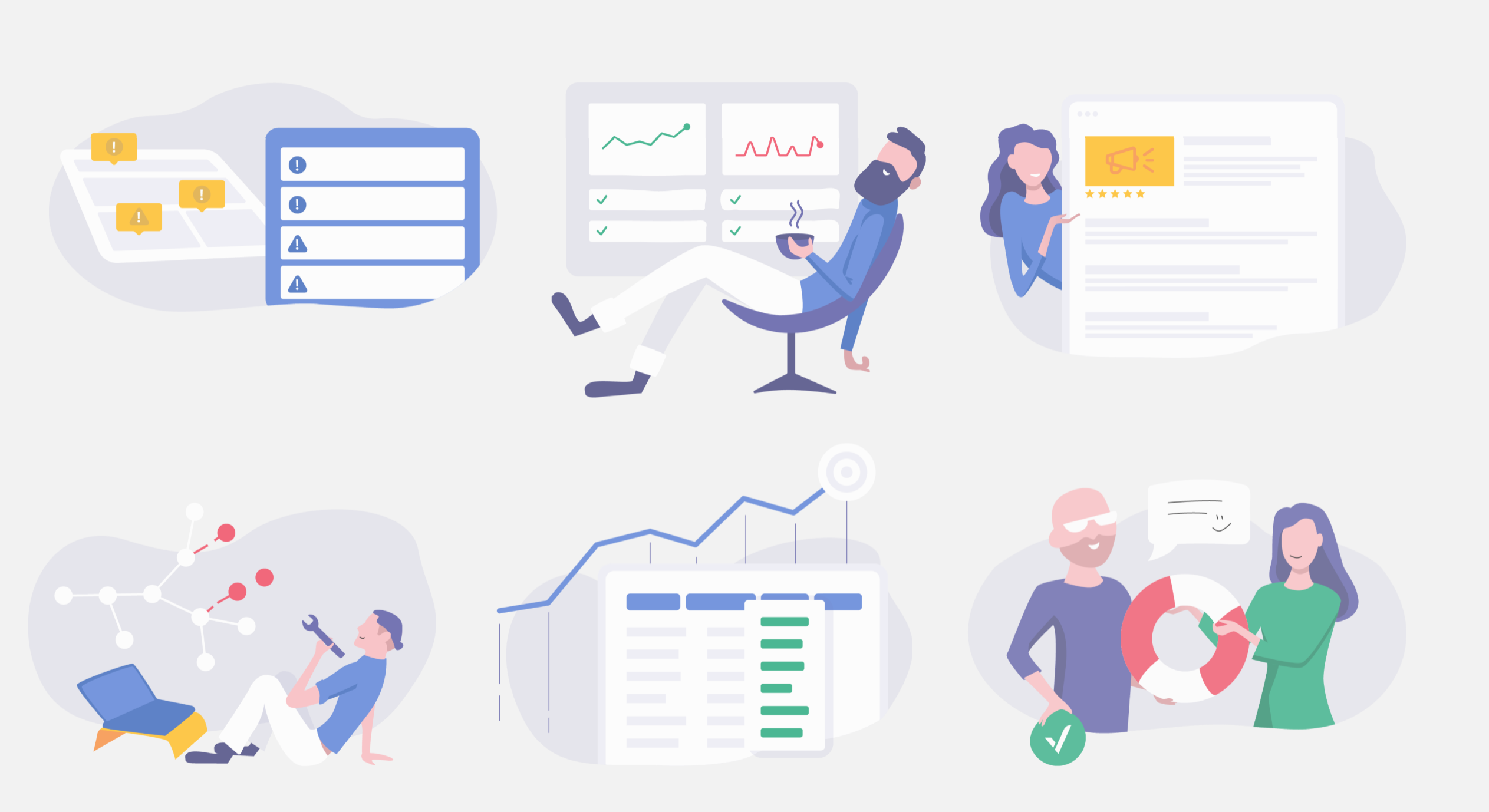
Illustrations variant(2):
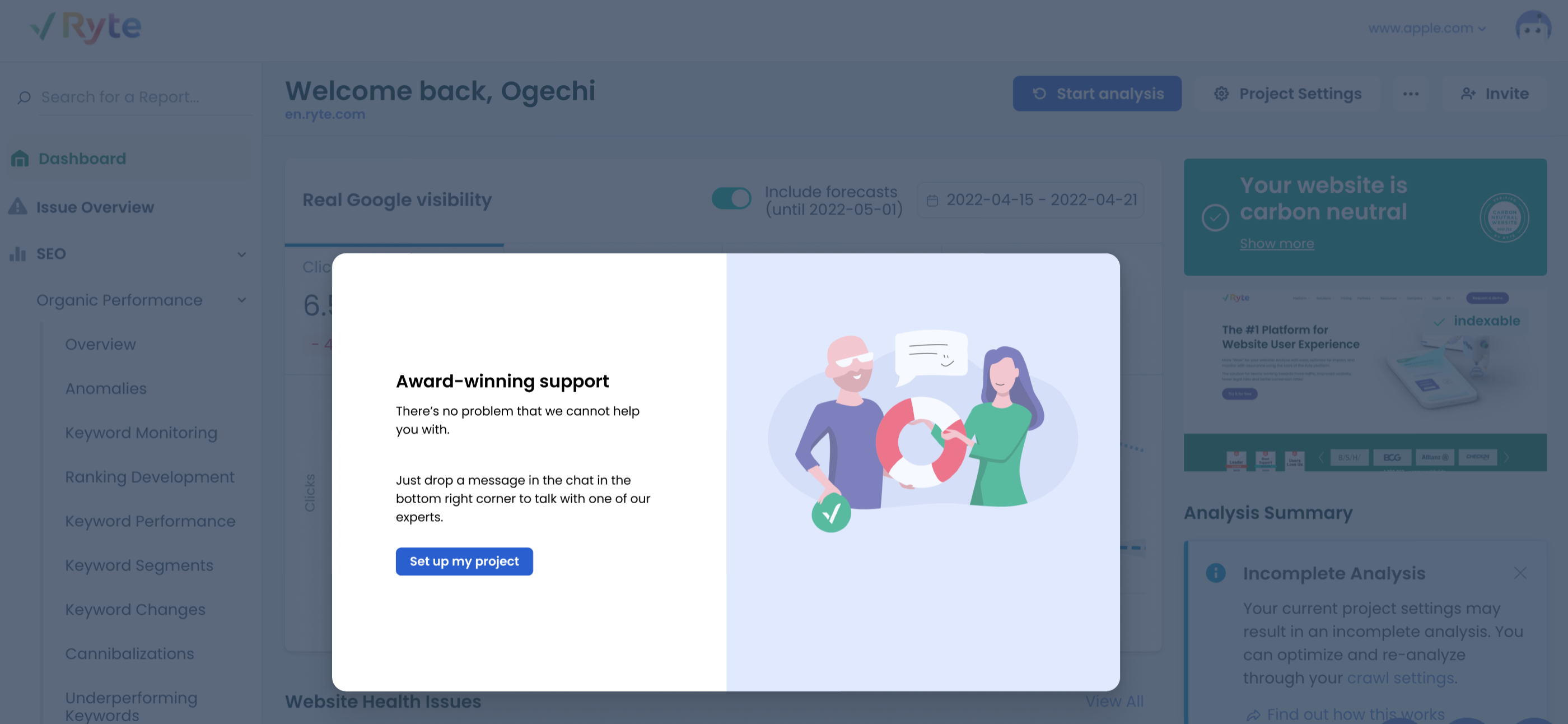
Final designs for introductory tour

Mobile Design

Final Solution

My Certifications

priority level:
MY ROLE
UX Designer (User interviews, Workshop facilitation, Graphics, Wireframing,
Revamp of the onboarding experience
Collaborated with Product owner, Josef Jaud, UES (User Experience) Team

Nice to have
Important
very critical

Company project:
solution preview

About Me


50%
Introverted


50%
Introverted


THE PREMISE
In order to improve Ryte's non-touch funnel, (a model where quality leads are nurtured into purchasing a package), I led the design for a personalized onboarding experience where these potential customers can better understand the value of Ryte based off of what their goals are.
Overview

How might we show immediate value to the users who sign up for the tool, right from the get go?
As a company, we learned that our lead generation (10k~ new signups per month), was not converting well to long-term "Basic" or "Business" package users. Although our marketing efforts were working, it's clear that the users who land on our tool are unable to grasp the immediate value of signing up with Ryte. To them it's unclear what we can offer and how they can start using it as there is hardly any clear introduction in the tool.
Just like a new customer entering a brick-and-mortar store, first impressions and customer service matter a lot. It might even be the competitive edge that makes all the difference. As the designer, my goal is to replicate this inviting experience for our first time users.
Problem statement

The new onboarding experience aims to not only take users into the tool after signing up. It also aims to communicate the value that Ryte can offer and tailor it to what our users actually need right from the very beginning: from the questionnaire survey that personalizes a users' experience to an intro tour to give the user the feeling and reassurance that this is the tool they are looking for.
The Solution

- Evaluating user pain points in current user flow
- The current onboarding process: Before the most prominent page - the dashboard - is seen by users upon their first sign up, the onboarding process is actually what takes them there. Along with the PO, I reviewed and analyzed the current onboarding experience and listed out the problematic parts of the user flow.
The process

The problem with the current onboarding process:
- After registration and set up users are immediately taken to the dashboard with no prior context or understanding of what is happening
- The current process was very overwhelming and confusing for users: The Ryte tool had over 1000 features with different use cases, lack of a personalized introductory and directional experience on how to get value quickly made for bad user experience.
2. Understanding the User's Perspective
How is the onboarding experience perceived by actual users? I went to conduct a remote interview with a user who has previously signed up for Ryte but did not continue using the tool in order to understand what pain points they have and what aspects of the experience need clarification and improvement.
User registration
project set up
Dashboard


To address the problem of users not seeing the value that Ryte can provide on the get-go, I along with our UX Researcher, mapped the macro goals and micro use cases that a user might face, and evaluated what content and feature they need to be directed to:
3. Mapping out the user’s goals
Since the goal is to improve the non-touch funnel and gain more quality leads and reduce churn, I needed to understand how our Business Development team sees what a "quality lead" looks like in order to identify them quicker and nurture their journey with enriched content that suits their needs.
4. Considering business needs
The onboarding would feature first a survey questionnaire that gathers information from the user in order to curate a personalized experience, and afterwards an intro tour based on user’s responses. This would not only allow us to understand what our users need, it also helps us identify quality leads within the funnel.
5. Wireframing
In a (cross functional) kickoff workshop, we defined the 5 most important Jobs to be done(JTBD) by our users:
“What is it that users want to get achieved with Ryte?”
1. Website Audit: Get a 360 degree analysis of your website
2. Around the clock monitoring: Stay one step ahead with automatically scheduled crawls, anomaly detection, and custom alerts and solve any issues before your visitors and search engines even notice.
3. Keyword search: Easily identify underperforming keywords and pages with dedicated reports and discover optimisation potential.
4. Custom reporting: Craft the reports you need, track and report on the developments of your work or share them with colleagues.
5. detailed issue reports and URL inspector: provide you with all the guidance and data you need to fix any issues and smooth out WUX imperfections.
Kickoff workshop for Intro tour feature:

Workshop conclusions for Intro tour feature

I started out with wireframes on Miro to reflect all conclusions reached in the crossfunctional kickoff workshop we had:
I made skeletal Illustration sketches representing illustration ideas we agreed on during the workshops:
wireframing

Illustrations 1:
Final illustrations

Illustrations variant(2):
Final designs for introductory tour

Mobile Design

Final Solution
priority level:
MY ROLE
UX Designer (User interviews, Workshop facilitation, Graphics, Wireframing, Prototyping)
Revamp of the onboarding experience
Collaborated with Product owner, Josef Jaud, UES (User Experience) Team

Nice to have
Important
very critical

Company project:
solution preview
About Me


50%
Introverted


50%
Introverted


THE PREMISE
In order to improve Ryte's non-touch funnel, (a model where quality leads are nurtured into purchasing a package), I led the design for a personalized onboarding experience where these potential customers can better understand the value of Ryte based off of what their goals are.
Overview

How might we show immediate value to the users who sign up for the tool, right from the get go?
As a company, we learned that our lead generation (10k~ new signups per month), was not converting well to long-term "Basic" or "Business" package users. Although our marketing efforts were working, it's clear that the users who land on our tool are unable to grasp the immediate value of signing up with Ryte. To them it's unclear what we can offer and how they can start using it as there is hardly any clear introduction in the tool.
Just like a new customer entering a brick-and-mortar store, first impressions and customer service matter a lot. It might even be the competitive edge that makes all the difference. As the designer, my goal is to replicate this inviting experience for our first time users.
Problem statement

The new onboarding experience aims to not only take users into the tool after signing up. It also aims to communicate the value that Ryte can offer and tailor it to what our users actually need right from the very beginning: from the questionnaire survey that personalizes a users' experience to an intro tour to give the user the feeling and reassurance that this is the tool they are looking for.
The Solution

- Evaluating user pain points in current user flow
- The current onboarding process: Before the most prominent page - the dashboard - is seen by users upon their first sign up, the onboarding process is actually what takes them there. Along with the PO, I reviewed and analyzed the current onboarding experience and listed out the problematic parts of the user flow.
The process

The problem with the current onboarding process:
- After registration and set up users are immediately taken to the dashboard with no prior context or understanding of what is happening
- The current process was very overwhelming and confusing for users: The Ryte tool had over 1000 features with different use cases, lack of a personalized introductory and directional experience on how to get value quickly made for bad user experience.
2. Understanding the User's Perspective
How is the onboarding experience perceived by actual users? I went to conduct a remote interview with a user who has previously signed up for Ryte but did not continue using the tool in order to understand what pain points they have and what aspects of the experience need clarification and improvement.
User registration
project set up
Dashboard


To address the problem of users not seeing the value that Ryte can provide on the get-go, I along with our UX Researcher, mapped the macro goals and micro use cases that a user might face, and evaluated what content and feature they need to be directed to:
3. Mapping out the user’s goals
Since the goal is to improve the non-touch funnel and gain more quality leads and reduce churn, I needed to understand how our Business Development team sees what a "quality lead" looks like in order to identify them quicker and nurture their journey with enriched content that suits their needs.
4. Considering business needs
The onboarding would feature first a survey questionnaire that gathers information from the user in order to curate a personalized experience, and afterwards an intro tour based on user’s responses. This would not only allow us to understand what our users need, it also helps us identify quality leads within the funnel.
5. Wireframing
In a (cross functional) kickoff workshop, we defined the 5 most important Jobs to be done(JTBD) by our users:
“What is it that users want to get achieved with Ryte?”
1. Website Audit: Get a 360 degree analysis of your website
2. Around the clock monitoring: Stay one step ahead with automatically scheduled crawls, anomaly detection, and custom alerts and solve any issues before your visitors and search engines even notice.
3. Keyword search: Easily identify underperforming keywords and pages with dedicated reports and discover optimisation potential.
4. Custom reporting: Craft the reports you need, track and report on the developments of your work or share them with colleagues.
5. detailed issue reports and URL inspector: provide you with all the guidance and data you need to fix any issues and smooth out WUX imperfections.
Kickoff workshop for Intro tour feature:

Workshop conclusions for Intro tour feature

I started out with wireframes on Miro to reflect all conclusions reached in the crossfunctional kickoff workshop we had:
I made skeletal Illustration sketches representing illustration ideas we agreed on during the workshops:
wireframing

Illustrations 1:
Final illustrations

Illustrations variant(2):
Final designs for introductory tour

Mobile Design

Final Solution