Ryte Design System Revamp


GmbH

Data Explorer


Switch to new navigation


Search for a report...
Dashboard

SEO


Issue Overview

!

Quality Assurance

Web Performance

Compliance
Accessibility


Sustainability


Report Gallery

Switch to new navigation


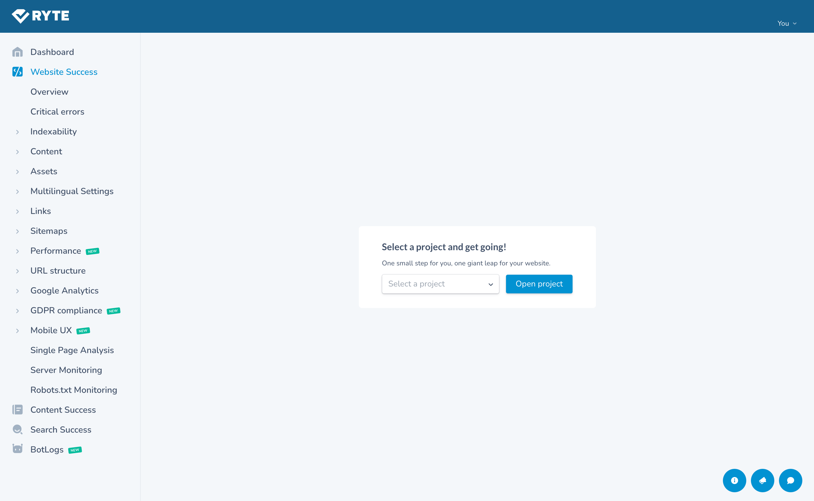
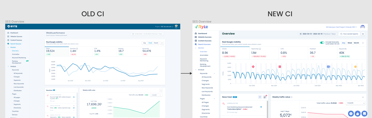
OLD NAVIGATION/OLD CI
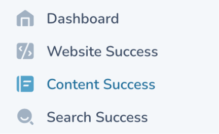
NEW NAVIGATION/NEW CI
MY ROLE
- Component Library Revamp
- Standardization of UI Patterns
- Visual & Interaction Consistency
- Developer Handoff + QA
- Documentation for Adoption
PROJECT DURATION
- 5 Months
- March - July, 2022
PROJECT TYPE
- Company Project (Ryte GmbH, Munich)
Following the decision to revamp our User Interface and Brand Corporate Identity to take on a more modern, bold, consistent and mature UI reflective of the Ryte Vision and WUX (Website User Experience) pillars, there was a corresponding need to revamp our Design System components.
Ryte GmbH Design System Revamp


Data Explorer


Switch to new navigation


Search for a report...
Dashboard

SEO


Issue Overview

!

Quality Assurance

Web Performance

Compliance
Accessibility


Sustainability


Report Gallery

Switch to new navigation


OLD NAVIGATION/OLD CI
NEW NAVIGATION/NEW CI
Preview of Revamped Design System with new CI

In a crossfunctional kickoff workshop (Engineering team, Design team of 3, and 2 Product Owners) we identified all UI components that existed in the old CI and Ryte tool:
Step 1: component workshop

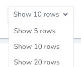
- selecting one or more values, in the context of a form
- multiple options to select are possible
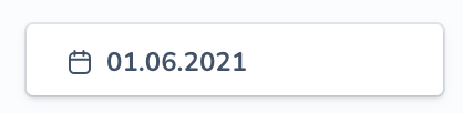
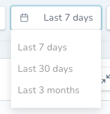
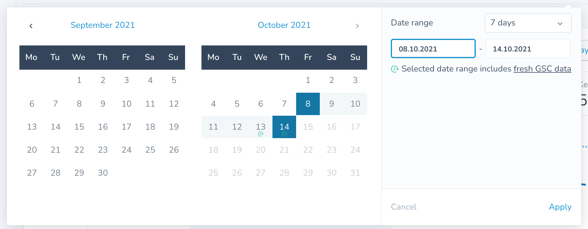
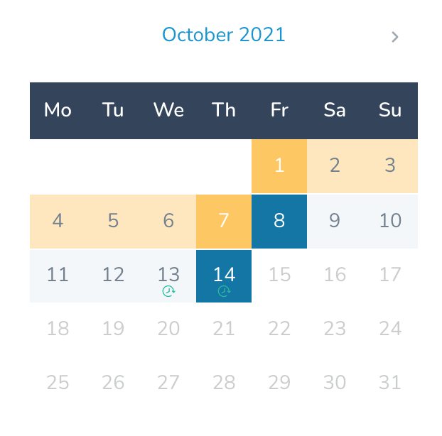
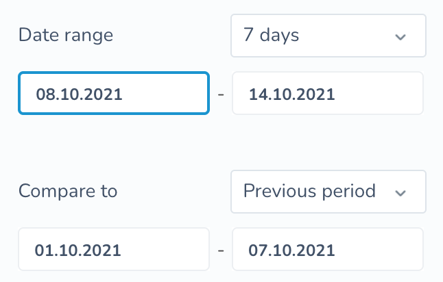
- selecting a time/date
- calendar shows up
- mm/dd/yyyy in one field or a date range
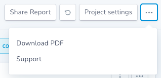
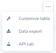
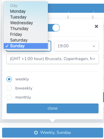
- select a single action
- opens a modal
- navigates somewhere else after selection
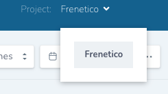
Select
Datetime picker
Popover Menu
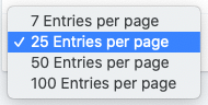
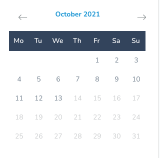
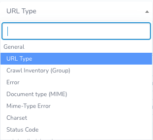
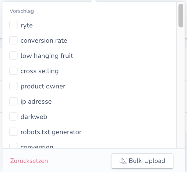
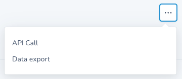
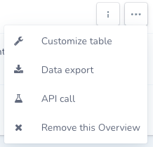

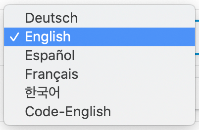
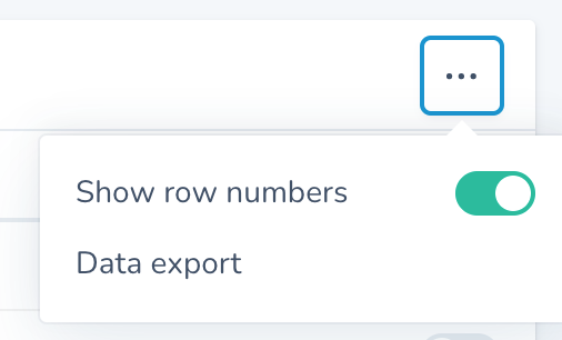
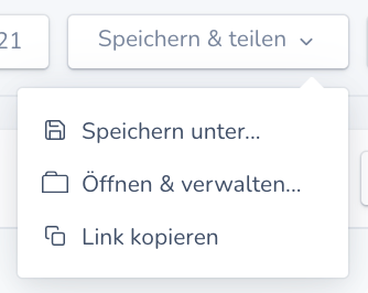
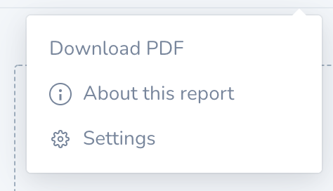
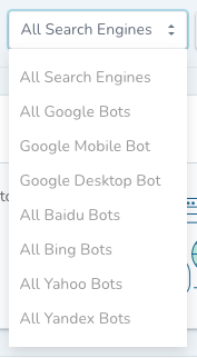
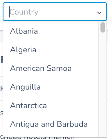
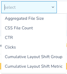
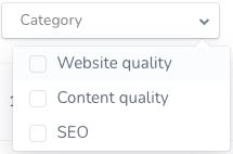
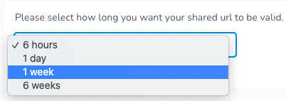
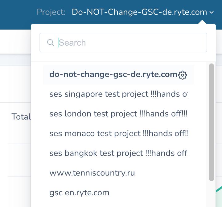
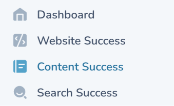
note the “tick” element
note the “arrow” element


Buttons
- Does an action within the page
- clickable
- Primary, Secondary, Destructive
- can have an icon next to the label
- can have only icon, without text
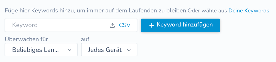
- where users can input any query
- text area
- checkbox
- radio button
- toggle button
- text inputs with icons
- password field with visibility function
- strings in the UI
- h1
- h2
- h3
- p
Text Fields and Inputs
Typography
and Fonts






























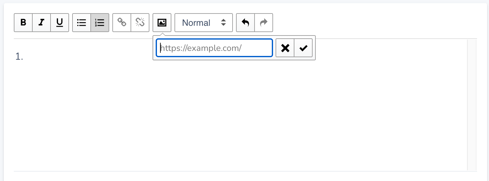
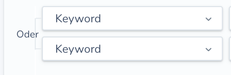











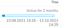
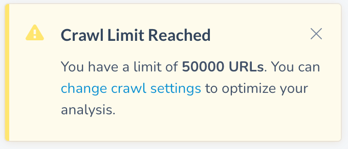
- alerts users to something happening in the system
- warning
- error
- success
- closeable
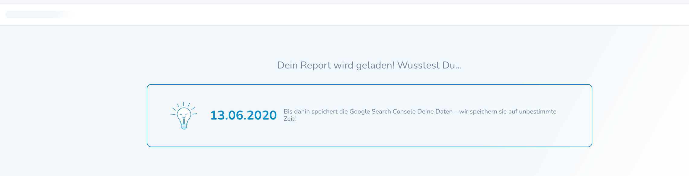
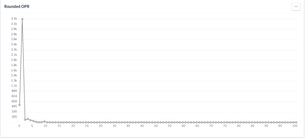
- shows while content is loading
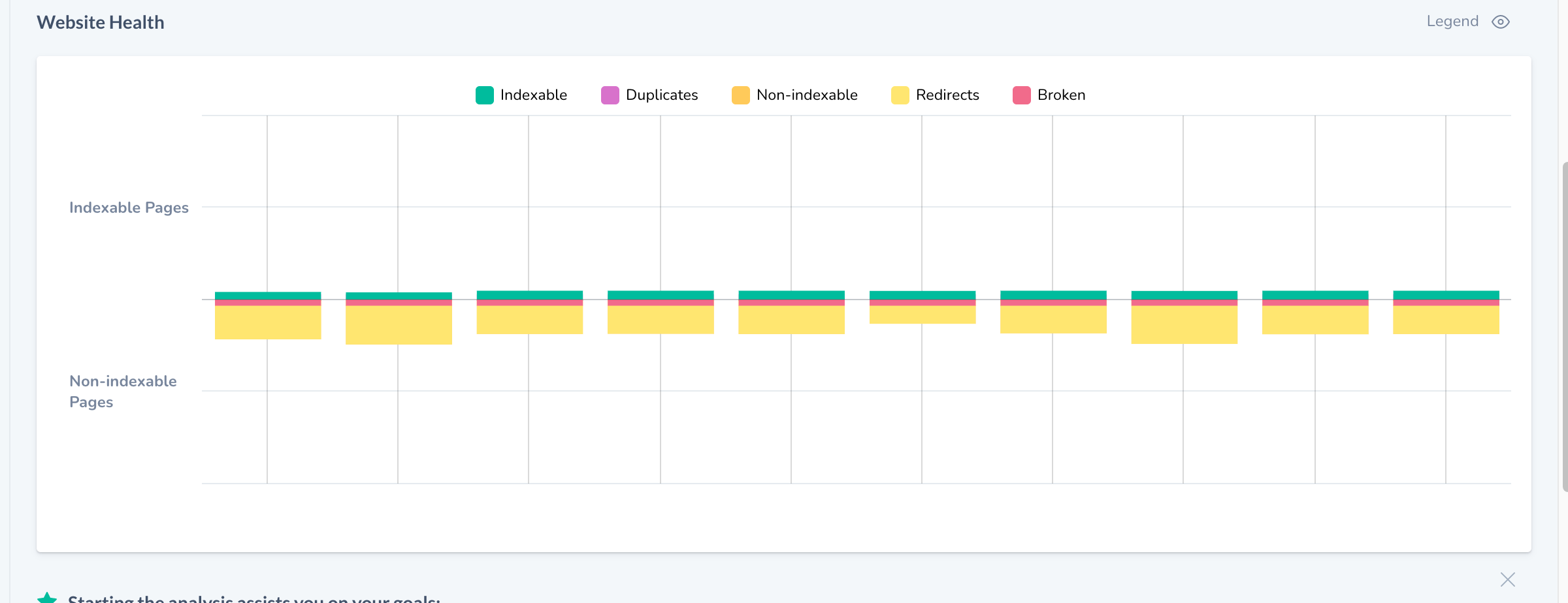
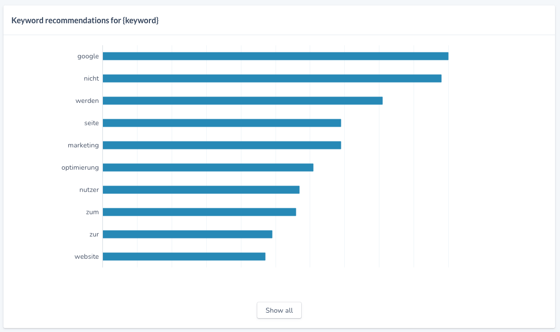
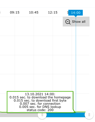
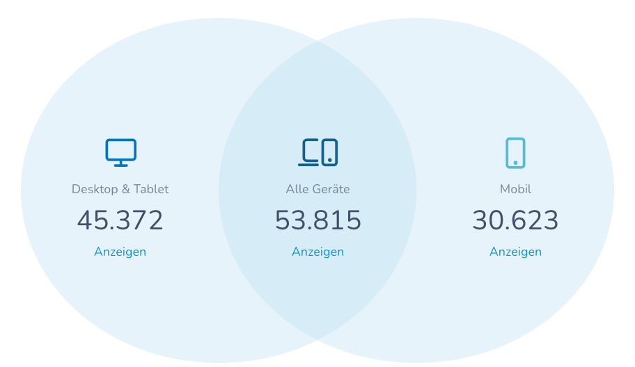
- venn diagram
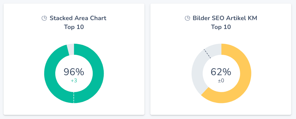
- circle graph (small)
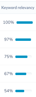
- donut chart (big, interactive)
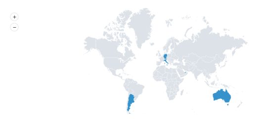
- map
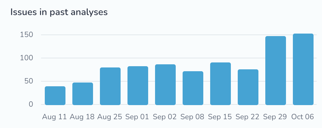
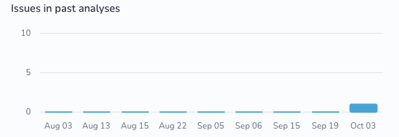
- bar graph
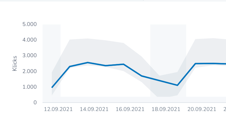
- line graph
- legend
- distribution chart
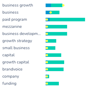
- stacked bar chart with extra dots
- interactive
- Decorative placeholder
- Reflects brand
- Meaning, showing status
- photographic / vector
Status Banners
Loading State
Graphs
Illustrations


















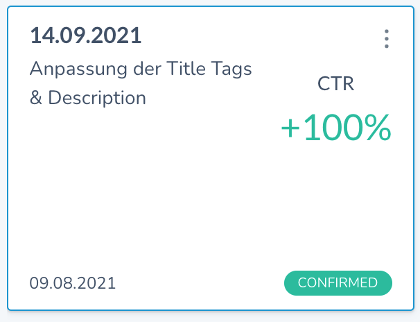
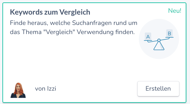
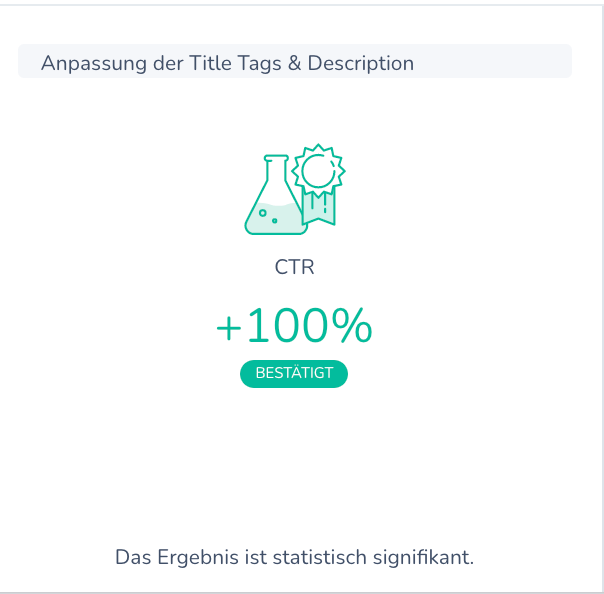
- shows status and actions in the most micro way
- represents external integrations
- can be used in lieu of big buttons to save space (e.g. mobile)
- replacement for (or addition to) text
- “a collection of text and images combined”
- repeatable element with the same layout
- content is consistent with each other
- complex layout, usually more than just two elements
- its content can vary differently from each other
- fixed layout with a defined padding, header
- has headers that may possibly show the number of results w/i the table
- controls the data underneath it
Icons
Cards
Container









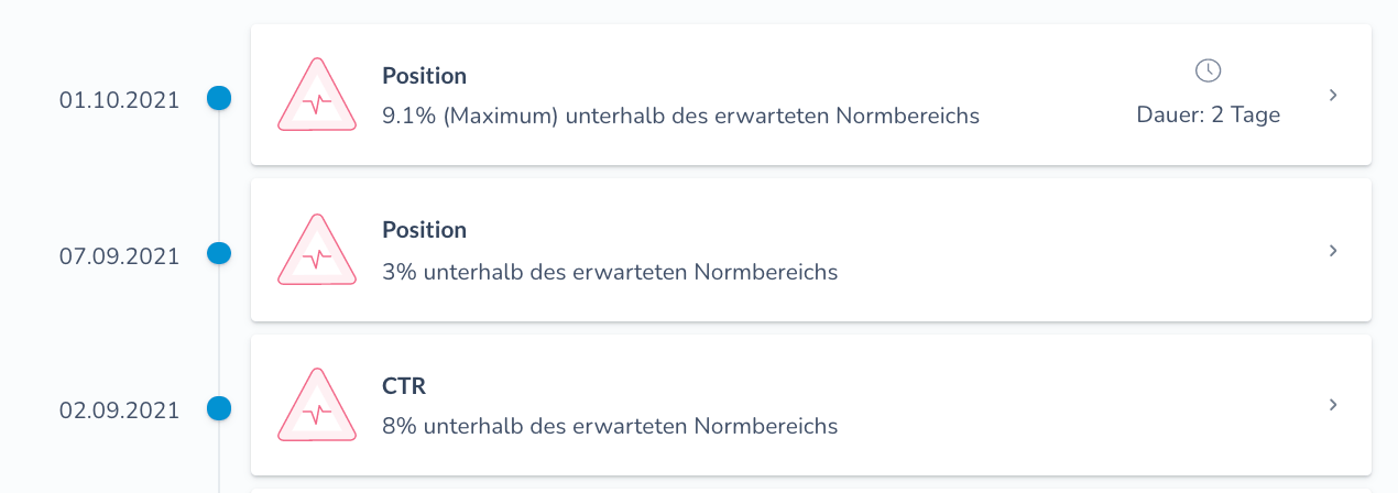
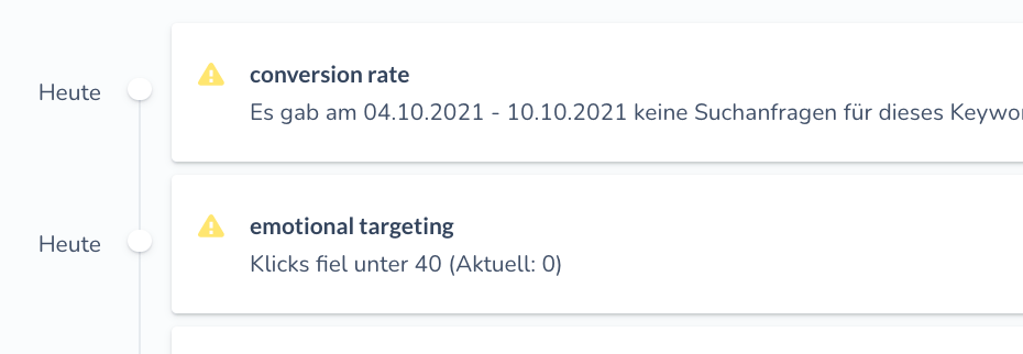

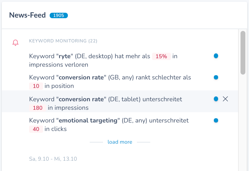
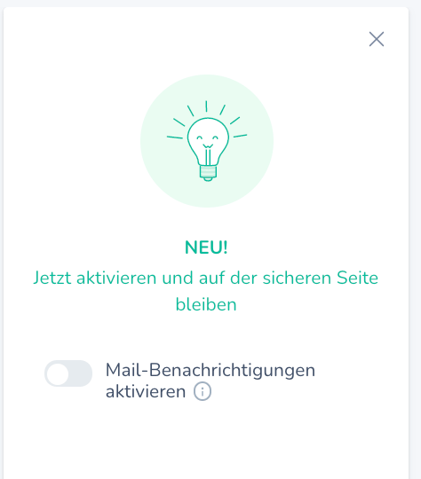
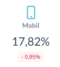
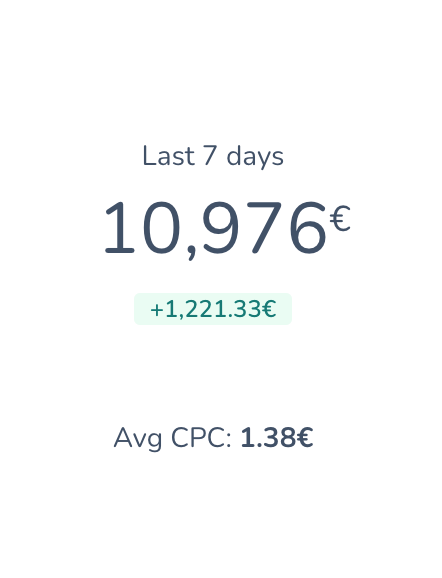

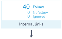


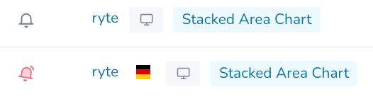







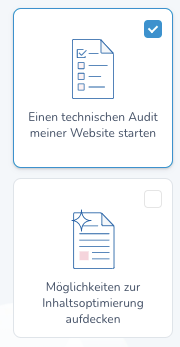



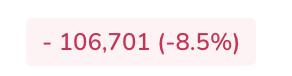

these are not actually clickable



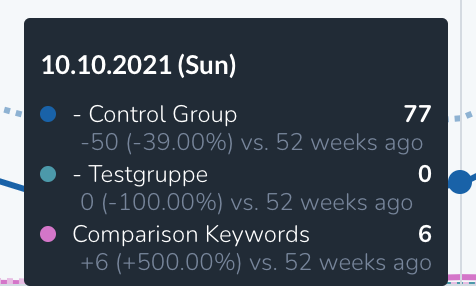
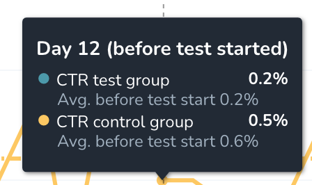
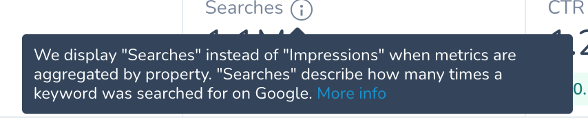
- used to dismiss a modal; by cancelling or confirming the action
- used as filters
- always has a contained bg
- clickable
- a list
- content exists in a single line
- providing extra contextual info on the UI
- visible on hover
- can contain links
- has a nose
- maximum width
- on mobile - has an info icon, to tap and show dialogue
- on desktop, clearly visible that it is interactive
- nose points down as default (tooltip is above the trigger element)
- informational
- severity or category or type
attached to the badge info
- visually contained (e.g. with a background)
- allows users to switch between content that is equal in importance
- can have a style
Tags
Badges
Tabs
Tooltips
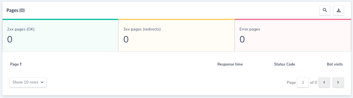

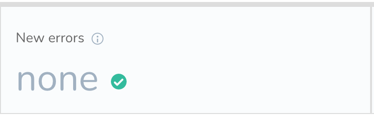
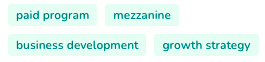
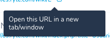



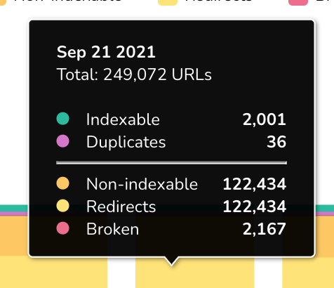

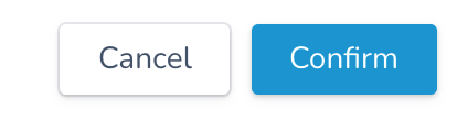
Buttons in a Modal
ESC




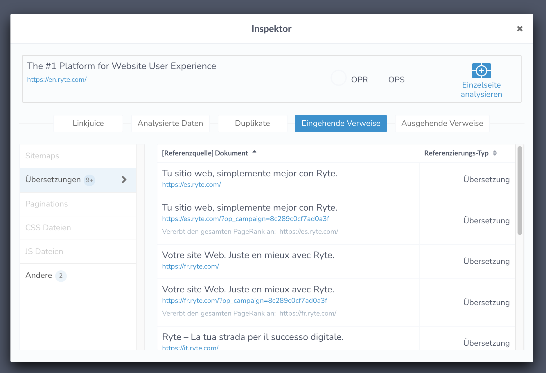
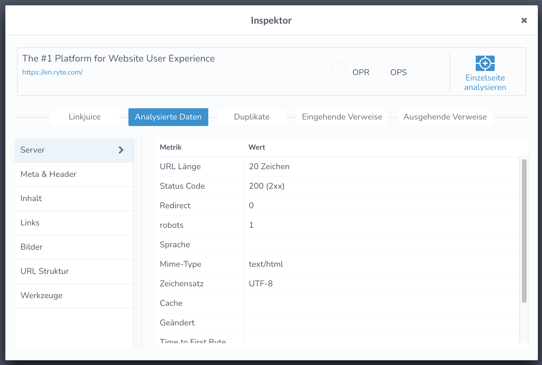
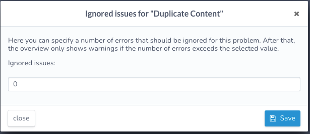
- a container with a close button on top right
- container has a max of 80% of viewport height, content is scrollable inside
- can have a min stack of 2 modals on top of each other
- case for mobile devices TBD
- some call to action on the bottom of the modal
Modal
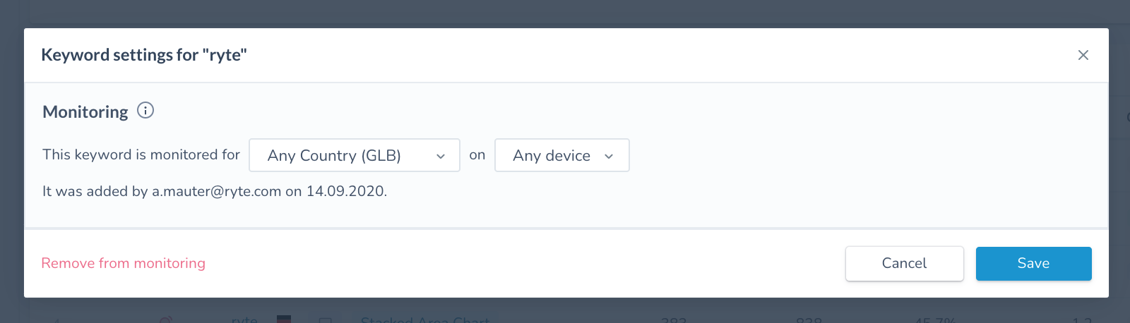


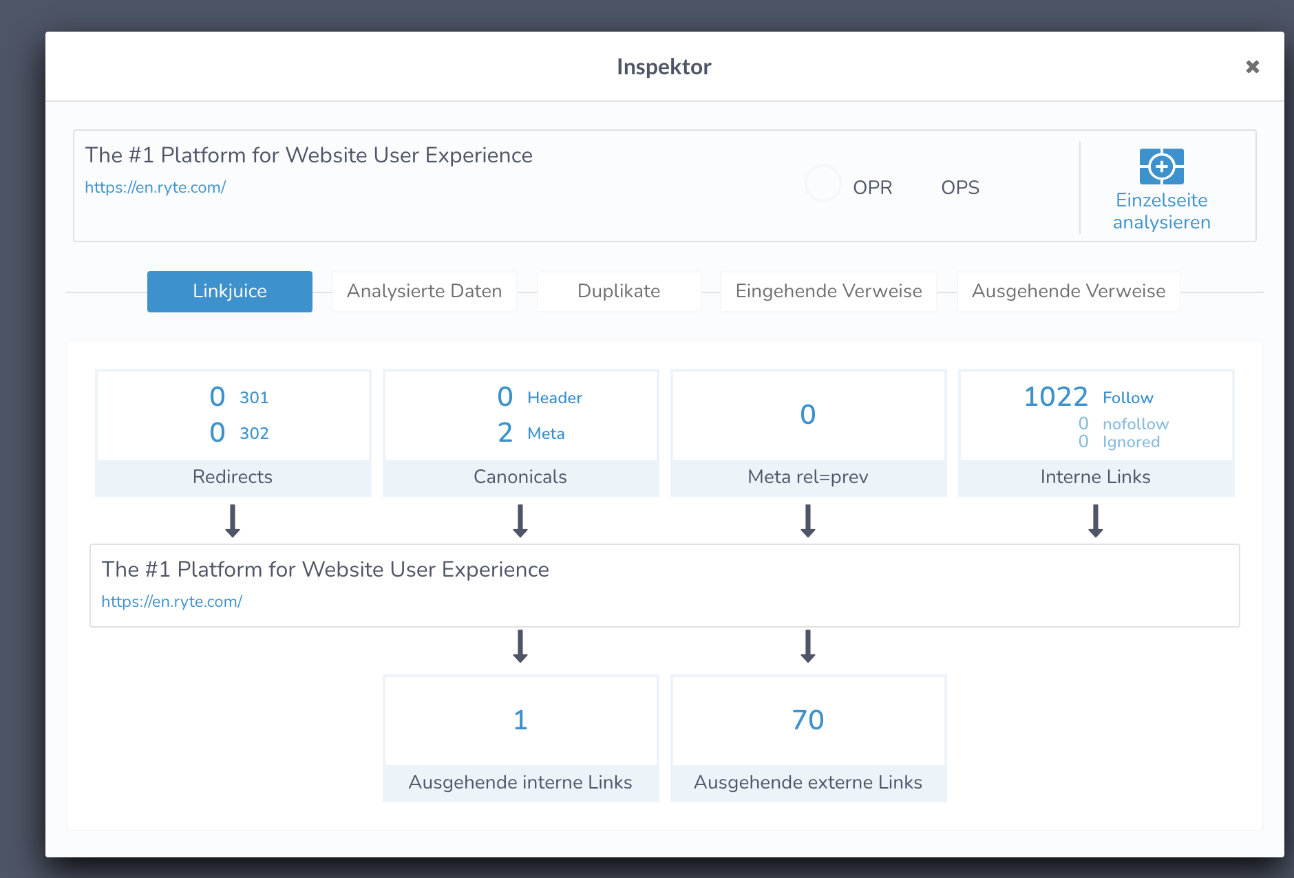
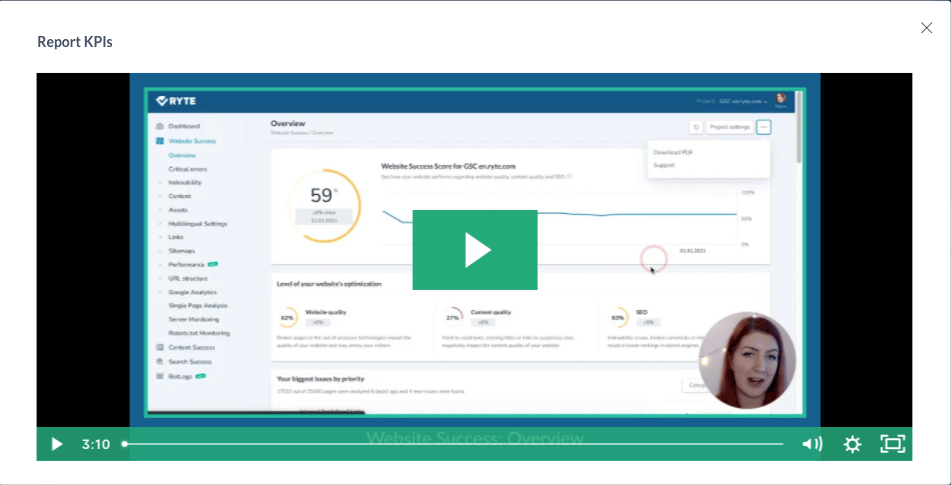
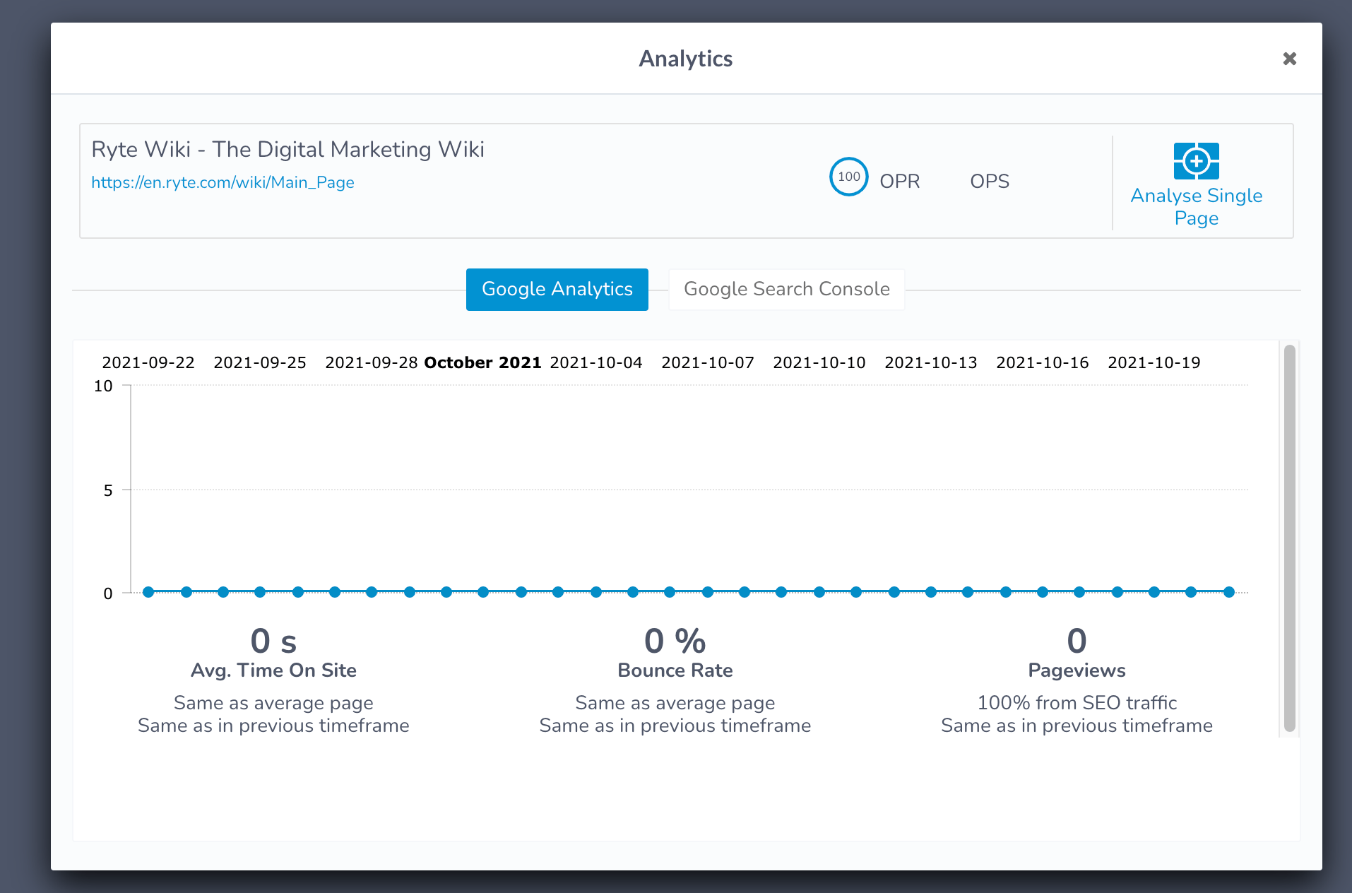
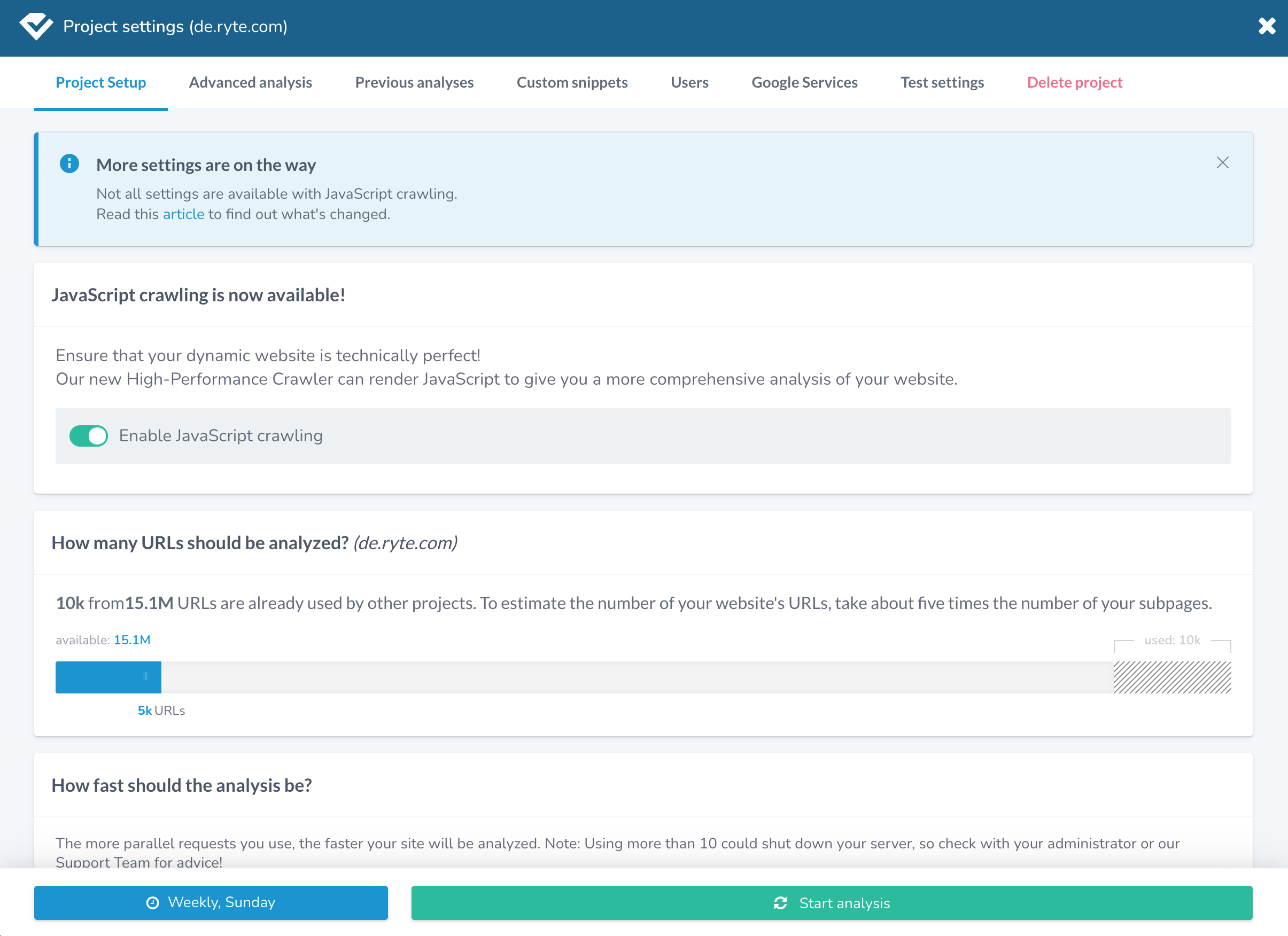
After identification of all UI components to be reflected in the NEW CI, the next step was to decide on which components get built first and in what order; So I led another workshop where we (crossfunctional teams) prioritized components to be built:
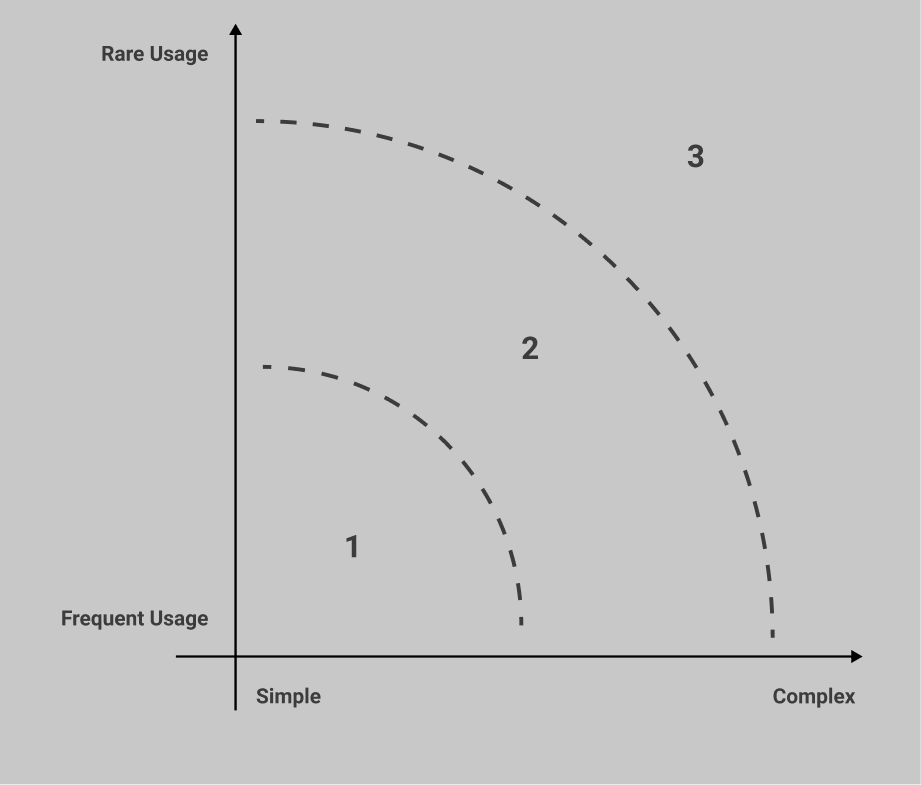
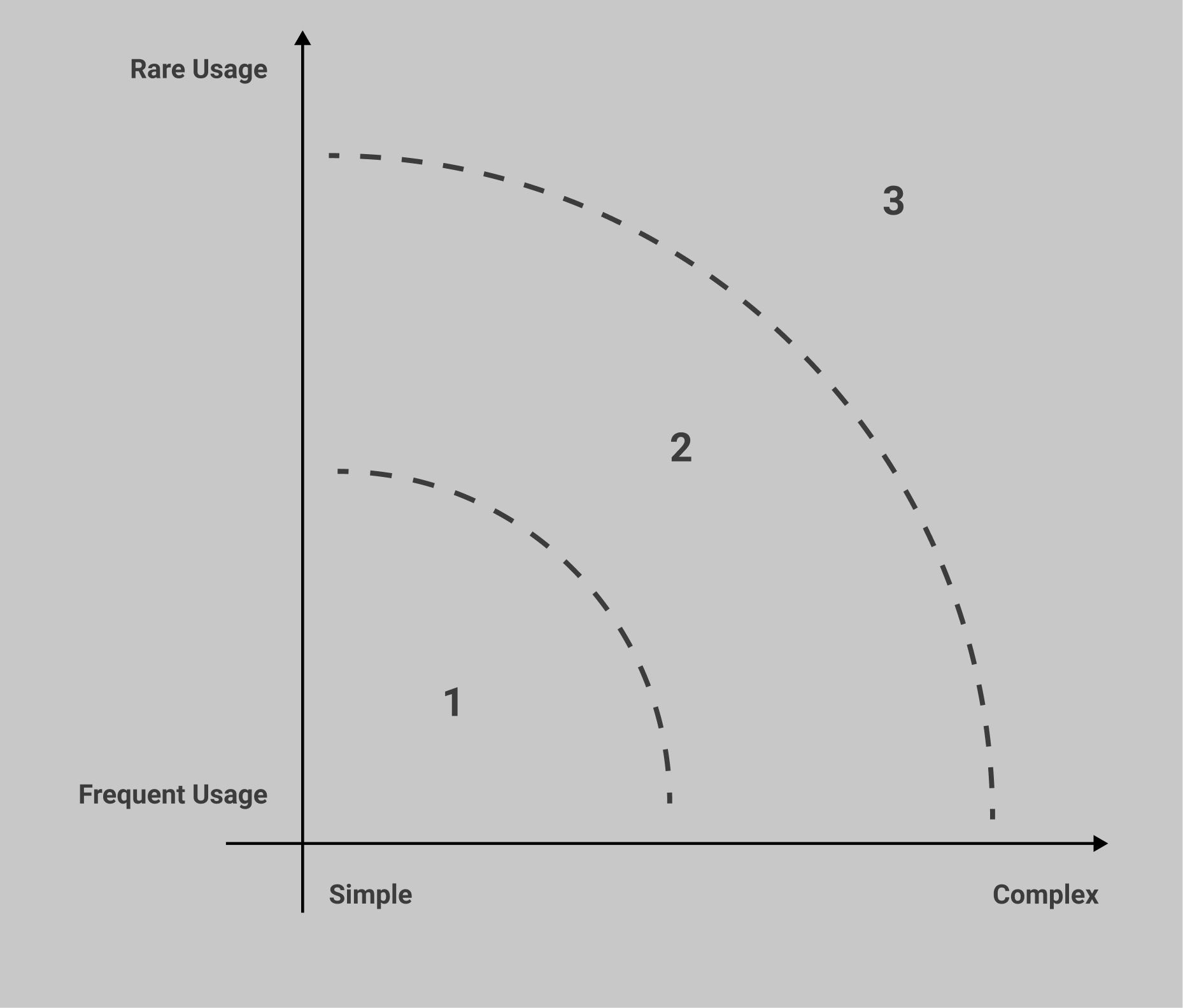
I divided us into 2 breakout groups where we each had the task to prioritise these components in terms of Usage(Rare and Frequent Usage) and complexity(effort for developing and integration of components):
Step 2: component prioritization workshop

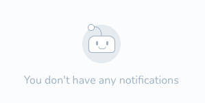
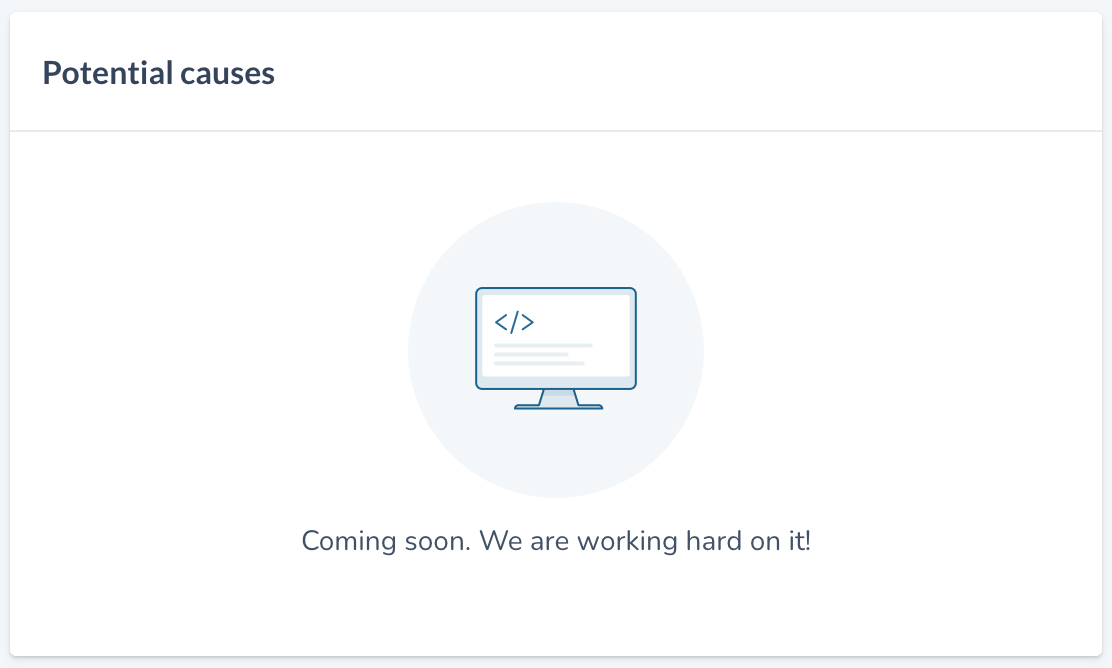
- shows when there’s nothing to show, no data
- minimizable
- shows knowledge of the content, not the status of the system
- Leads to another page
- <a> tag element
- blue or b/w underlined
- copy url features
- on hover the link preview shows up
- allows you to right click and open in a new tab
Links
Empty State
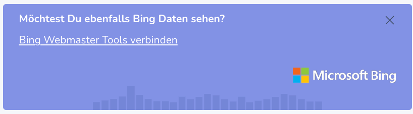
Knowledge Panel
Promo banner










SEO Issues
No issues found

SEO Issues
Website analysis is currently running - any detected SEO issues will be displayed here as soon as the analysis is finished


SEO Issues
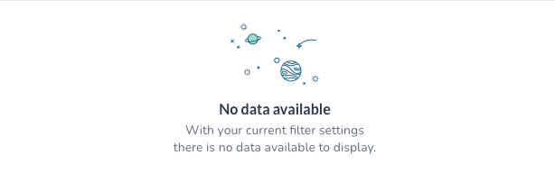
No data available
This may be caused by:
- Your last analysis is too old
- You have exceeded your URL budget
- This URL is excluded from analysis in your project settings


Check and start new analysis

Anomaly detection

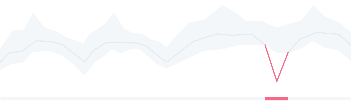
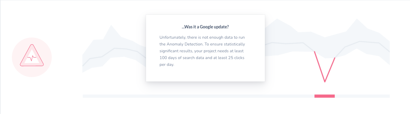
…Was it a Google update?
Upgrade your account
Upgrade to a Business Account to automatically detect unusual behaviour in your data.


Anomaly detection
We can automatically detect unusual behaviour in your data if your project is ranking for at least 25 keywords and there’s 2 months of data available. Please hang along and see!
…Was it a Google update?
Anomaly detection

As you have just recently connected this project to Google Search Console, we are currently scanning for anomalies in your project! This might take a couple of hours - please check again soon!


score in calculation
not enough data
not eligible yet
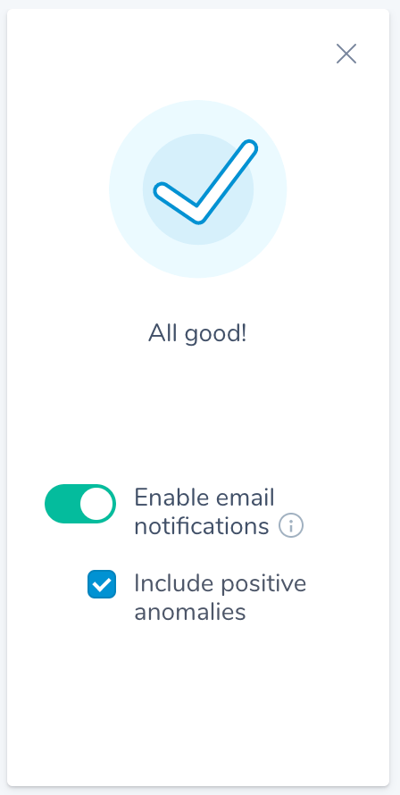
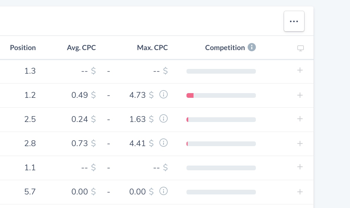

Only project owners or managers can add keywords to monitoring
Distribution in search result pages


Page 2


Page 1
No searches

Page 3+
Go to Keyword Monitoring
To track your keywords please add them to monitoring first

XXXX
XXXX
XXXX
XXXX
Clicks
CTR
Impressions
Position


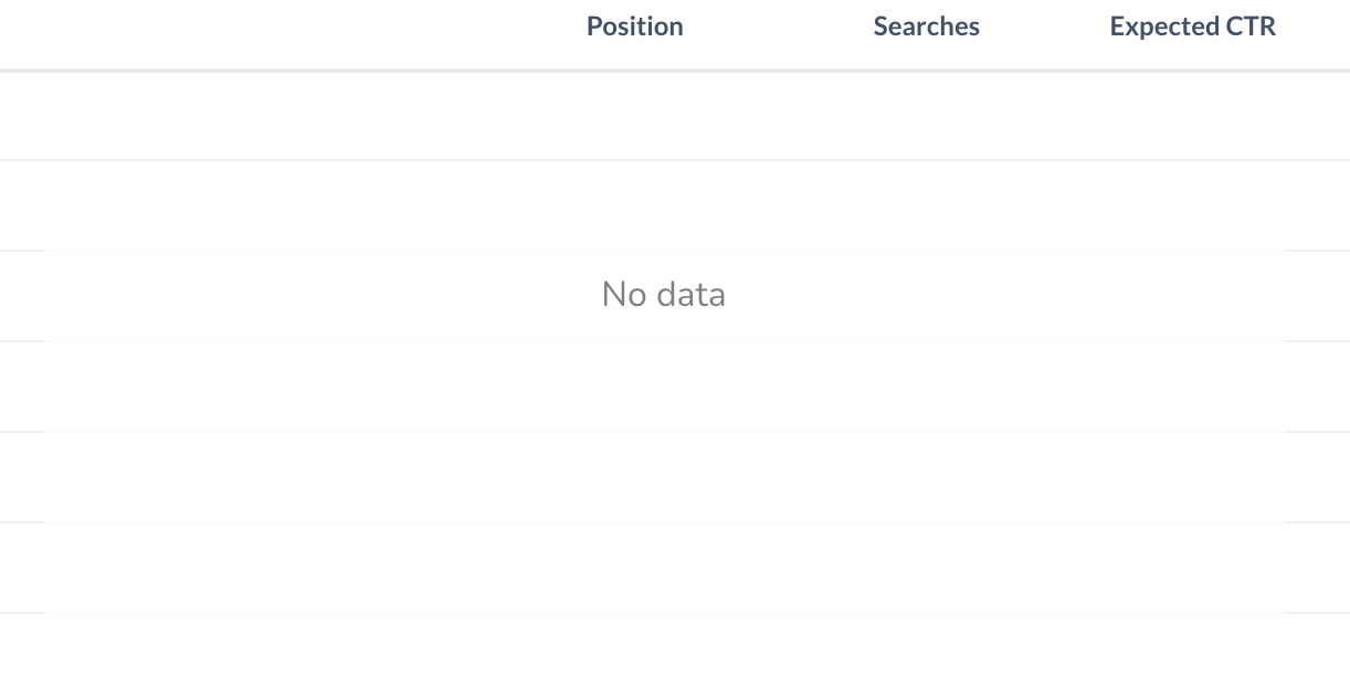
No data available yet
It seems like the Google Search Console property you have connected was just recently created. It might take a few days for Google to collect first data.


No anomalies have been found in your KPIs.

Position


CTR

Impressions


Clicks

no anomalies detected


no anomalies detected
no anomalies detected

no anomalies detected



Buttons
Buttons
Links
Links
Group A
Group B
Text Fields & Input
Text Fields & Input
Typography
Typography
Status Banners
Status Banners
Graphs
Modals
Containers
Graphs
Illustrations
Illustrations
Containers
Icons
Icons
Cards
Cards
Tables
Tables
Tags
Tags
Tabs
Tooltips
Tooltips
Select
Popover Menu
Empty State
Knowledge Panel
Badges
Slider
Select
Datetime picker
Popover Menu
Loading State
Empty State
Knowledge Panel
Badges
Tabs
Tables / lists?
Slider
Modal
☝️Effort for developing and integration the component
With the defined prioritisation matrix in mind, and to make the job easier, we (3 UX Designers)
worked simultaneously, trying out and testing new designs for different product components
to fit with already defined new brand colors and styles
I worked on navigation, buttons, tags, badges, Avatars, links, Tooltips, and Tabs components,
My colleagues designed other components and it was a successful collaborative effort:
Step 3: getting to work

Final Prioritization(collective decision):


Buttons
Links
Final Prioritization
Text Fields & Input
Typography
Status Banners
Graphs
Illustrations
Containers
Icons
Cards
Tables
Tags
Tooltips
Select
Datetime picker
Popover Menu
Loading State
Empty State
Knowledge Panel
Badges
Tabs
Tables / lists?
Slider
Modal


a
Project Settings

Dashboard

SEO


Quality Assurance


Performance


Compliance

Accessibility


Issue Overview

!
Data Explorer


www.myproject.com

Start your free trial!
TBD: rounded highlight

a
Project Settings
Dashboard

SEO
Quality Assurance
Performance
Compliance
Accessibility
Issue Overview
!
Data Explorer
www.myproject.com
Start your free trial!
TBD: full-width highlight
hover state? positioning?


Project Settings


!
www.myproject.com
Start your free trial!

Quality Assurance

Project Settings
!
www.myproject.com
Start your free trial!
TBD: rounded highlight
TBD: full-width highlight


a
Project Settings

Dashboard

SEO


Quality Assurance


Performance


Compliance

Accessibility


Issue Overview

!
Data Explorer


www.myproject.com


Start your free trial!
TBD: rounded highlight


a
Project Settings
Dashboard

SEO


Quality Assurance


Performance


Compliance

Accessibility


Issue Overview

!
Data Explorer


www.myproject.com
Start your free trial!
hover state? positioning?


Project Settings


!
www.myproject.com

Start your free trial!
TBD: rounded highlight


Project Settings


!
www.myproject.com
Start your free trial!
TBD:

Quality Assurance

Download
Download
Day

Week
Month
Day

Week
Month
Day
Day
Confirm
Confirm

Download

Project settings
Add a project
Show keywords

32px / 12px, same height as current button & input components
32px / 12px, same height as current button & input components
height: 36px, font 13px
height: 40px, font 14px
height: 40px, font 14px
min-width?
no min-width?
Buttons
button in Banner: same as secondary


/wiki/ (64468)
/wiki/ 64468
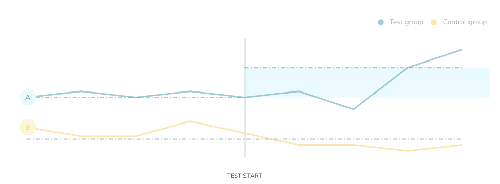
control group

+ 303 (2.2%)
+ 303 2.2%
+ 303

2.2%
2 new errors
2 new errors
2 new errors
2
2
2
2
2
Testgruppe
Keyword is conversion rate
Keyword is conversion rate
are filters = “selected state”?
improve readability
Tags
Badges
Links
Tabs
2 types: blue / bw underlined
Web Vitals: “poor” pages
Web Vitals: “poor” pages
Change currency
Change currency
Change currency
Change currency
19.524
Clicks
+112
19
High underperformance
8
Medium underperformance
8
Medium underperformance
32
Low underperformance
32
Low underperformance
19.524
+ 303

2.2%
Clicks
19.524
Impressions
+ 303

2.2%
8.1
CTR
+ 3.3


Inactive
Normal

Selected


www.myproject.com


www.myproject.com
www.myproject.com
www.myproject.com
www.myproject.com
www.myproject.com


Welcome!


AVATAR?
if there is a name prop e.g business_weekly, use to generate initials instead?


BW

BW
if square image is needed
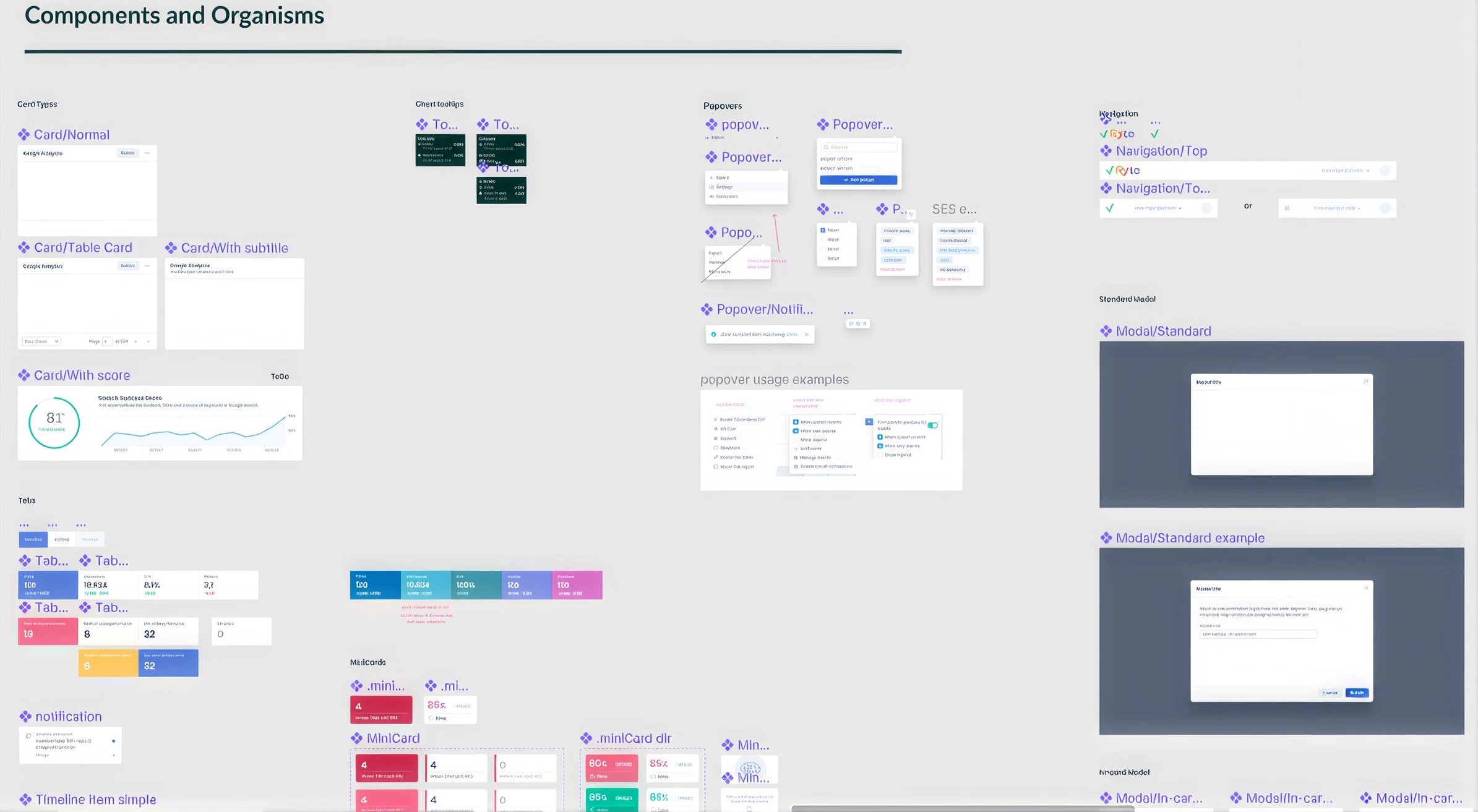
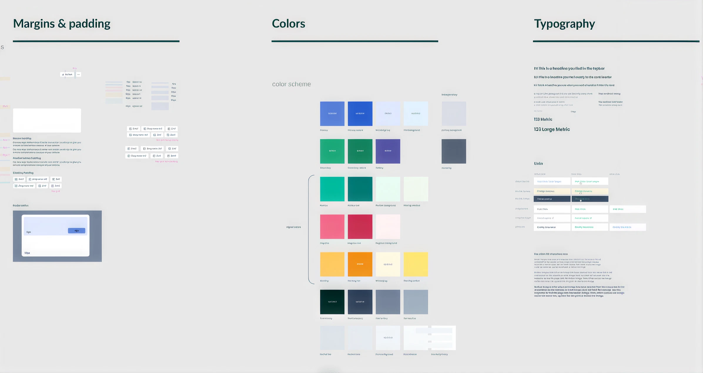
All NEW CI components combined:

What was missing?
- Documenting descriptions of each component and when to use:
Why was this important?
Junior designers, interns and non design expert team members for whom specified guidelines of use and implementation was necessary
What was missing?
- Page based (node) seperation of components within the design system (also to connect storybook used by the front-end developers to design system in figma)
Why was this important?
This allows the Front end Engineers to see in real time any changes made in the design system or libraries in figma alongside code-based components.
The alphabetical arrangement of components in pages made for easier search and identification
Further Improvements

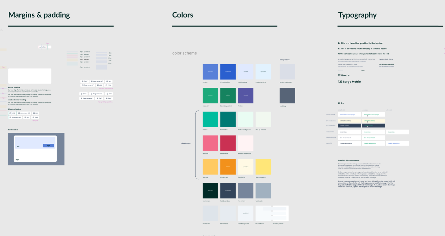
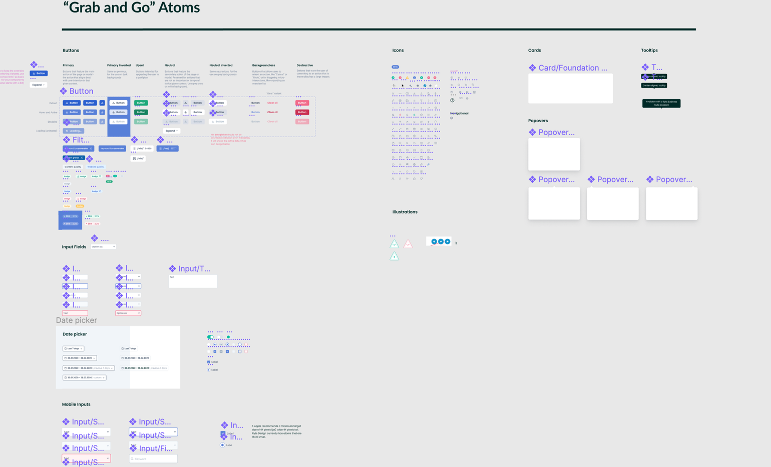
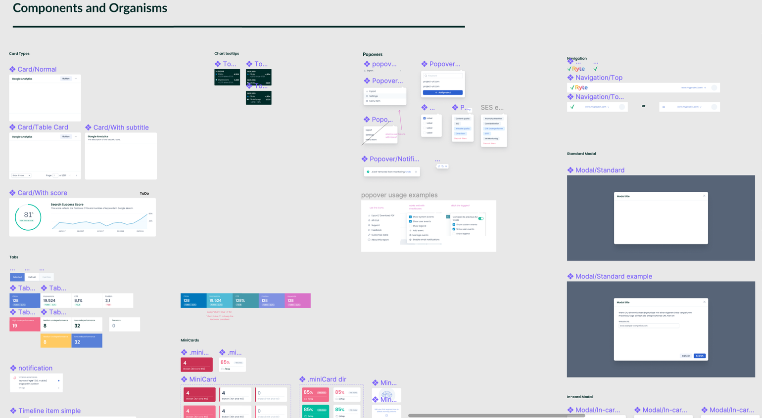

See full specifications in this video:
Final Design System with Component descriptions and Page based seperation



My Certifications
Ryte Design System Revamp
GmbH
Data Explorer
Switch to new navigation
Search for a report...
Dashboard
SEO
Issue Overview
!
Quality Assurance
Web Performance
Compliance
Accessibility
Sustainability
Report Gallery
Switch to new navigation
OLD NAVIGATION/OLD CI
NEW NAVIGATION/NEW CI
MY ROLE
- Component Library Revamp
- Standardization of UI Patterns
- Visual & Interaction Consistency
- Developer Handoff + QA
- Documentation for Adoption
PROJECT DURATION
- 5 Months
- March - July, 2022
PROJECT TYPE
- Company Project (Ryte GmbH, Munich)
Following the decision to revamp our User Interface and Brand Corporate Identity to take on a more modern, bold, consistent and mature UI reflective of the Ryte Vision and WUX (Website User Experience) pillars, there was a corresponding need to revamp our Design System components.
Ryte GmbH Design System Revamp

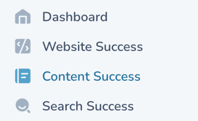

Data Explorer


Switch to new navigation


Search for a report...
Dashboard

SEO


Issue Overview

!

Quality Assurance

Web Performance

Compliance
Accessibility


Sustainability


Report Gallery

Switch to new navigation


OLD NAVIGATION/OLD CI
NEW NAVIGATION/NEW CI
Preview of Revamped Design System with new CI

In a crossfunctional kickoff workshop (Engineering team, Design team of 3, and 2 Product Owners) we identified all UI components that existed in the old CI and Ryte tool:
Step 1: component workshop

- selecting one or more values, in the context of a form
- multiple options to select are possible
- selecting a time/date
- calendar shows up
- mm/dd/yyyy in one field or a date range
- select a single action
- opens a modal
- navigates somewhere else after selection
Select
Datetime picker
Popover Menu
note the “tick” element
note the “arrow” element
Buttons
- Does an action within the page
- clickable
- Primary, Secondary, Destructive
- can have an icon next to the label
- can have only icon, without text
- where users can input any query
- text area
- checkbox
- radio button
- toggle button
- text inputs with icons
- password field with visibility function
- strings in the UI
- h1
- h2
- h3
- p
Text Fields and Inputs
Typography
and Fonts
- alerts users to something happening in the system
- warning
- error
- success
- closeable
- shows while content is loading
- venn diagram
- circle graph (small)
- donut chart (big, interactive)
- map
- bar graph
- line graph
- legend
- distribution chart
- stacked bar chart with extra dots
- interactive
- Decorative placeholder
- Reflects brand
- Meaning, showing status
- photographic / vector
Status Banners
Loading State
Graphs
Illustrations
- shows status and actions in the most micro way
- represents external integrations
- can be used in lieu of big buttons to save space (e.g. mobile)
- replacement for (or addition to) text
- “a collection of text and images combined”
- repeatable element with the same layout
- content is consistent with each other
- complex layout, usually more than just two elements
- its content can vary differently from each other
- fixed layout with a defined padding, header
- has headers that may possibly show the number of results w/i the table
- controls the data underneath it
Icons
Cards
Container


these are not actually clickable
- used to dismiss a modal; by cancelling or confirming the action
- used as filters
- always has a contained bg
- clickable
- a list
- content exists in a single line
- providing extra contextual info on the UI
- visible on hover
- can contain links
- has a nose
- maximum width
- on mobile - has an info icon, to tap and show dialogue
- on desktop, clearly visible that it is interactive
- nose points down as default (tooltip is above the trigger element)
- informational
- severity or category or type
attached to the badge info
- visually contained (e.g. with a background)
- allows users to switch between content that is equal in importance
- can have a style
Buttons in a Modal
ESC
- a container with a close button on top right
- container has a max of 80% of viewport height, content is scrollable inside
- can have a min stack of 2 modals on top of each other
- case for mobile devices TBD
- some call to action on the bottom of the modal
After identification of all UI components to be reflected in the NEW CI, the next step was to decide on which components get built first and in what order; So I led another workshop where we (crossfunctional teams) prioritized components to be built:
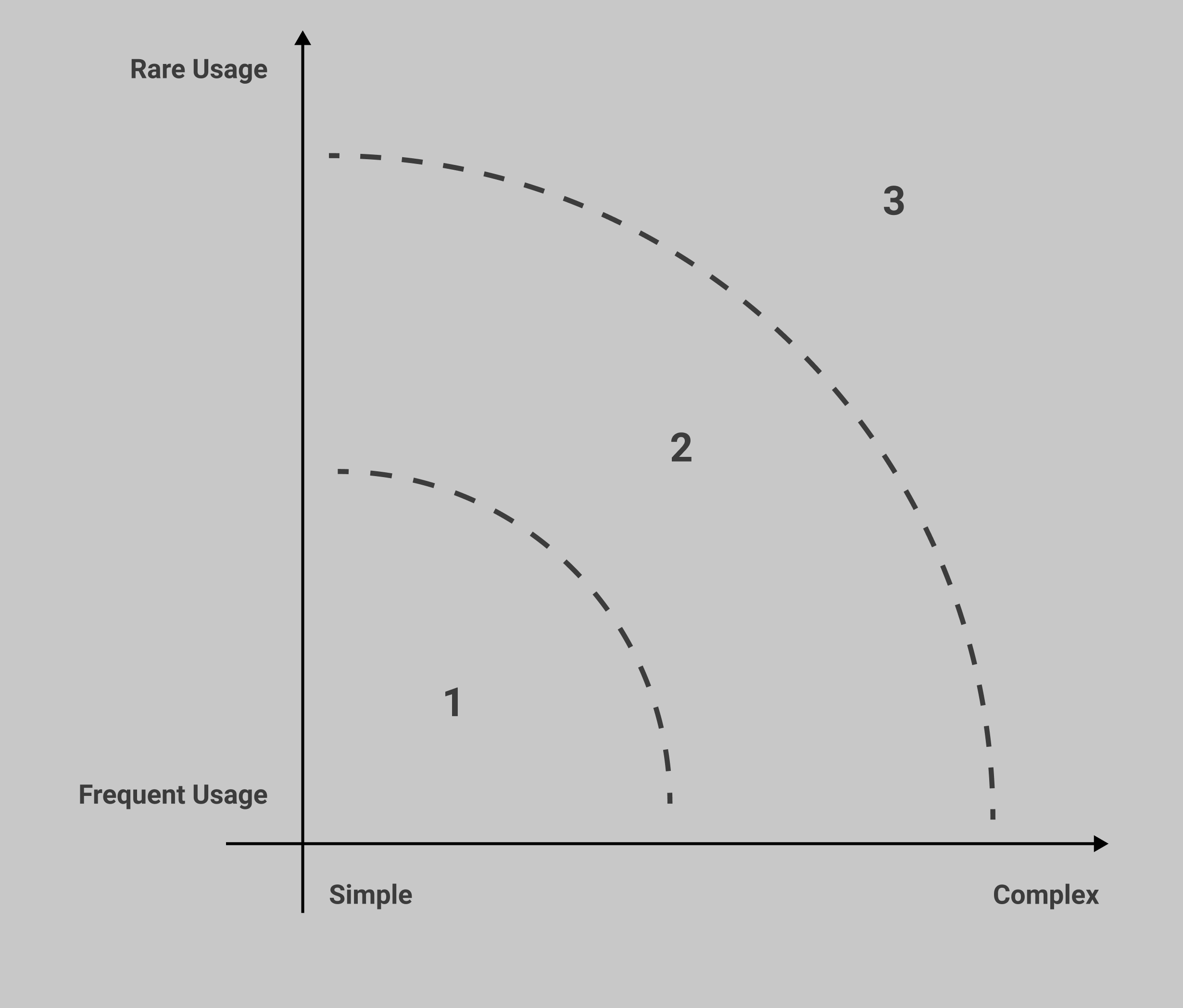
I divided us into 2 breakout groups where we each had the task to prioritise these components in terms of Usage(Rare and Frequent Usage) and complexity(effort for developing and integration of components):
Step 2: component prioritization workshop

- shows when there’s nothing to show, no data
- minimizable
- shows knowledge of the content, not the status of the system
- Leads to another page
- <a> tag element
- blue or b/w underlined
- copy url features
- on hover the link preview shows up
- allows you to right click and open in a new tab
Links
Empty State
Knowledge Panel
Promo banner


SEO Issues
No issues found

SEO Issues
Website analysis is currently running - any detected SEO issues will be displayed here as soon as the analysis is finished


SEO Issues
No data available
This may be caused by:
- Your last analysis is too old
- You have exceeded your URL budget
- This URL is excluded from analysis in your project settings


Check and start new analysis

Anomaly detection

…Was it a Google update?
Upgrade your account
Upgrade to a Business Account to automatically detect unusual behaviour in your data.


Anomaly detection
We can automatically detect unusual behaviour in your data if your project is ranking for at least 25 keywords and there’s 2 months of data available. Please hang along and see!
…Was it a Google update?
Anomaly detection

As you have just recently connected this project to Google Search Console, we are currently scanning for anomalies in your project! This might take a couple of hours - please check again soon!


score in calculation
not enough data
not eligible yet

Only project owners or managers can add keywords to monitoring
Distribution in search result pages


Page 2


Page 1
No searches

Page 3+
Go to Keyword Monitoring
To track your keywords please add them to monitoring first

XXXX
XXXX
XXXX
XXXX
Clicks
CTR
Impressions
Position


No data available yet
It seems like the Google Search Console property you have connected was just recently created. It might take a few days for Google to collect first data.


No anomalies have been found in your KPIs.

Position


CTR

Impressions


Clicks

no anomalies detected


no anomalies detected
no anomalies detected

no anomalies detected


Buttons
Buttons
Links
Links
Group A
Group B
Text Fields & Input
Text Fields & Input
Typography
Typography
Status Banners
Status Banners
Graphs
Modals
Containers
Graphs
Illustrations
Illustrations
Containers
Icons
Icons
Cards
Cards
Tables
Tables
Tags
Tags
Tabs
Tooltips
Tooltips
Select
Popover Menu
Empty State
Knowledge Panel
Badges
Slider
Select
Datetime picker
Popover Menu
Loading State
Empty State
Knowledge Panel
Badges
Tabs
Tables / lists?
Slider
Modal
☝️Effort for developing and integration the component
With the defined prioritisation matrix in mind, and to make the job easier, we (3 UX Designers)
worked simultaneously, trying out and testing new designs for different product components
to fit with already defined new brand colors and styles
I worked on navigation, buttons, tags, badges, Avatars, links, Tooltips, and Tabs components,
My colleagues designed other components and it was a successful collaborative effort:
Step 3: getting to work

Final Prioritization(collective decision):


Buttons
Links
Final Prioritization
Text Fields & Input
Typography
Status Banners
Graphs
Illustrations
Containers
Icons
Cards
Tables
Tags
Tooltips
Select
Datetime picker
Popover Menu
Loading State
Empty State
Knowledge Panel
Badges
Tabs
Tables / lists?
Slider
Modal


a
Project Settings

Dashboard

SEO


Quality Assurance


Performance


Compliance

Accessibility


Issue Overview

!
Data Explorer


www.myproject.com

Start your free trial!
TBD: rounded highlight

a
Project Settings
Dashboard

SEO
Quality Assurance
Performance
Compliance
Accessibility
Issue Overview
!
Data Explorer
www.myproject.com
Start your free trial!
TBD: full-width highlight
hover state? positioning?


Project Settings


!
www.myproject.com
Start your free trial!

Quality Assurance


Project Settings
!
www.myproject.com
Start your free trial!
TBD: rounded highlight
TBD: full-width highlight


a
Project Settings

Dashboard

SEO


Quality Assurance


Performance


Compliance

Accessibility


Issue Overview

!
Data Explorer


www.myproject.com


Start your free trial!
TBD: rounded highlight


a
Project Settings
Dashboard

SEO


Quality Assurance


Performance


Compliance

Accessibility


Issue Overview

!
Data Explorer


www.myproject.com
Start your free trial!
hover state? positioning?


Project Settings


!
www.myproject.com

Start your free trial!
TBD: rounded highlight


Project Settings


!
www.myproject.com
Start your free trial!
TBD:

Quality Assurance

Download
Download
Day

Week
Month
Day

Week
Month
Day
Day
Confirm
Confirm

Download

Project settings
Add a project
Show keywords

32px / 12px, same height as current button & input components
32px / 12px, same height as current button & input components
height: 36px, font 13px
height: 40px, font 14px
height: 40px, font 14px
min-width?
no min-width?
Buttons
button in Banner: same as secondary


/wiki/ (64468)
/wiki/ 64468
control group

+ 303 (2.2%)
+ 303 2.2%
+ 303

2.2%
2 new errors
2 new errors
2 new errors
2
2
2
2
2
Testgruppe
Keyword is conversion rate
Keyword is conversion rate
are filters = “selected state”?
improve readability
Tags
Badges
Links
Tabs
2 types: blue / bw underlined
Web Vitals: “poor” pages
Web Vitals: “poor” pages
Change currency
Change currency
Change currency
Change currency
19.524
Clicks
+112
19
High underperformance
8
Medium underperformance
8
Medium underperformance
32
Low underperformance
32
Low underperformance
19.524
+ 303

2.2%
Clicks
19.524
Impressions
+ 303

2.2%
8.1
CTR
+ 3.3


Inactive
Normal

Selected


www.myproject.com


www.myproject.com
www.myproject.com
www.myproject.com
www.myproject.com
www.myproject.com



Welcome!


AVATAR?
if there is a name prop e.g business_weekly, use to generate initials instead?


BW

BW
if square image is needed
All NEW CI components combined:

What was missing?
- Documenting descriptions of each component and when to use:
Why was this important?
Junior designers, interns and non design expert team members for whom specified guidelines of use and implementation was necessary
What was missing?
- Page based (node) seperation of components within the design system (also to connect storybook used by the front-end developers to design system in figma)
Why was this important?
This allows the Front end Engineers to see in real time any changes made in the design system or libraries in figma alongside code-based components.
The alphabetical arrangement of components in pages made for easier search and identification
Further Improvements

See full specifications in this video:
Final Design System with Component descriptions and Page based seperation


Ryte Design System Revamp
GmbH
Data Explorer
Switch to new navigation
Search for a report...
Dashboard
SEO
Issue Overview
!
Quality Assurance
Web Performance
Compliance
Accessibility
Sustainability
Report Gallery
Switch to new navigation
OLD NAVIGATION/OLD CI
NEW NAVIGATION/NEW CI
MY ROLE
- Component Library Revamp
- Standardization of UI Patterns
- Visual & Interaction Consistency
- Developer Handoff + QA
- Documentation for Adoption
PROJECT DURATION
- 5 Months
- March - July, 2022
PROJECT TYPE
- Company Project (Ryte GmbH, Munich)
Following the decision to revamp our User Interface and Brand Corporate Identity to take on a more modern, bold, consistent and mature UI reflective of the Ryte Vision and WUX (Website User Experience) pillars, there was a corresponding need to revamp our Design System components.
Ryte GmbH Design System Revamp


Data Explorer


Switch to new navigation


Search for a report...
Dashboard

SEO


Issue Overview

!

Quality Assurance

Web Performance

Compliance
Accessibility


Sustainability


Report Gallery

Switch to new navigation


OLD NAVIGATION/OLD CI
NEW NAVIGATION/NEW CI
Preview of Revamped Design System with new CI
In a crossfunctional kickoff workshop (Engineering team, Design team of 3, and 2 Product Owners) we identified all UI components that existed in the old CI and Ryte tool:
Step 1: component workshop

- selecting one or more values, in the context of a form
- multiple options to select are possible
- selecting a time/date
- calendar shows up
- mm/dd/yyyy in one field or a date range
- select a single action
- opens a modal
- navigates somewhere else after selection
Select
Datetime picker
Popover Menu
note the “tick” element
note the “arrow” element
Buttons
- Does an action within the page
- clickable
- Primary, Secondary, Destructive
- can have an icon next to the label
- can have only icon, without text
- where users can input any query
- text area
- checkbox
- radio button
- toggle button
- text inputs with icons
- password field with visibility function
- strings in the UI
- h1
- h2
- h3
- p
Text Fields and Inputs
Typography
and Fonts
- alerts users to something happening in the system
- warning
- error
- success
- closeable
- shows while content is loading
- venn diagram
- circle graph (small)
- donut chart (big, interactive)
- map
- bar graph
- line graph
- legend
- distribution chart
- stacked bar chart with extra dots
- interactive
- Decorative placeholder
- Reflects brand
- Meaning, showing status
- photographic / vector
Status Banners
Loading State
Graphs
Illustrations
- shows status and actions in the most micro way
- represents external integrations
- can be used in lieu of big buttons to save space (e.g. mobile)
- replacement for (or addition to) text
- “a collection of text and images combined”
- repeatable element with the same layout
- content is consistent with each other
- complex layout, usually more than just two elements
- its content can vary differently from each other
- fixed layout with a defined padding, header
- has headers that may possibly show the number of results w/i the table
- controls the data underneath it
Icons
Cards
Container
these are not actually clickable
- used to dismiss a modal; by cancelling or confirming the action
- used as filters
- always has a contained bg
- clickable
- a list
- content exists in a single line
- providing extra contextual info on the UI
- visible on hover
- can contain links
- has a nose
- maximum width
- on mobile - has an info icon, to tap and show dialogue
- on desktop, clearly visible that it is interactive
- nose points down as default (tooltip is above the trigger element)
- informational
- severity or category or type
attached to the badge info
- visually contained (e.g. with a background)
- allows users to switch between content that is equal in importance
- can have a style
Buttons in a Modal
ESC
- a container with a close button on top right
- container has a max of 80% of viewport height, content is scrollable inside
- can have a min stack of 2 modals on top of each other
- case for mobile devices TBD
- some call to action on the bottom of the modal
After identification of all UI components to be reflected in the NEW CI, the next step was to decide on which components get built first and in what order; So I led another workshop where we (crossfunctional teams) prioritized components to be built:
I divided us into 2 breakout groups where we each had the task to prioritise these components in terms of Usage(Rare and Frequent Usage) and complexity(effort for developing and integration of components):
Step 2: component prioritization workshop

- shows when there’s nothing to show, no data
- minimizable
- shows knowledge of the content, not the status of the system
- Leads to another page
- <a> tag element
- blue or b/w underlined
- copy url features
- on hover the link preview shows up
- allows you to right click and open in a new tab
Links
Empty State
Knowledge Panel
Promo banner


SEO Issues
No issues found

SEO Issues
Website analysis is currently running - any detected SEO issues will be displayed here as soon as the analysis is finished


SEO Issues
No data available
This may be caused by:
- Your last analysis is too old
- You have exceeded your URL budget
- This URL is excluded from analysis in your project settings


Check and start new analysis

Anomaly detection

…Was it a Google update?
Upgrade your account
Upgrade to a Business Account to automatically detect unusual behaviour in your data.


Anomaly detection
We can automatically detect unusual behaviour in your data if your project is ranking for at least 25 keywords and there’s 2 months of data available. Please hang along and see!
…Was it a Google update?
Anomaly detection

As you have just recently connected this project to Google Search Console, we are currently scanning for anomalies in your project! This might take a couple of hours - please check again soon!


score in calculation
not enough data
not eligible yet

Only project owners or managers can add keywords to monitoring
Distribution in search result pages


Page 2


Page 1
No searches

Page 3+
Go to Keyword Monitoring
To track your keywords please add them to monitoring first

XXXX
XXXX
XXXX
XXXX
Clicks
CTR
Impressions
Position


No data available yet
It seems like the Google Search Console property you have connected was just recently created. It might take a few days for Google to collect first data.


No anomalies have been found in your KPIs.

Position


CTR

Impressions


Clicks

no anomalies detected


no anomalies detected
no anomalies detected
no anomalies detected


Buttons
Buttons
Links
Links
Group A
Group B
Text Fields & Input
Text Fields & Input
Typography
Typography
Status Banners
Status Banners
Graphs
Modals
Containers
Graphs
Illustrations
Illustrations
Containers
Icons
Icons
Cards
Cards
Tables
Tables
Tags
Tags
Tabs
Tooltips
Tooltips
Select
Popover Menu
Empty State
Knowledge Panel
Badges
Slider
Select
Datetime picker
Popover Menu
Loading State
Empty State
Knowledge Panel
Badges
Tabs
Tables / lists?
Slider
Modal
☝️Effort for developing and integration the component
With the defined prioritisation matrix in mind, and to make the job easier, we (3 UX Designers)
worked simultaneously, trying out and testing new designs for different product components
to fit with already defined new brand colors and styles
I worked on navigation, buttons, tags, badges, Avatars, links, Tooltips, and Tabs components,
My colleagues designed other components and it was a successful collaborative effort:
Step 3: getting to work

Final Prioritization(collective decision):


Buttons
Links
Final Prioritization
Text Fields & Input
Typography
Status Banners
Graphs
Illustrations
Containers
Icons
Cards
Tables
Tags
Tooltips
Select
Datetime picker
Popover Menu
Loading State
Empty State
Knowledge Panel
Badges
Tabs
Tables / lists?
Slider
Modal


a
Project Settings

Dashboard

SEO


Quality Assurance


Performance


Compliance

Accessibility


Issue Overview

!
Data Explorer


www.myproject.com

Start your free trial!
TBD: rounded highlight


a
Project Settings
Dashboard

SEO
Quality Assurance
Performance
Compliance
Accessibility
Issue Overview
!
Data Explorer
www.myproject.com
Start your free trial!
TBD: full-width highlight
hover state? positioning?


Project Settings


!
www.myproject.com
Start your free trial!

Quality Assurance


Project Settings
!
www.myproject.com
Start your free trial!
TBD: rounded highlight
TBD: full-width highlight


a
Project Settings

Dashboard

SEO


Quality Assurance


Performance


Compliance

Accessibility


Issue Overview

!
Data Explorer


www.myproject.com


Start your free trial!
TBD: rounded highlight


a
Project Settings
Dashboard

SEO


Quality Assurance


Performance


Compliance

Accessibility


Issue Overview

!
Data Explorer


www.myproject.com
Start your free trial!
hover state? positioning?


Project Settings


!
www.myproject.com

Start your free trial!
TBD: rounded highlight


Project Settings


!
www.myproject.com
Start your free trial!
TBD:

Quality Assurance

Download
Download
Day

Week
Month
Day

Week
Month
Day
Day
Confirm
Confirm

Download

Project settings
Add a project
Show keywords

32px / 12px, same height as current button & input components
32px / 12px, same height as current button & input components
height: 36px, font 13px
height: 40px, font 14px
height: 40px, font 14px
min-width?
no min-width?
Buttons
button in Banner: same as secondary


/wiki/ (64468)
/wiki/ 64468
control group

+ 303 (2.2%)
+ 303 2.2%
+ 303

2.2%
2 new errors
2 new errors
2 new errors
2
2
2
2
2
Testgruppe
Keyword is conversion rate
Keyword is conversion rate
are filters = “selected state”?
improve readability
Tags
Badges
Links
Tabs
2 types: blue / bw underlined
Web Vitals: “poor” pages
Web Vitals: “poor” pages
Change currency
Change currency
Change currency
Change currency
19.524
Clicks
+112
19
High underperformance
8
Medium underperformance
8
Medium underperformance
32
Low underperformance
32
Low underperformance
19.524
+ 303

2.2%
Clicks
19.524
Impressions
+ 303

2.2%
8.1
CTR
+ 3.3


Inactive
Normal

Selected


www.myproject.com


www.myproject.com
www.myproject.com
www.myproject.com
www.myproject.com
www.myproject.com



Welcome!


AVATAR?
if there is a name prop e.g business_weekly, use to generate initials instead?


BW

BW
if square image is needed
All NEW CI components combined:

What was missing?
- Documenting descriptions of each component and when to use:
Why was this important?
Junior designers, interns and non design expert team members for whom specified guidelines of use and implementation was necessary
What was missing?
- Page based (node) seperation of components within the design system (also to connect storybook used by the front-end developers to design system in figma)
Why was this important?
This allows the Front end Engineers to see in real time any changes made in the design system or libraries in figma alongside code-based components.
The alphabetical arrangement of components in pages made for easier search and identification
Further Improvements

See full specifications in this video:
Final Design System with Component descriptions and Page based seperation
