MY ROLE
- End-to-End UX/UI Design
- Usability Testing & Iteration
- Design System Alignment
- Cross-functional Collaboration (PMs,
- Developers)
- Design Handover & QA
PROJECT DURATION
- 4 Months
- May - August, 2025
PROJECT TYPE
- Company Project (IntegrityNext GmbH)
With the introduction of Germany's Supply Chain Due Diligence Act (LkSG) on January 1, 2023, companies are now required to ensure that their supply chains comply with human rights and environmental standards.
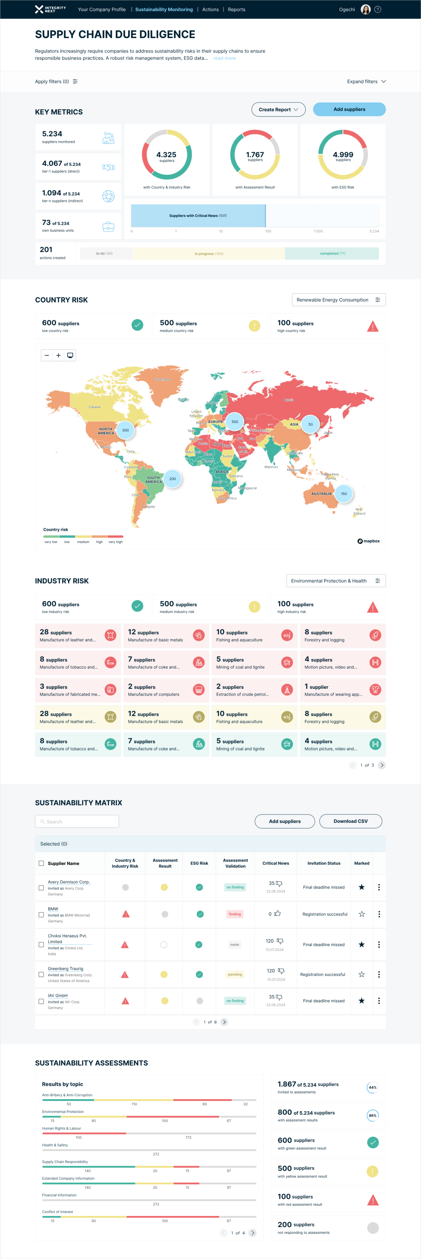
I led the redesign of our Supply Chain Due Diligence (SCDD) Dashboard to provide an improved solution to help our Users meet these new requirements.
Key features of the dashboard include:
Supplier Monitoring and Risk Evaluation: Track and assess supplier risks based on country-specific and industry-specific factors, helping companies better manage high-risk areas in their supply chains.
Sustainability Metrics: The dashboard offers a real-time overview of crucial sustainability indicators, such as the geographic distribution of suppliers, country-specific risk levels (low, medium, or high), and industry-specific risk (low, medium, high risk) evaluations.
Critical News Monitoring: Keep track of significant news events that could affect suppliers or the supply chain, allowing businesses to respond proactively.
Assessment Results Overview: Easily access and analyse sustainability assessment results for each supplier, enabling companies to make informed decisions.
1. Project Overview
SCDD - Supply Chain Due Dilligence
ESG - Environmental, Social, Governance
Shortened terminologies
- solution preview
- Before Re-design


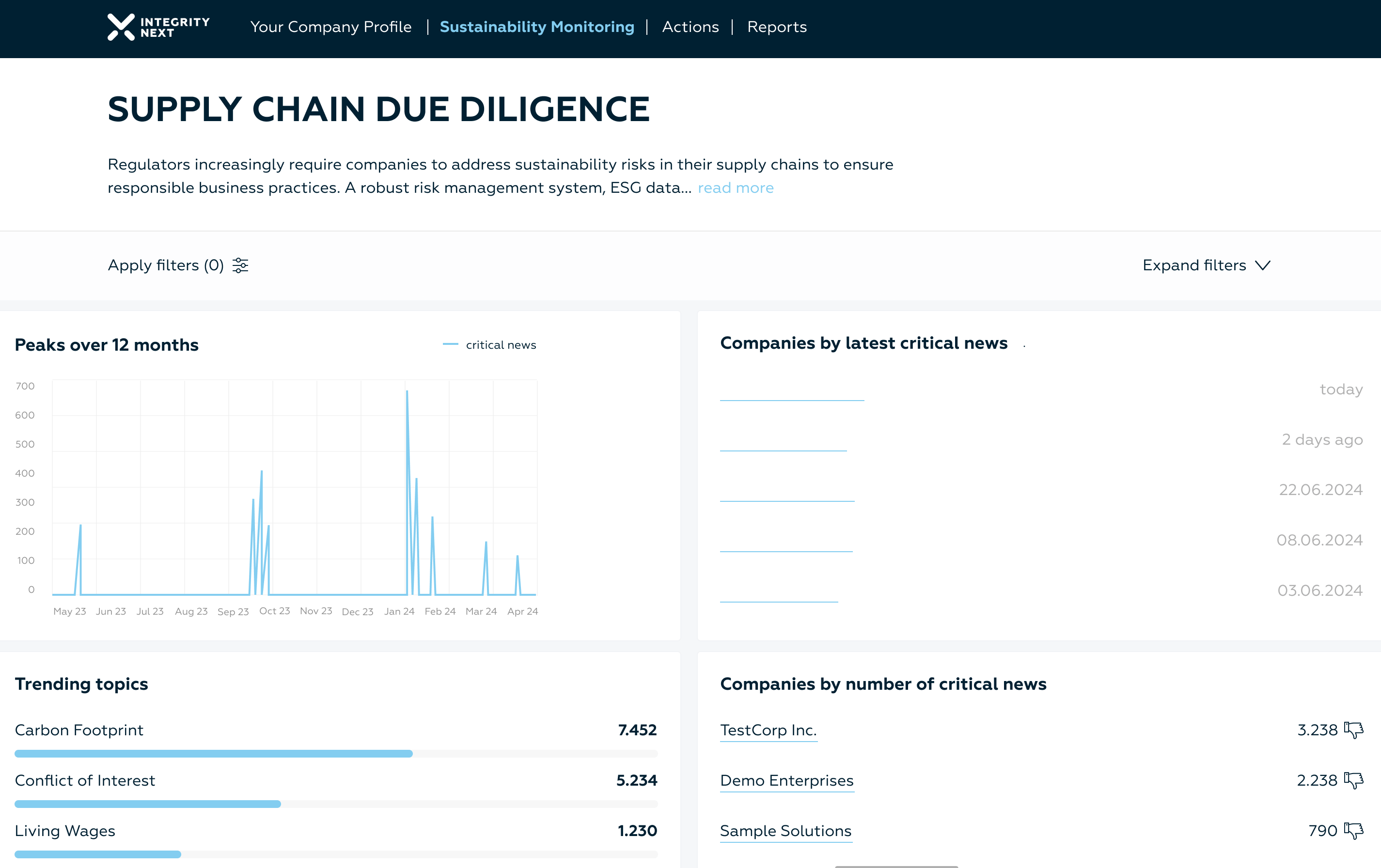
Your Company Profile
Sustainability Monitoring
Actions
Reports
Kateryna


Supply Chain Due Diligence
- AFTER RE-DESIGN
THE PROCESS
To kickoff, I conducted a workshop along with the Product Manager and team members to audit the current SCDD Dashboard design, focusing on what should be kept or retained within the current solution, pinning the problem areas and improvement suggestions to bring added value to our users:
STEP 1: Analysis of the Current SCDD Dashboard

Your Company Profile
Sustainability Monitoring
Actions
Reports

Supply Chain Due Diligence


Current SCDD Dashboard
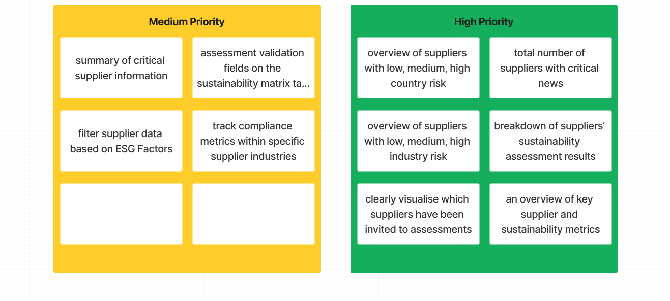
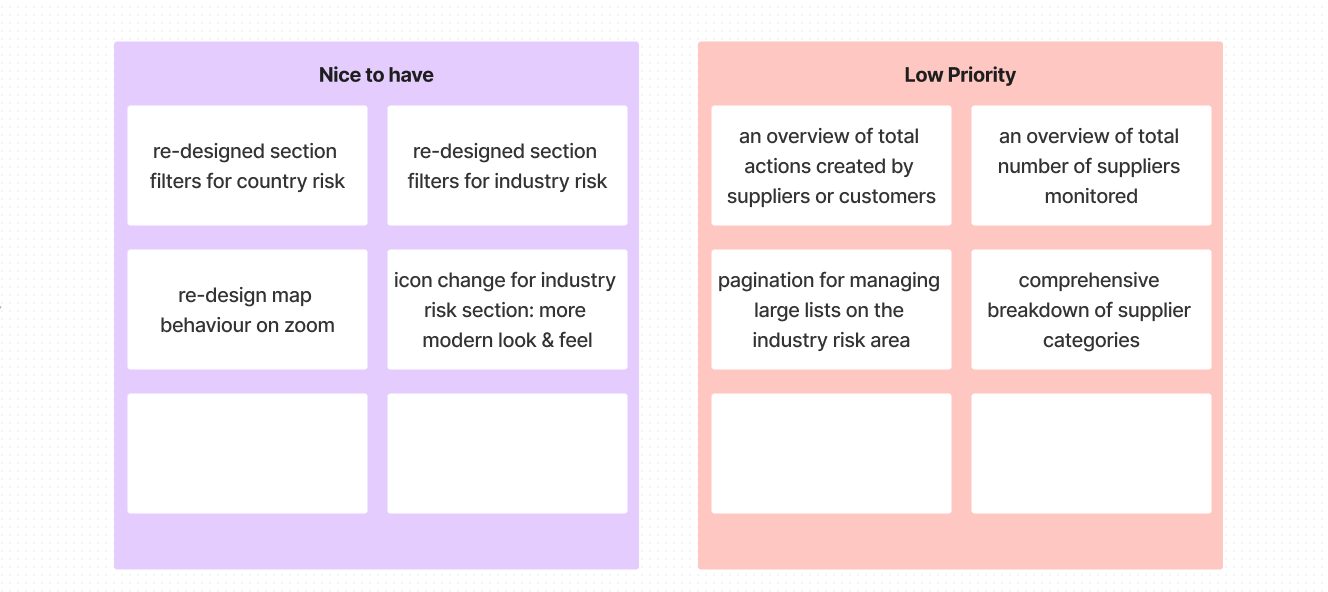
After the kickoff workshop, we sought to understand more in depth what changes are really of top priority to our users and how these could be interwoven with internal business and product requirements. So alongside the Product Manager, we conducted 3 user interviews and I further summarised our findings into nice to have, low, medium, high priority categories:
STEP 2: UNDERSTANDING THE USERS’ PERSPECTIVE
With collated results from the internal workshop and user interviews in mind, we formulated and refined the problems as statements:
Do similar implementations exist from our top 3 competitors?
STEP 3: PROBLEM STATEMENT
STEP 4: COMPETITOR RESEARCH

How might we assist our Users in tracking sustainability metrics, critical news, country and industry risk levels,
and assessment results for all their direct and indirect suppliers within their supply chain in real time?
How might we support our Users to ensure compliance with the Supply Chain Due Diligence Act’s requirements
for supplier monitoring and risk evaluation?
How might we provide a comprehensive overview of critical supplier metrics and other key performance indicators to help our users make informed decisions?
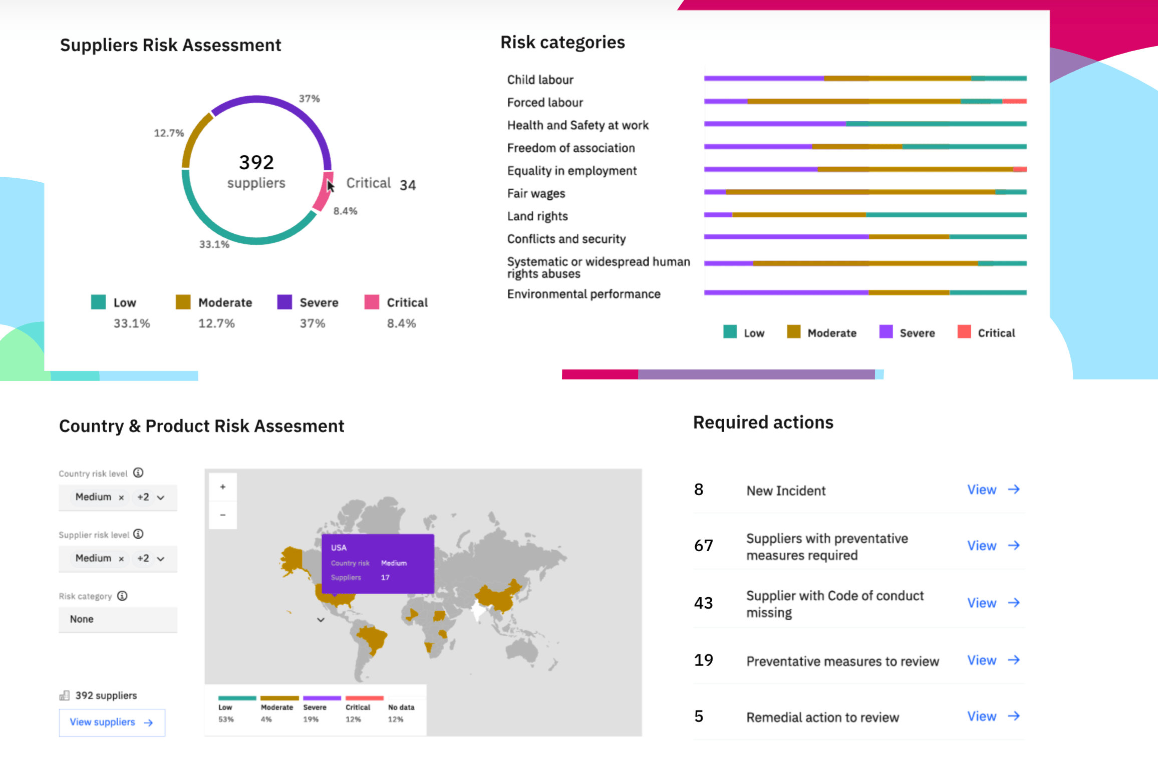
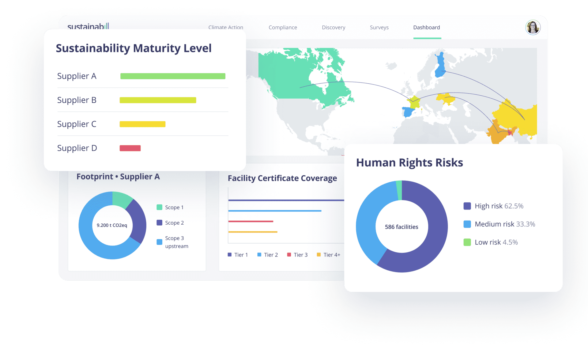
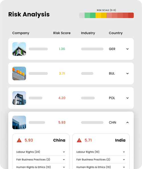
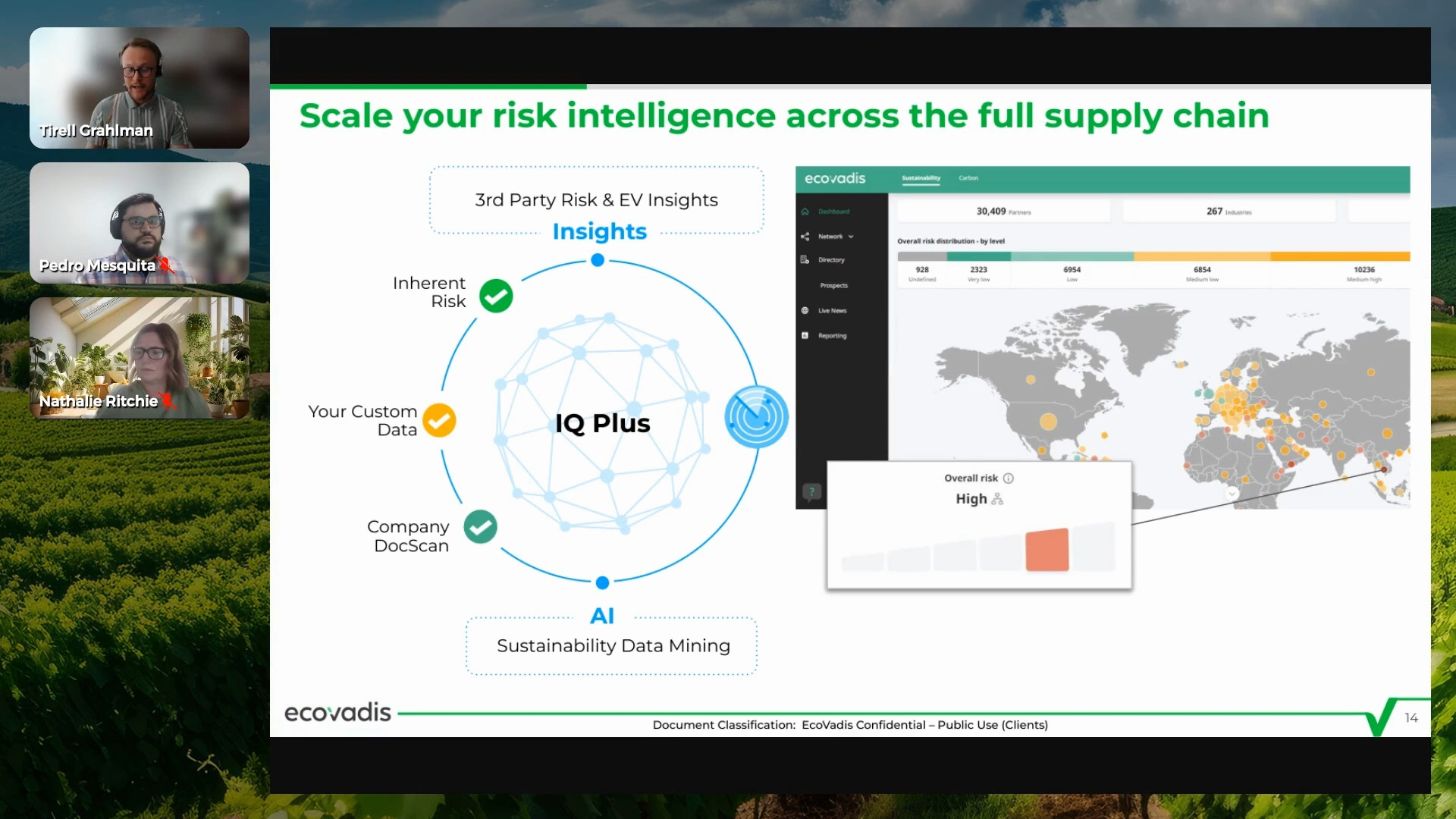
I dedicated several hours to conducting in-depth competitor research, focusing on how our direct competitors addressed similar challenges. This allowed me to assess whether they had already found effective solutions, which design patterns they employed, and what strategies we could draw inspiration from:
Incorporating Stakeholder/User Feedback:
Technical Considerations/Feedback:
2nd Design Iteration:
While the design received positive feedback, certain key suggestions and requests from users and stakeholders stood out:

most users where unfamiliar with geographical locations and wished to see the names of the countries and contents clearly written out on the map.

Users wanted to see on first glance a supplier number count for all continents.
users expressed interest in knowing the risk levels of countries where they had no suppliers in but which had
lower risks compared to the countries their current suppliers where located in.
A white background would be preferred over the dark blue background for the map.
I presented the first design variant to our Software developers and got some technical feedback:
Overlapping blinking dots on the map would slow down rendering speed significantly.
Tooltips for overlapping areas on the map would negatively impact performance and should ideally be
displayed only when the map is zoomed in.
Edge case considerations: what if a user has suppliers in every country on the map? that would be over 200 blinking bubbles and would be a technical challenge.
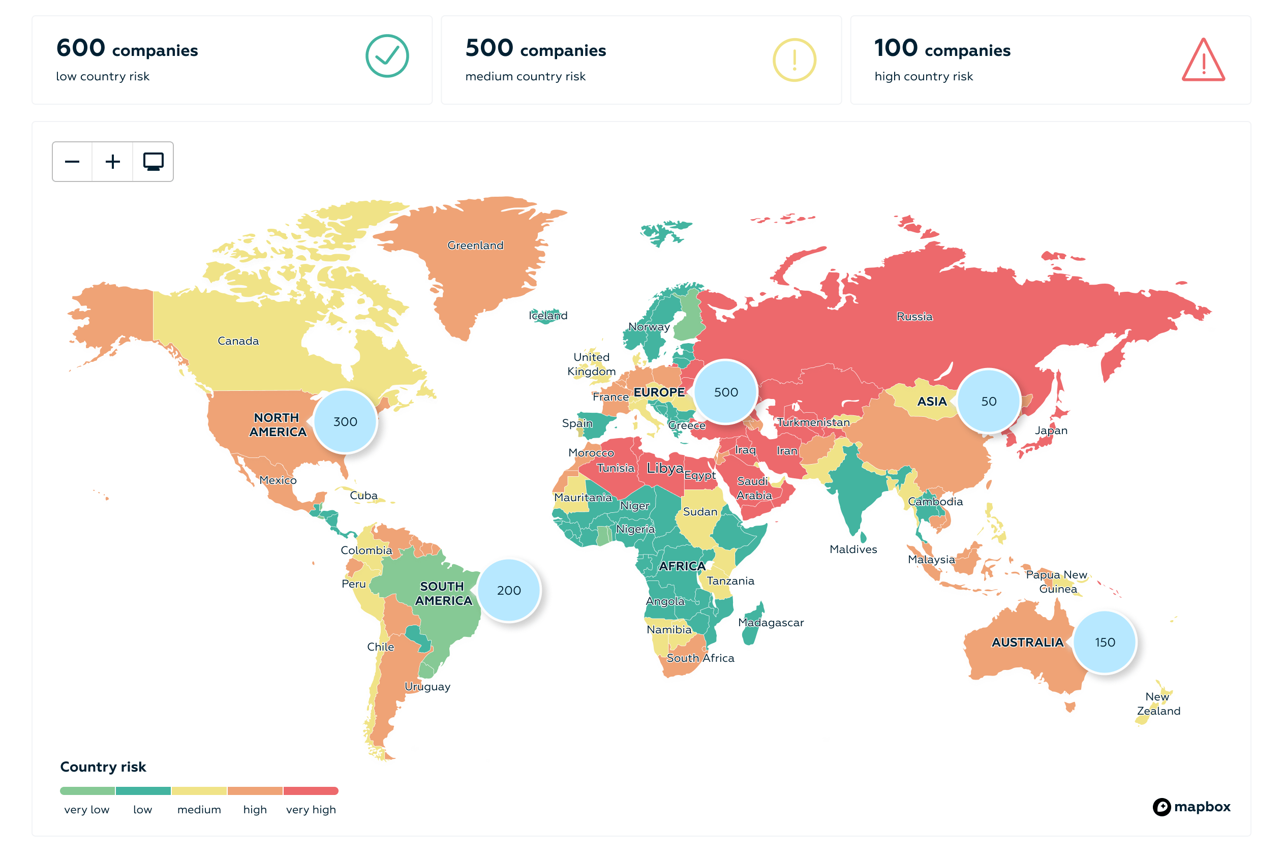
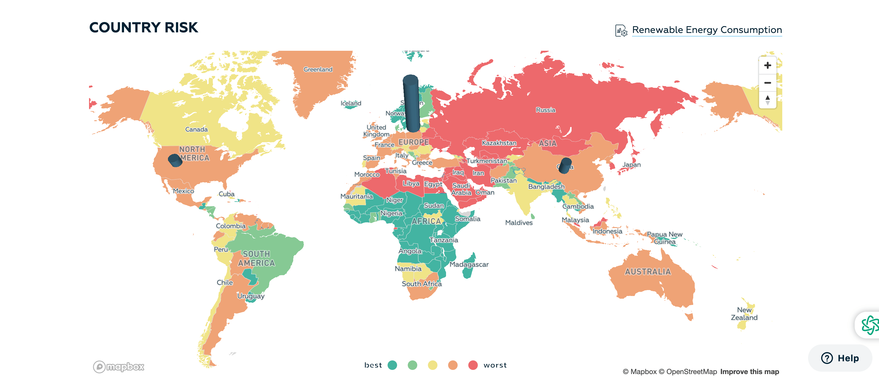
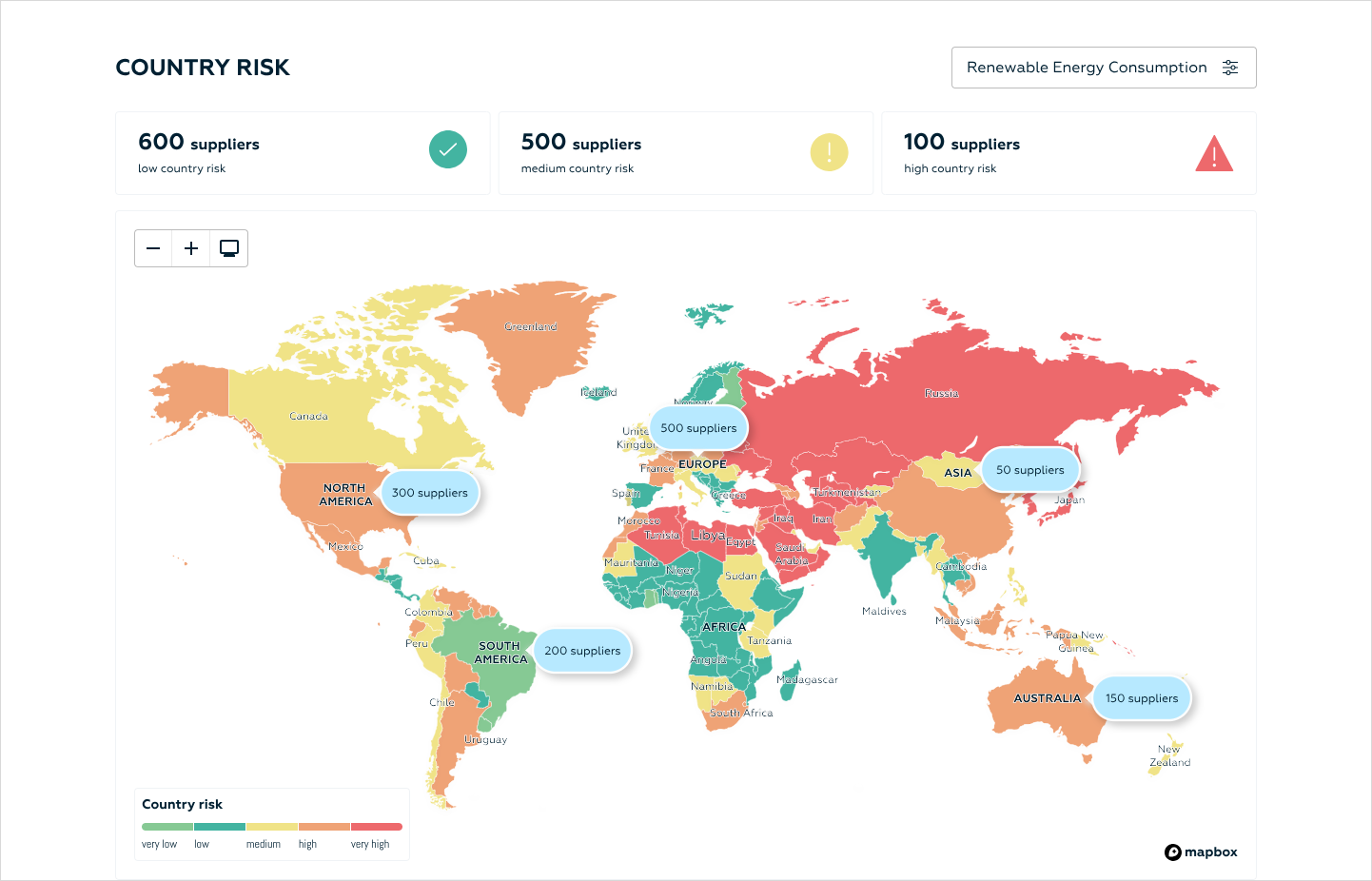
Taking into consideration all received user, stakeholder and technical feedback, I created a second improved design variant for the country risk section:
all countries on the map where now coloured to reflect their risk levels (green for low country risk, yellow for medium country risk, red for high country risk.
number of suppliers in each continent/country level was now displayed on default view.
white background was introduced for the map
3rd Design Iteration:
Addition Feedback:
- Industry Risk Section
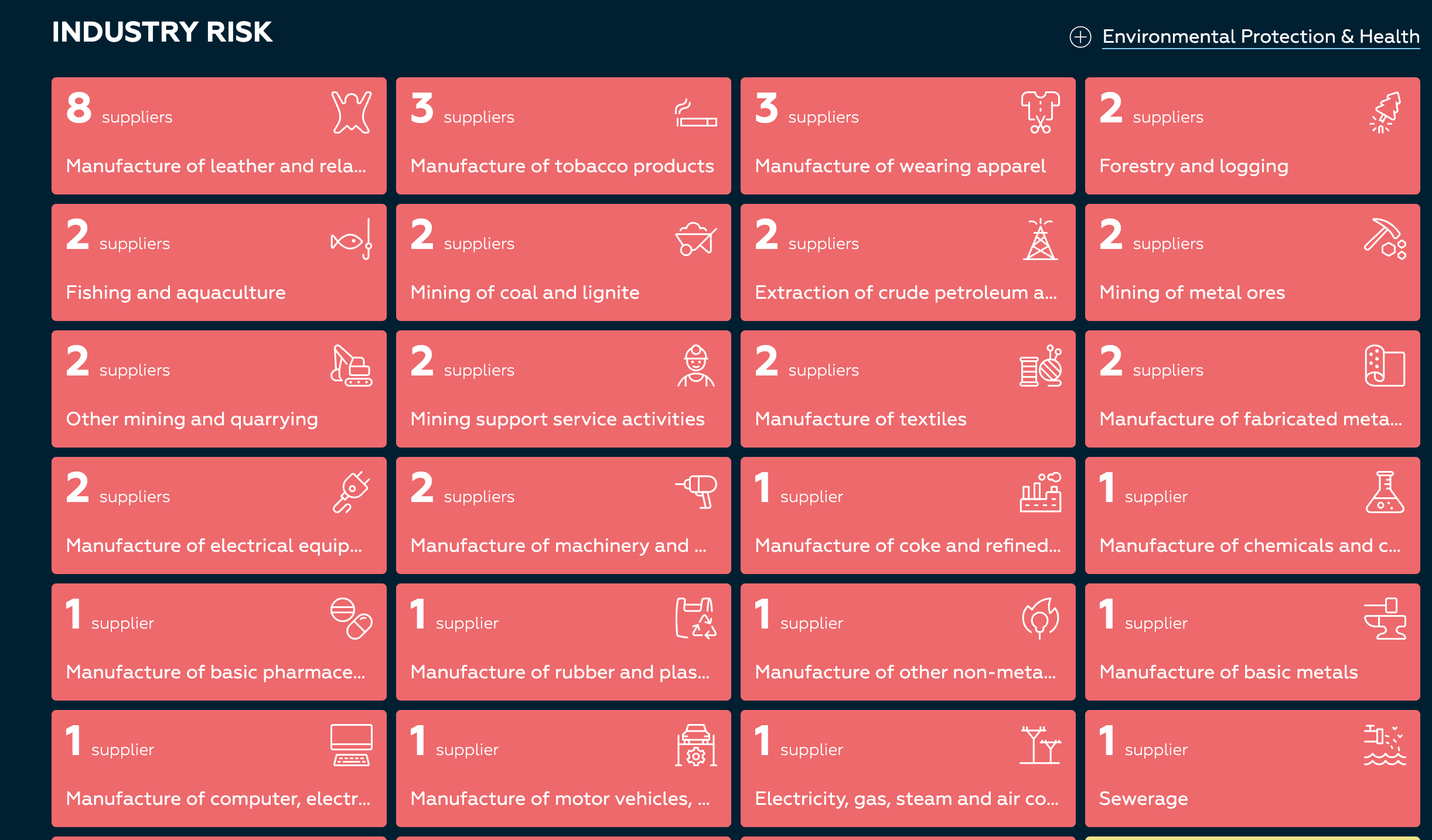
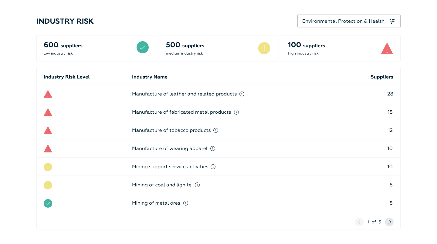
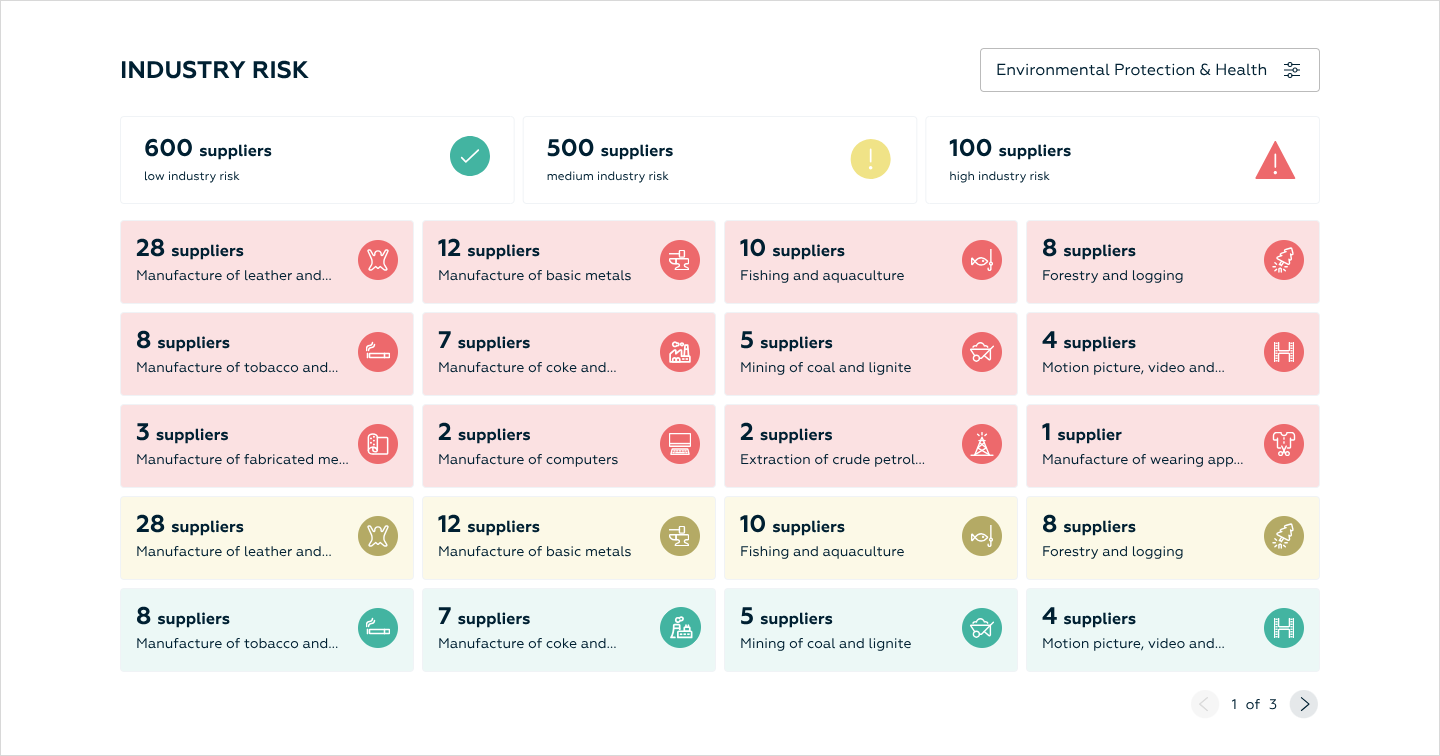
With the redesigned and enhanced Industry Risk section, our users can now:
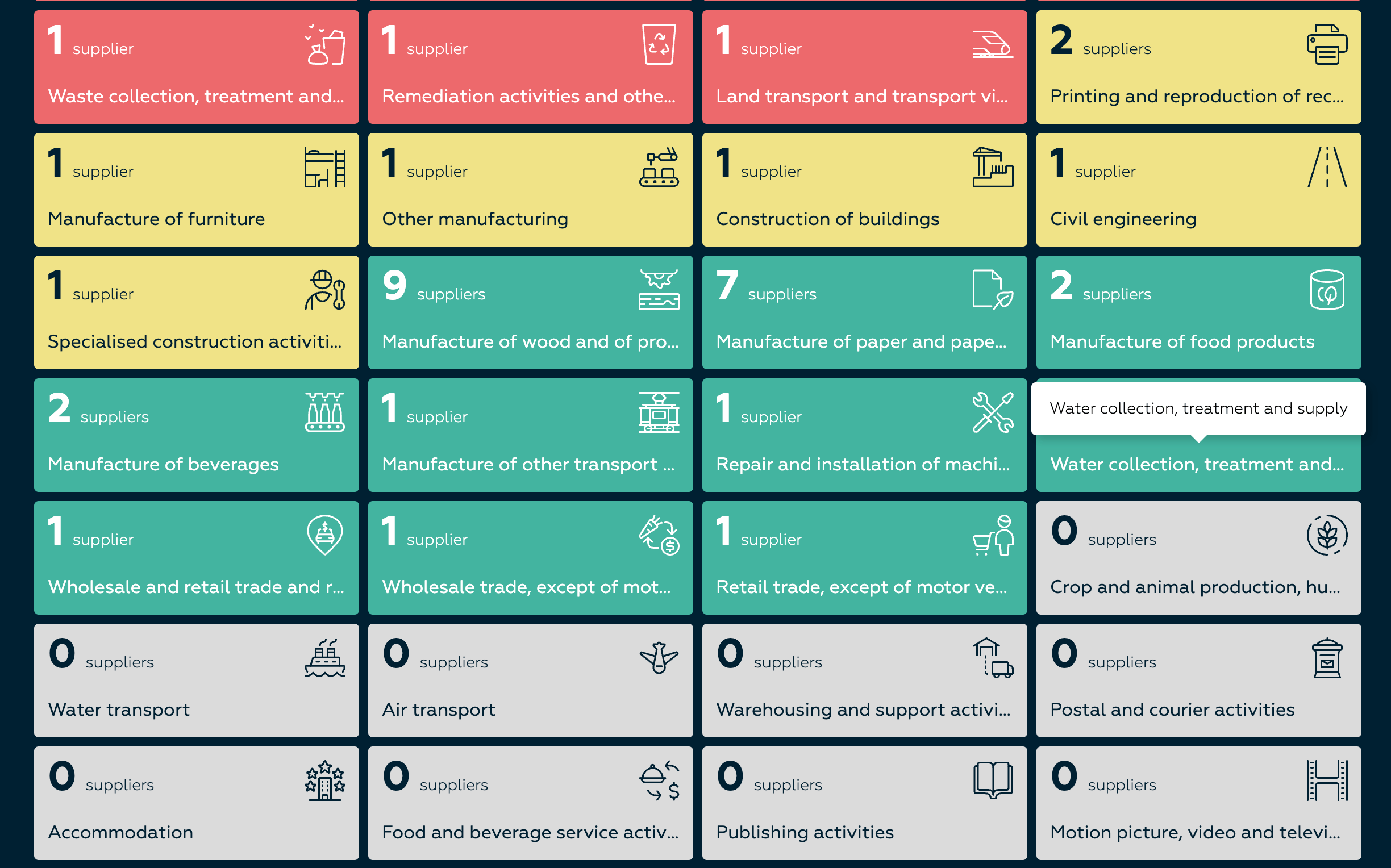
Easily view the total number of their suppliers categorised by low, medium, and high industry risk levels.
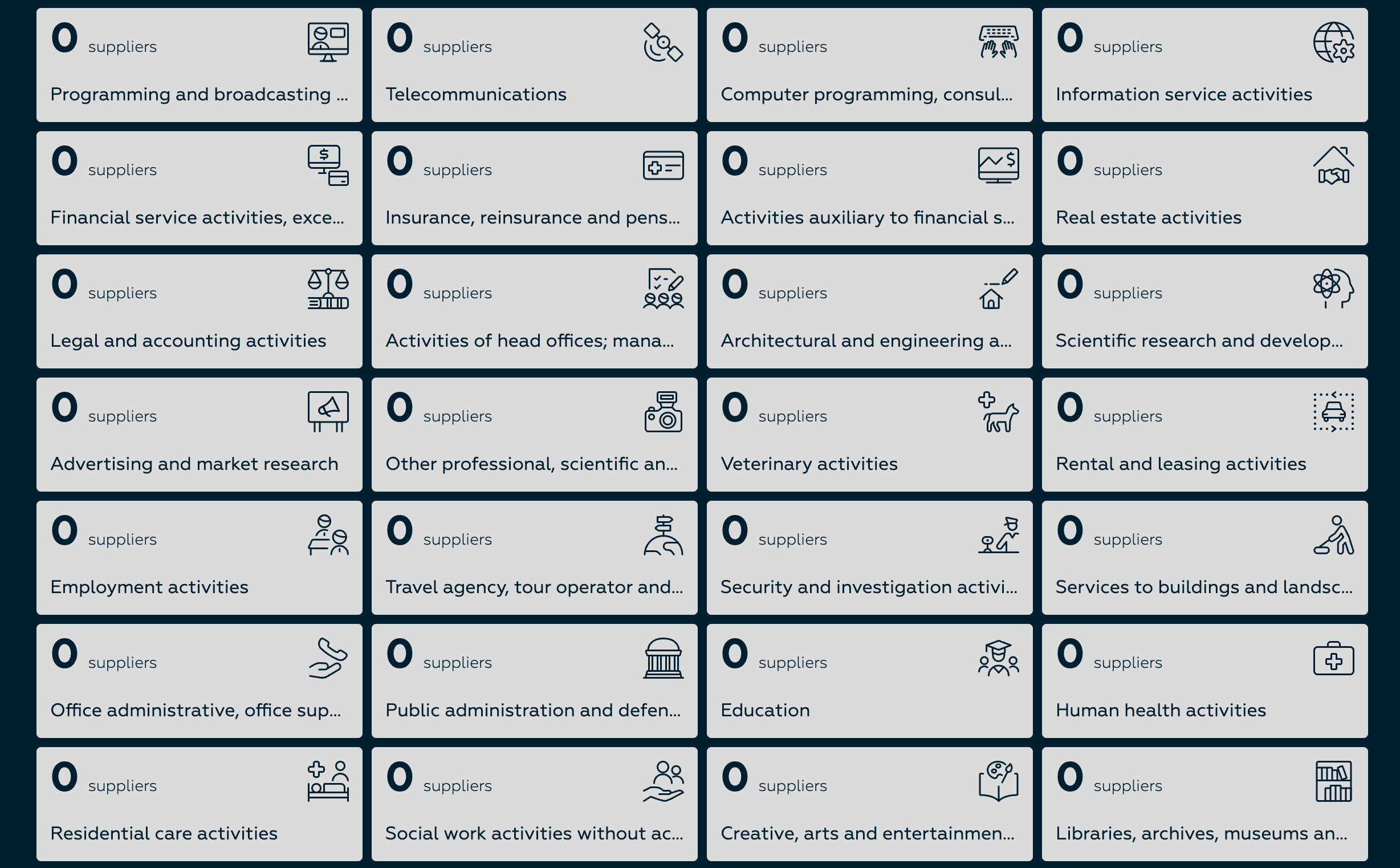
Visualise the distribution of suppliers across various industry sectors, making it clearer to identify which sectors pose higher risks.
Filter supplier data based on Environmental, Social, and Governance (ESG) factors to focus on industry-specific concerns.
Quickly assess risk factors in specific industries (like forestry, mining, or manufacturing) and track compliance metrics within those sectors.
The second design iteration received super positive feedback from stakeholders and users alike with one minor change request:
the word “suppliers” appeared redundant when referencing the supplier count across different geographical locations.
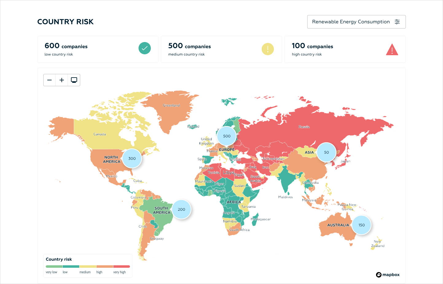
Finalized Supply Chain Due Diligence Dashboard:
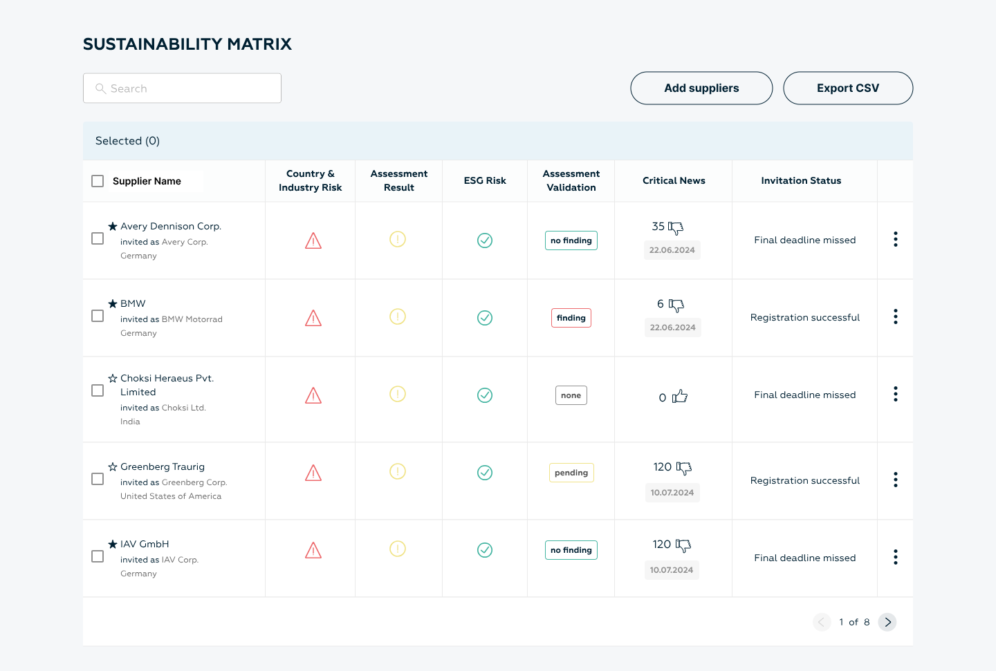
Design variants for the Sustainability Matrix Table:
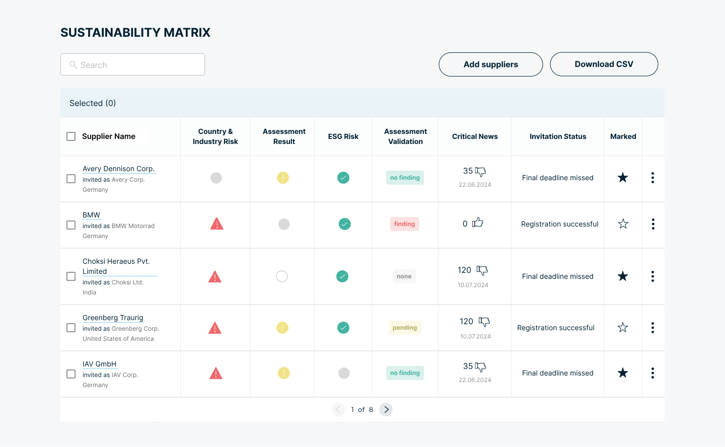
Final refinements to the Sustainability Matrix Table:
Final refinements to the Sustainability Matrix Table:
Click play below for a sneak peek into the Dev Handoff space on Figma:
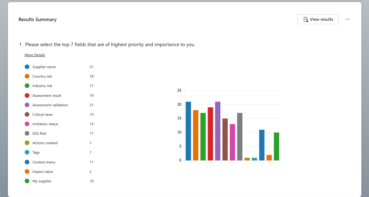
Taking the survey results into account, I began developing design variants for the sustainability matrix.
Design variant #1
During internal meetings with key stakeholders, decisions were made to:

Replace all outlined icons with filled icons.
Add the column title "Marked" to the Starred column.
In response to these updates, I created a new design variant to incorporate the final changes.
After design iterations have been approved by internal and external stakeholders, I create a developers’ handoff documentation with:
default states for each section
empty state specifications
spacing information
loading state specifications
accessibility specifications
Responsiveness, screen size considerations and designs
Error states
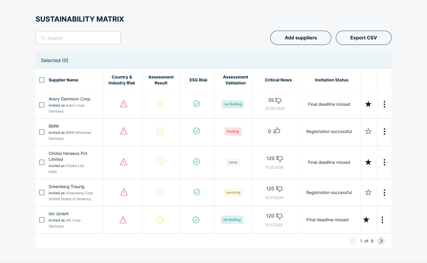
Design variant #2
Survey Results

- Country Risk Section
Ist Design Iteration:
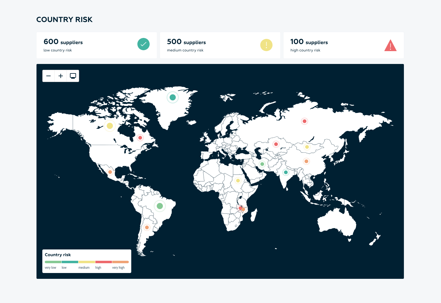
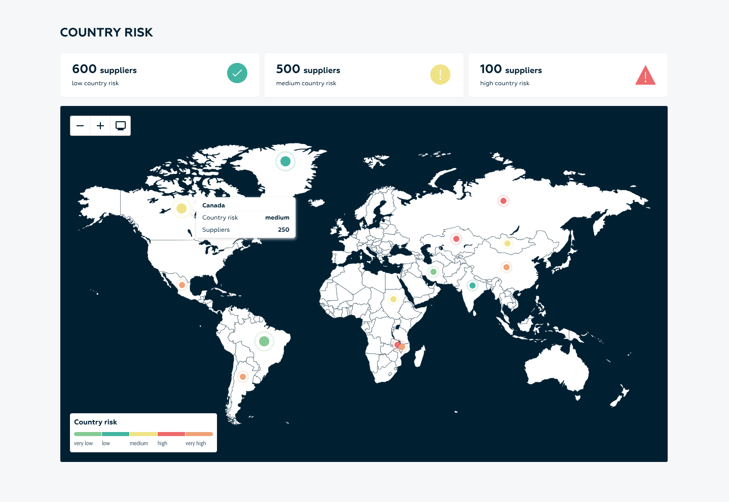
With the enhanced Country Risk Section, users can now:

View a comprehensive breakdown of their suppliers categorised by low, medium, and high country risk levels.

Visualise the geographical distribution of suppliers on an interactive world map, allowing for a more intuitive understanding of supplier locations and associated risks.
Zoom in on specific regions or hover over geolocations to reveal detailed data, including supplier counts per
area, with tooltips providing advanced information for further analysis.
This update provides users with an at-a-glance risk assessment, helping them make more informed decisions about their supply chain.
Interactive prototype: Key Metrics section

Design variant #1

STEP 5: DESIGN KICK-OFF
- Key Metrics Section
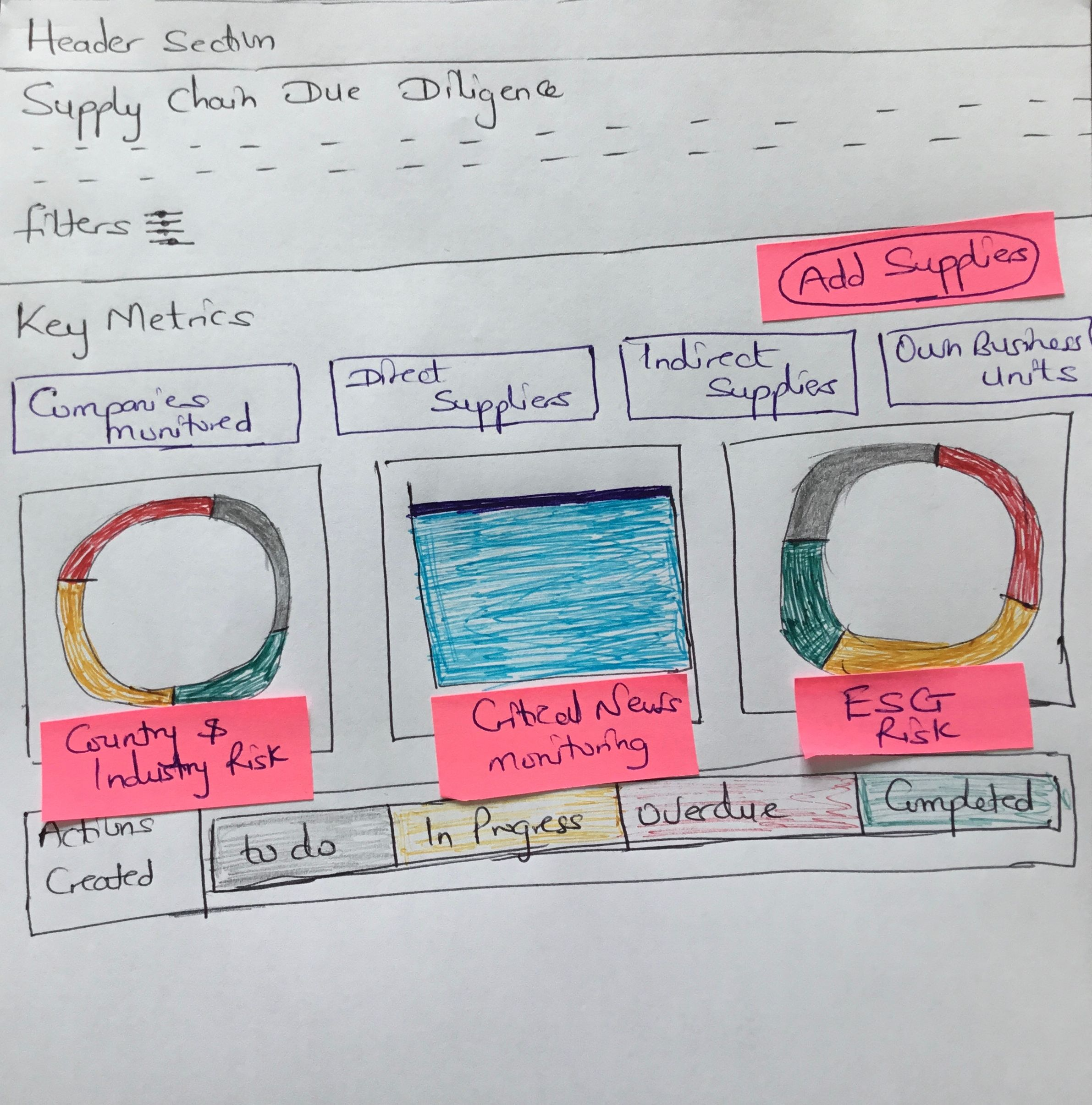
Keeping the key sustainability and supplier metrics in focus, I began by creating some sketches to
visualize how this section could be structured:
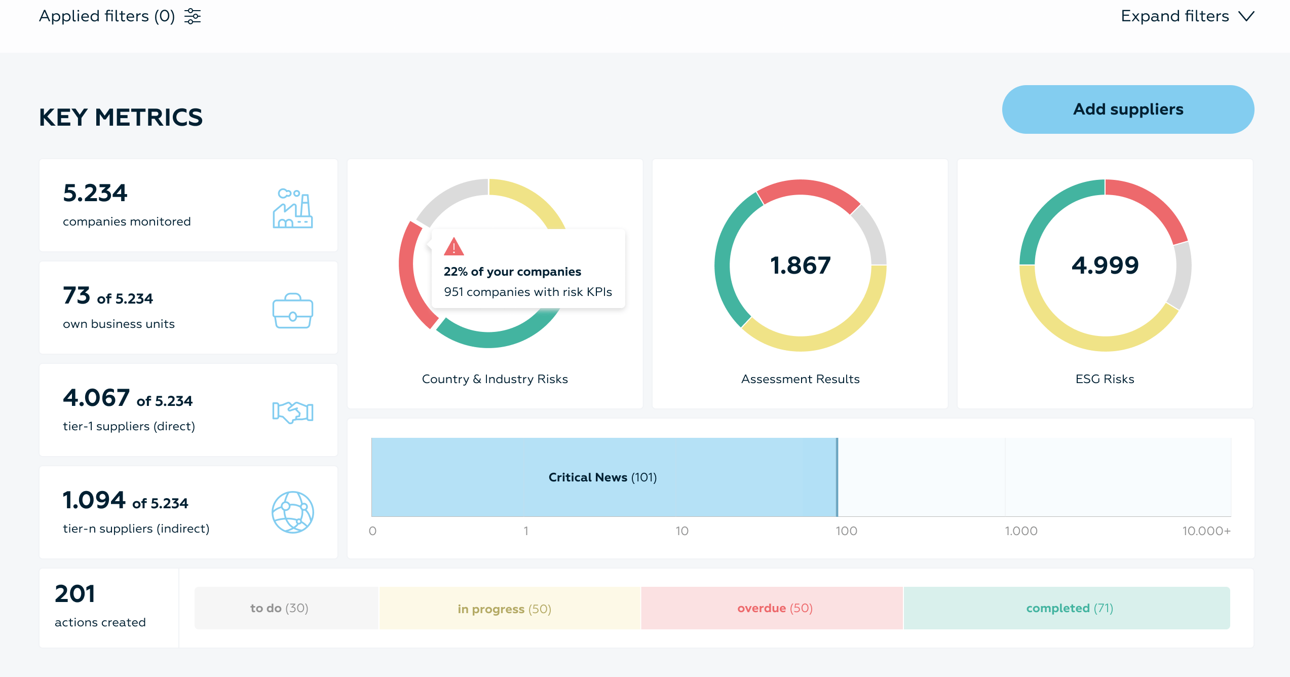
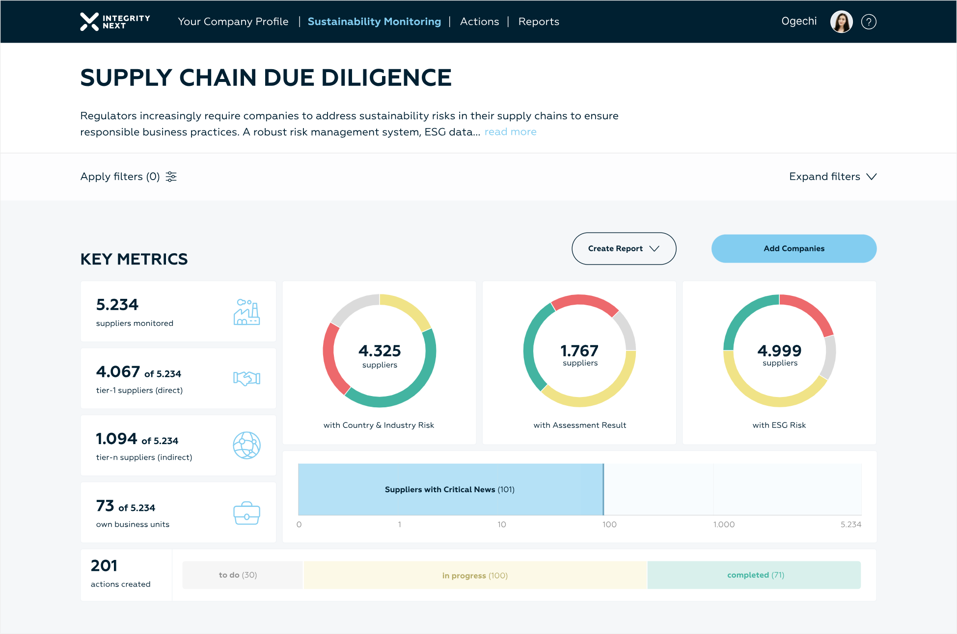
With the new Key Metrics Section, Users could see at a glance an overview of important sustainability
and supplier metrics like:

total number of suppliers monitored
total number of suppliers flagged with low, medium and high industry risk
total number of suppliers flagged with low, medium and high country risk
total number of suppliers with low, medium and high, or no ESG risk results
total number of suppliers identified with critical news
total number of actions created to mitigate and correct these supplier sustainability risks
DETAILED BREAKDOWN OF SUB-SECTIONS WITHING THE SCDD DASHBOARD
INITIAL SKETCHES AND VISUAL REPRESENTATION
- Daato:
- Osapiens:
- Ecovadis:


50%
Extroverted




50%
Extroverted


Daato
country and industry risk analysis
critical news monitoring
key metrics overview section
Ecovadis
Osapiens


Visual Characteristics:
Justifications for this Design Variant:
For the Industry Risk Section, I presented 2 design variants to Stakeholders:
- Clear Hierarchy and Readability:
- The layout uses a structured table format with Industry Risk Level, Industry Name, and Supplier Count, allowing users to quickly scan and interpret information. The consistent use of headings and alignment improves readability and helps users locate key details without confusion.
- Risk Visualisation Through Colour Codes:
- The use of colour-coded icons (red for high risk, yellow for medium risk) next to each industry effectively
- highlights the risk levels.
- Pagination for Managing Large Data Sets:
- Instead of overwhelming users with a long list, the design introduces pagination. It avoids scrolling fatigue and keeps the interface clean.
- Minimalistic and Professional Style:
- The design employs a minimalistic approach with ample white space, ensuring that users aren’t distracted by unnecessary elements.
Design variant #1
- Sustainability Matrix Section
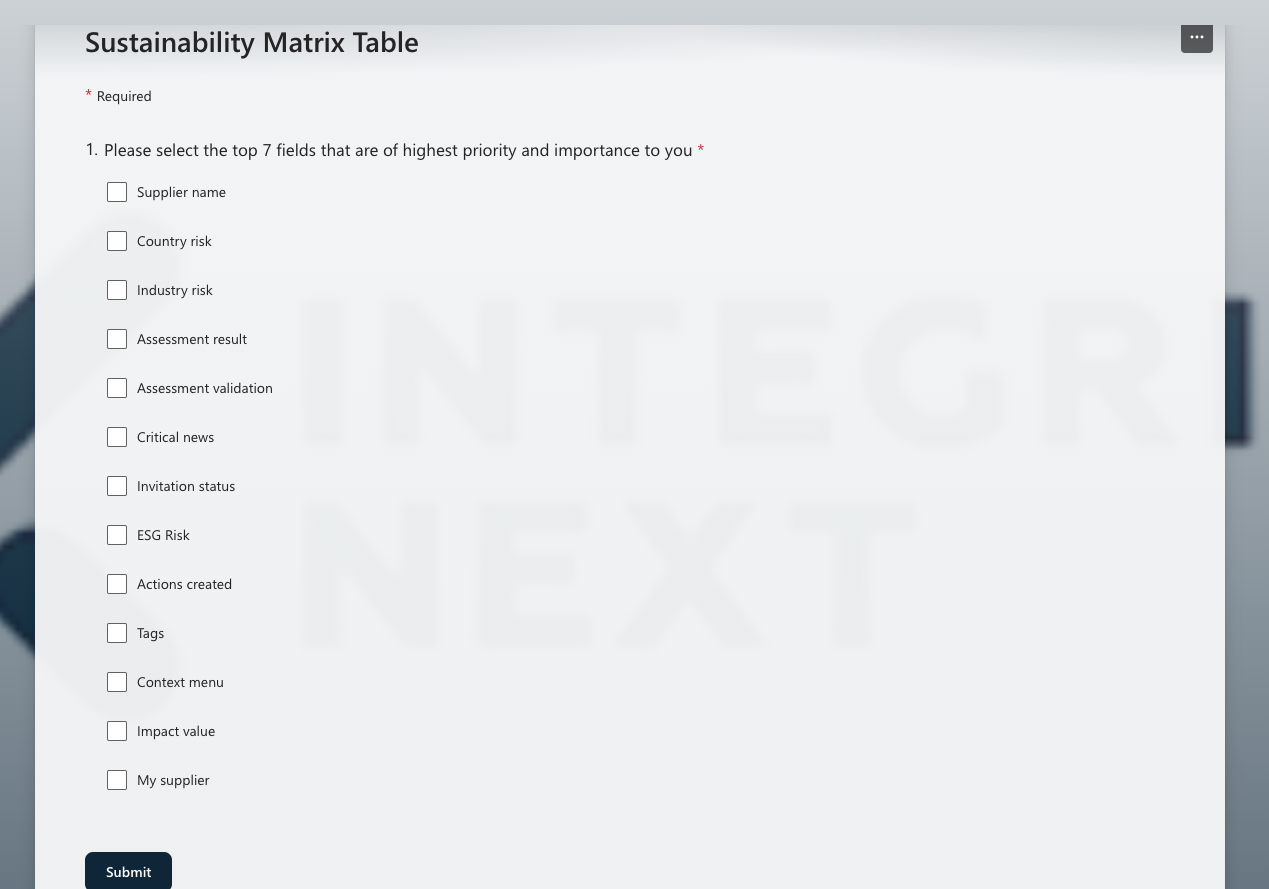
Initial Steps: Survey creation and distribution to our users
We went with Design Variant #2:
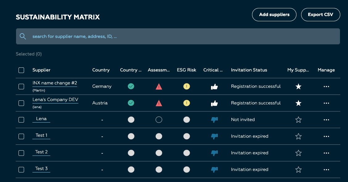
With the Sustainability Matrix, our goal was to provide our customers with a detailed, tabular overview of their
suppliers' performance across critical metrics such as country and industry risk, assessment results, ESG risk
scores, validation status, critical news, invitation status, actions created, tags, and more supplier-specific data.
With over 12 possible fields to display on the sustainability matrix table, and the possibility to only display at most 7 columns/visible fields at once given space limitations and technical considerations, the problem then was understanding which of these were of top importance to our users:
Supplier name
Country risk
Industry risk
Assessment result
Assessment validation
Critical news
Invitation status
ESG Risk
Actions
Tags
Context menu
Impact value
My Supplier
To solve this problem, I created a one-question survey, prompting our users to select the top 7 fields that were
of top importance to them:
Since retaining the familiar card layout from the current existing design and not being too disruptive with design changes was of top importance to stakeholders, we decided to go with design variant 2:
Design variant #2


Supply Chain - Due
Diligence (SCDD)
My Certifications

Supply Chain - Due Diligence (SCDD) Solution
MY ROLE
- End-to-End UX/UI Design
- Usability Testing & Iteration
- Design System Alignment
- Cross-functional Collaboration (PMs,
- Developers)
- Design Handover & QA
PROJECT DURATION
- 4 Months
- May - August, 2025
PROJECT TYPE
- Company Project (IntegrityNext GmbH)
With the introduction of Germany's Supply Chain Due Diligence Act (LkSG) on January 1, 2023, companies are now required to ensure that their supply chains comply with human rights and environmental standards.
I led the redesign of our Supply Chain Due Diligence (SCDD) Dashboard to provide an improved solution to help our Users meet these new requirements.
Key features of the dashboard include:
Supplier Monitoring and Risk Evaluation: Track and assess supplier risks based on country-specific and industry-specific factors, helping companies better manage high-risk areas in their supply chains.
Sustainability Metrics: The dashboard offers a real-time overview of crucial sustainability indicators, such as the geographic distribution of suppliers, country-specific risk levels (low, medium, or high), and industry-specific risk (low, medium, high risk) evaluations.
Critical News Monitoring: Keep track of significant news events that could affect suppliers or the supply chain, allowing businesses to respond proactively.
Assessment Results Overview: Easily access and analyse sustainability assessment results for each supplier, enabling companies to make informed decisions.
1. Project Overview
SCDD - Supply Chain Due Dilligence
ESG - Environmental, Social, Governance
Shortened terminologies
- solution preview
- Before Re-design

Your Company Profile
Sustainability Monitoring
Actions
Reports
Kateryna


Supply Chain Due Diligence
- AFTER RE-DESIGN
THE PROCESS
To kickoff, I conducted a workshop along with the Product Manager and team members to audit the current SCDD Dashboard design, focusing on what should be kept or retained within the current solution, pinning the problem areas and improvement suggestions to bring added value to our users:
STEP 1: Analysis of the Current SCDD Dashboard

Your Company Profile
Sustainability Monitoring
Actions
Reports

Supply Chain Due Diligence




Current SCDD Dashboard
After the kickoff workshop, we sought to understand more in depth what changes are really of top priority to our users and how these could be interwoven with internal business and product requirements. So alongside the Product Manager, we conducted 3 user interviews and I further summarised our findings into nice to have, low, medium, high priority categories:
STEP 2: UNDERSTANDING THE USERS’ PERSPECTIVE
With collated results from the internal workshop and user interviews in mind, we formulated and refined the problems as statements:
Do similar implementations exist from our top 3 competitors?
STEP 3: PROBLEM STATEMENT
STEP 4: COMPETITOR RESEARCH

How might we assist our Users in tracking sustainability metrics, critical news, country and industry risk levels,
and assessment results for all their direct and indirect suppliers within their supply chain in real time?
How might we support our Users to ensure compliance with the Supply Chain Due Diligence Act’s requirements
for supplier monitoring and risk evaluation?
How might we provide a comprehensive overview of critical supplier metrics and other key performance indicators to help our users make informed decisions?
I dedicated several hours to conducting in-depth competitor research, focusing on how our direct competitors addressed similar challenges. This allowed me to assess whether they had already found effective solutions, which design patterns they employed, and what strategies we could draw inspiration from:
Incorporating Stakeholder/User Feedback:
Technical Considerations/Feedback:
2nd Design Iteration:
While the design received positive feedback, certain key suggestions and requests from users and stakeholders stood out:

most users where unfamiliar with geographical locations and wished to see the names of the countries and contents clearly written out on the map.

Users wanted to see on first glance a supplier number count for all continents.
users expressed interest in knowing the risk levels of countries where they had no suppliers in but which had
lower risks compared to the countries their current suppliers where located in.
A white background would be preferred over the dark blue background for the map.
I presented the first design variant to our Software developers and got some technical feedback:
Overlapping blinking dots on the map would slow down rendering speed significantly.
Tooltips for overlapping areas on the map would negatively impact performance and should ideally be
displayed only when the map is zoomed in.
Edge case considerations: what if a user has suppliers in every country on the map? that would be over 200 blinking bubbles and would be a technical challenge.
Taking into consideration all received user, stakeholder and technical feedback, I created a second improved design variant for the country risk section:
all countries on the map where now coloured to reflect their risk levels (green for low country risk, yellow for medium country risk, red for high country risk.
number of suppliers in each continent/country level was now displayed on default view.
white background was introduced for the map
3rd Design Iteration:
Addition Feedback:
- Industry Risk Section
With the redesigned and enhanced Industry Risk section, our users can now:
Easily view the total number of their suppliers categorised by low, medium, and high industry risk levels.
Visualise the distribution of suppliers across various industry sectors, making it clearer to identify which
sectors pose higher risks.
Filter supplier data based on Environmental, Social, and Governance (ESG) factors to focus on industry-
specific concerns.
Quickly assess risk factors in specific industries (like forestry, mining, or manufacturing) and track
compliance metrics within those sectors.
The second design iteration received super positive feedback from stakeholders and users alike with one minor change request:
the word “suppliers” appeared redundant when referencing the supplier count across different geographical locations.
Finalized Supply Chain Due Diligence Dashboard:
Design variants for the Sustainability Matrix Table:
Final refinements to the Sustainability Matrix Table:
Final refinements to the Sustainability Matrix Table:
Click play below for a sneak peek into the Dev Handoff space on Figma:
Taking the survey results into account, I began developing design variants for the sustainability matrix.
Design variant #1
During internal meetings with key stakeholders, decisions were made to:

Replace all outlined icons with filled icons.
Add the column title "Marked" to the Starred column.
In response to these updates, I created a new design variant to incorporate the final changes.
After design iterations have been approved by internal and external stakeholders, I create a developers’ handoff documentation with:
default states for each section
empty state specifications
spacing information
loading state specifications
accessibility specifications
Responsiveness, screen size considerations and designs
Error states
Design variant #2
Survey Results
- Country Risk Section
Ist Design Iteration:
With the enhanced Country Risk Section, users can now:

View a comprehensive breakdown of their suppliers categorised by low, medium, and high country risk levels.

Visualise the geographical distribution of suppliers on an interactive world map, allowing for a more intuitive understanding of supplier locations and associated risks.
Zoom in on specific regions or hover over geolocations to reveal detailed data, including supplier counts per
area, with tooltips providing advanced information for further analysis.
This update provides users with an at-a-glance risk assessment, helping them make more informed decisions about their supply chain.
Interactive prototype: Key Metrics section

Design variant #1
STEP 5: DESIGN KICK-OFF
- Key Metrics Section
Keeping the key sustainability and supplier metrics in focus, I began by creating some sketches to visualize how this section could be structured:
With the new Key Metrics Section, Users could see at a glance an overview of important sustainability and supplier metrics like:

total number of suppliers monitored
total number of suppliers flagged with low, medium and high industry risk
total number of suppliers flagged with low, medium and high country risk
total number of suppliers with low, medium and high, or no ESG risk results
total number of suppliers identified with critical news
total number of actions created to mitigate and correct these supplier sustainability risks
DETAILED BREAKDOWN OF SUB-SECTIONS WITHING THE SCDD DASHBOARD
INITIAL SKETCHES AND VISUAL REPRESENTATION
- Daato:
- Osapiens:
- Ecovadis:


50%
Extroverted


50%
Extroverted


Daato
country and industry risk analysis
critical news monitoring
key metrics overview section
Ecovadis
Osapiens


Visual Characteristics:
Justifications for this Design Variant:
For the Industry Risk Section, I presented 2 design variants to Stakeholders:
- Clear Hierarchy and Readability:
- The layout uses a structured table format with Industry Risk Level, Industry Name, and Supplier Count, allowing users to quickly scan and interpret information. The consistent use of headings and alignment improves readability and helps users locate key details without confusion.
- Risk Visualisation Through Colour Codes:
- The use of colour-coded icons (red for high risk, yellow for medium risk) next to each industry effectively
- highlights the risk levels.
- Pagination for Managing Large Data Sets:
- Instead of overwhelming users with a long list, the design introduces pagination. It avoids scrolling fatigue and keeps the interface clean.
- Minimalistic and Professional Style:
- The design employs a minimalistic approach with ample white space, ensuring that users aren’t distracted by unnecessary elements.
Design variant #1
- Sustainability Matrix Section
Initial Steps: Survey creation and distribution to our users
We went with Design Variant #2:
With the Sustainability Matrix, our goal was to provide our customers with a detailed, tabular overview of their
suppliers' performance across critical metrics such as country and industry risk, assessment results, ESG risk
scores, validation status, critical news, invitation status, actions created, tags, and more supplier-specific data.
With over 12 possible fields to display on the sustainability matrix table, and the possibility to only display at most 7 columns/visible fields at once given space limitations and technical considerations, the problem then was understanding which of these were of top importance to our users:
Supplier name
Country risk
Industry risk
Assessment result
Assessment validation
Critical news
Invitation status
ESG Risk
Actions
Tags
Context menu
Impact value
My Supplier
To solve this problem, I created a one-question survey, prompting our users to select the top 7 fields that
were of top importance to them:
Since retaining the familiar card layout from the current existing design and not being too disruptive
with design changes was of top importance to stakeholders, we decided to go with design variant 2:
Design variant #2

Supply Chain - Due Diligence (SCDD) Solution
MY ROLE
- End-to-End UX/UI Design
- Usability Testing & Iteration
- Design System Alignment
- Cross-functional Collaboration (PMs, Developers)
- Design Handover & QA
PROJECT DURATION
- 4 Months
- May - August, 2025
PROJECT TYPE
- Company Project (IntegrityNext GmbH)
With the introduction of Germany's Supply Chain Due Diligence Act (LkSG) on January 1, 2023, companies are now required to ensure that their supply chains comply with human rights and environmental standards.
I led the redesign of our Supply Chain Due Diligence (SCDD) Dashboard to provide an improved solution to help our Users meet these new requirements.
Key features of the dashboard include:
Supplier Monitoring and Risk Evaluation: Track and assess supplier risks based on country-specific and industry-specific factors, helping companies better manage high-risk areas in their supply chains.
Sustainability Metrics: The dashboard offers a real-time overview of crucial sustainability indicators, such as the geographic distribution of suppliers, country-specific risk levels (low, medium, or high), and industry-specific risk (low, medium, high risk) evaluations.
Critical News Monitoring: Keep track of significant news events that could affect suppliers or the supply chain, allowing businesses to respond proactively.
Assessment Results Overview: Easily access and analyse sustainability assessment results for each supplier, enabling companies to make informed decisions.
1. Project Overview
SCDD - Supply Chain Due Dilligence
ESG - Environmental, Social, Governance
Shortened terminologies
- solution preview
- Before Re-design

Your Company Profile
Sustainability Monitoring
Actions
Reports
Kateryna


Supply Chain Due Diligence
- AFTER RE-DESIGN
THE PROCESS
To kickoff, I conducted a workshop along with the Product Manager and team members to audit the current SCDD Dashboard design, focusing on what should be kept or retained within the current solution, pinning the problem areas and improvement suggestions to bring added value to our users:
STEP 1: Analysis of the Current SCDD Dashboard

Your Company Profile
Sustainability Monitoring
Actions
Reports

Supply Chain Due Diligence




Current SCDD Dashboard
After the kickoff workshop, we sought to understand more in depth what changes are really of top priority to our users and how these could be interwoven with internal business and product requirements. So alongside the Product Manager, we conducted 3 user interviews and I further summarised our findings into nice to have, low, medium, high priority categories:
STEP 2: UNDERSTANDING THE USERS’ PERSPECTIVE
With collated results from the internal workshop and user interviews in mind, we formulated and refined the problems as statements:
Do similar implementations exist from our top 3 competitors?
STEP 3: PROBLEM STATEMENT
STEP 4: COMPETITOR RESEARCH

How might we assist our Users in tracking sustainability metrics, critical news, country and industry risk levels,
and assessment results for all their direct and indirect suppliers within their supply chain in real time?
How might we support our Users to ensure compliance with the Supply Chain Due Diligence Act’s requirements
for supplier monitoring and risk evaluation?
How might we provide a comprehensive overview of critical supplier metrics and other key performance indicators to help our users make informed decisions?
I dedicated several hours to conducting in-depth competitor research, focusing on how our direct competitors addressed similar challenges. This allowed me to assess whether they had already found effective solutions, which design patterns they employed, and what strategies we could draw inspiration from:
Incorporating Stakeholder/User Feedback:
Technical Considerations/Feedback:
2nd Design Iteration:
While the design received positive feedback, certain key suggestions and requests from users and stakeholders stood out:

most users where unfamiliar with geographical locations and wished to see the names of the countries and contents clearly written out on the map.

Users wanted to see on first glance a supplier number count for all continents.
users expressed interest in knowing the risk levels of countries where they had no suppliers in but which had
lower risks compared to the countries their current suppliers where located in.
A white background would be preferred over the dark blue background for the map.
I presented the first design variant to our Software developers and got some technical feedback:
Overlapping blinking dots on the map would slow down rendering speed significantly.
Tooltips for overlapping areas on the map would negatively impact performance and should ideally be
displayed only when the map is zoomed in.
Edge case considerations: what if a user has suppliers in every country on the map? that would be over 200 blinking bubbles and would be a technical challenge.
Taking into consideration all received user, stakeholder and technical feedback, I created a second improved design variant for the country risk section:
all countries on the map where now coloured to reflect their risk levels (green for low country risk, yellow for medium country risk, red for high country risk.
number of suppliers in each continent/country level was now displayed on default view.
white background was introduced for the map
3rd Design Iteration:
Addition Feedback:
- Industry Risk Section
With the redesigned and enhanced Industry Risk section, our users can now:
Easily view the total number of their suppliers categorised by low, medium, and high industry risk levels.
Visualise the distribution of suppliers across various industry sectors, making it clearer to identify which sectors pose higher risks.
Filter supplier data based on Environmental, Social, and Governance (ESG) factors to focus on industry-specific concerns.
Quickly assess risk factors in specific industries (like forestry, mining, or manufacturing) and track compliance metrics within those sectors.
The second design iteration received super positive feedback from stakeholders and users alike with one minor change request:
the word “suppliers” appeared redundant when referencing the supplier count across different geographical locations.
Finalized Supply Chain Due Diligence Dashboard:
Design variants for the Sustainability Matrix Table:
Final refinements to the Sustainability Matrix Table:
Final refinements to the Sustainability Matrix Table:
Click play below for a sneak peek into the Dev Handoff space on Figma:
Taking the survey results into account, I began developing design variants for the sustainability matrix.
Design variant #1
During internal meetings with key stakeholders, decisions were made to:
Replace all outlined icons with filled icons.
Add the column title "Marked" to the Starred column.
In response to these updates, I created a new design variant to incorporate the final changes.
After design iterations have been approved by internal and external stakeholders, I create a developers’ handoff documentation with:
default states for each section
empty state specifications
spacing information
loading state specifications
accessibility specifications
Responsiveness, screen size considerations and designs
Error states
Design variant #2
Survey Results
- Country Risk Section
Ist Design Iteration:
With the enhanced Country Risk Section, users can now:
View a comprehensive breakdown of their suppliers categorised by low, medium, and high country risk levels.
Visualise the geographical distribution of suppliers on an interactive world map, allowing for a more intuitive understanding of supplier locations and associated risks.
Zoom in on specific regions or hover over geolocations to reveal detailed data, including supplier counts per
area, with tooltips providing advanced information for further analysis.
This update provides users with an at-a-glance risk assessment, helping them make more informed decisions about their supply chain.
Interactive prototype: Key Metrics section
Design variant #1
STEP 5: DESIGN KICK-OFF
- Key Metrics Section
Keeping the key sustainability and supplier metrics in focus, I began by creating some sketches to visualize how this section could be structured:
With the new Key Metrics Section, Users could see at a glance an overview of important sustainability and supplier metrics like:
total number of suppliers monitored
total number of suppliers flagged with low, medium and high industry risk
total number of suppliers flagged with low, medium and high country risk
total number of suppliers with low, medium and high, or no ESG risk results
total number of suppliers identified with critical news
total number of actions created to mitigate and correct these supplier sustainability risks
DETAILED BREAKDOWN OF SUB-SECTIONS WITHING THE SCDD DASHBOARD
INITIAL SKETCHES AND VISUAL REPRESENTATION
- Daato:
- Osapiens:
- Ecovadis:
50%
Extroverted
50%
Extroverted
Daato
country and industry risk analysis
critical news monitoring
key metrics overview section
Ecovadis
Osapiens
Visual Characteristics:
Justifications for this Design Variant:
For the Industry Risk Section, I presented 2 design variants to Stakeholders:
- Clear Hierarchy and Readability:
- The layout uses a structured table format with Industry Risk Level, Industry Name, and Supplier Count, allowing users to quickly scan and interpret information. The consistent use of headings and alignment improves readability and helps users locate key details without confusion.
- Risk Visualisation Through Colour Codes:
- The use of colour-coded icons (red for high risk, yellow for medium risk) next to each industry effectively
- highlights the risk levels.
- Pagination for Managing Large Data Sets:
- Instead of overwhelming users with a long list, the design introduces pagination. It avoids scrolling fatigue and keeps the interface clean.
- Minimalistic and Professional Style:
- The design employs a minimalistic approach with ample white space, ensuring that users aren’t distracted by unnecessary elements.
Design variant #1
- Sustainability Matrix Section
Initial Steps: Survey creation and distribution to our users
We went with Design Variant #2:
With the Sustainability Matrix, our goal was to provide our customers with a detailed, tabular overview of their
suppliers' performance across critical metrics such as country and industry risk, assessment results, ESG risk
scores, validation status, critical news, invitation status, actions created, tags, and more supplier-specific data.
With over 12 possible fields to display on the sustainability matrix table, and the possibility to only display at most 7 columns/visible fields at once given space limitations and technical considerations, the problem then was understanding which of these were of top importance to our users:
Supplier name
Country risk
Industry risk
Assessment result
Assessment validation
Critical news
Invitation status
ESG Risk
Actions
Tags
Context menu
Impact value
My Supplier
To solve this problem, I created a one-question survey, prompting our users to select the top 7 fields that were
of top importance to them:
Since retaining the familiar card layout from the current existing design and not being too disruptive with design changes was of top importance to stakeholders, we decided to go with design variant 2:
Design variant #2